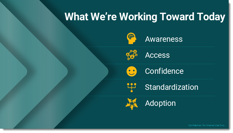
When Bullet Points Are Bad
This is directly from The Presentation Podcast episode 244 conversation (listen here) where the podcast hosts, Troy – Nolan – Sandy, talked about bullet points, specifically when they are not needed on a slide. The conversation was envisioned after Troy received this slide from a client recently:

- Note: client content has been stripped from the slide, and master.
- The conversation focused not only about the bullet list text boxes not being aligned (which was very obvious when the slide was on a 30′ wide screen!), but also that the icon + bullet + key word does not make an effective slide.
- Listen to the podcast for a full conversation about this slide’s bullets and many other bullet point talking points. 😂 (The Presentation Podcast, episode 244)
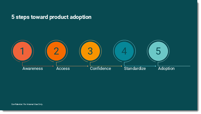
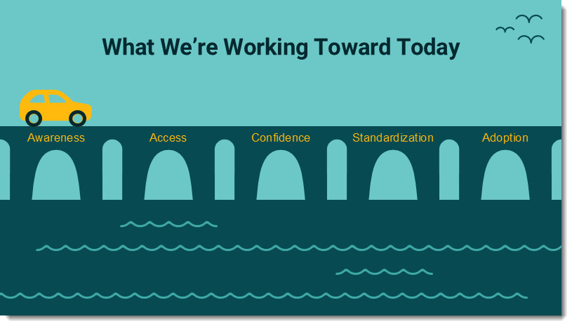
In preparing for the podcast I sent the example slide to Nolan and Sandy, and some of the TLC Creative design team. Today I get to share the slide makeovers!
(Troy)
(Sandy)

(Nolan)

(this version from Nolan was set up as a multi-slide animation)

(Lori – and this slide was a full animation sequence! Static 1st frame shown here)
(Amber)