How to Make Excel Use a PowerPoint Custom Color Scheme
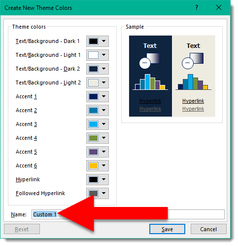
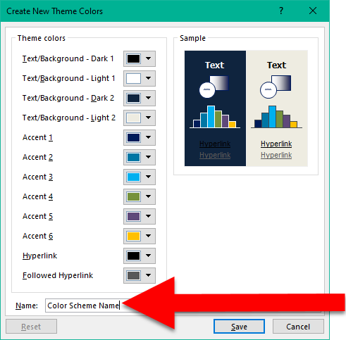
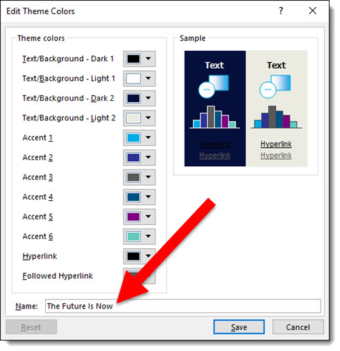
Microsoft Office; PowerPoint, Excel, Work, etc. have many shared components. PowerPoint tends to be the most visual design app of the suite and a common request we receive is how to add the colors from a PowerPoint we developed into Excel. You will need to add the custom color scheme to your computer, see the previous post. The process is fairly easy, here is an example and the action steps:
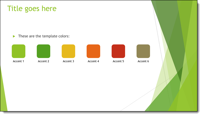
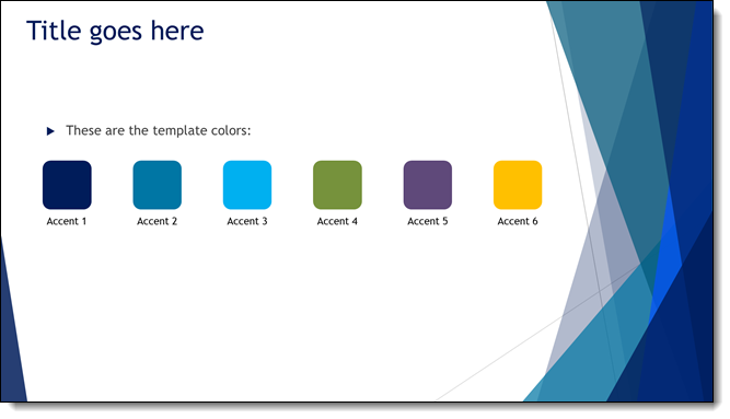
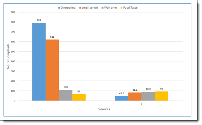
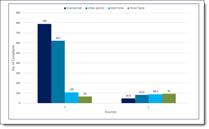
1. In Excel, our example chart uses the standard Office color scheme (boring!)
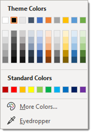
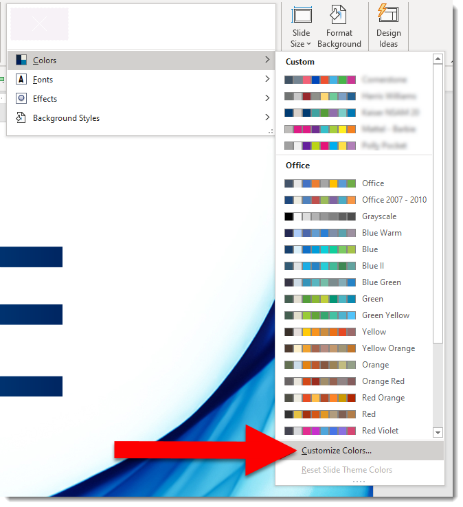
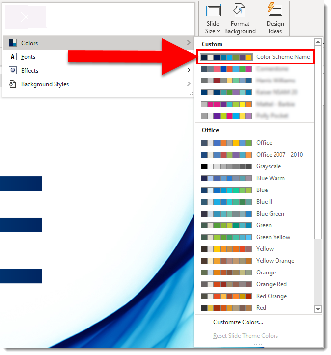
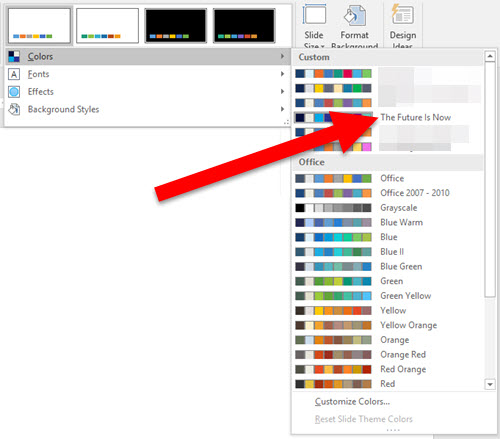
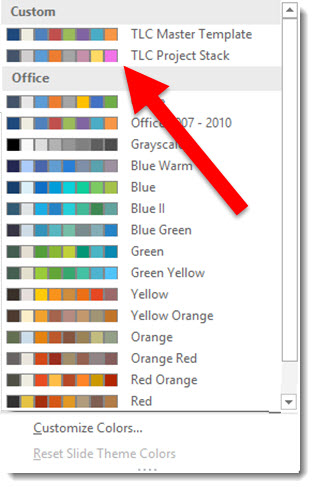
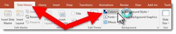
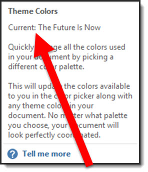
2. In excel go to PAGE LAYOUT > COLORS
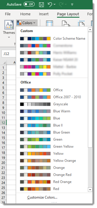
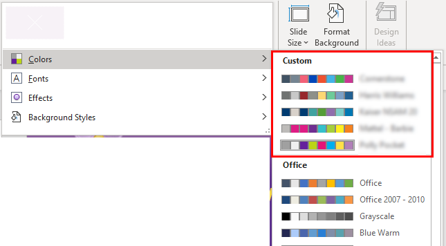
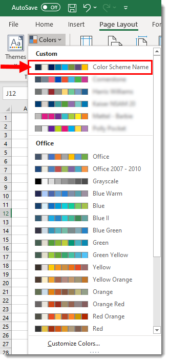
3. In the CUSTOM section, select the custom color scheme we saved from PowerPoint to the computer Office options. We are selecting the COLOR SCHEME NAME custom colors.
4. Now the excel file instantly updates charts to match the PowerPoint file!
Troy @ TLC