Tutorial

To Infinity and Beyond! (PPT2007 Lines)

To Infinity and Beyond! or at least that may be what the programmer was thinking when it comes to adjusting straight lines in PowerPoint 2007.

If you have not experienced this bug, here a quick overview:
– Add a straight line to slide

– Hold down shift key (to keep it on a 90′ axis) and click the end point.
– ZOOM, the line immediately extends forever

But there are solutions! Note: be sure all updates to Office 2007 are installed. A fairly recent update/hotfix has made the below solutions work. So if they do not work on your computer, you may be missing an update.

Option 1 – Get on the Line
– If working with thicker lines this bug does not act as “buggy”.
– Continue to hold down the click when you try to extend a line and it has shot off into the next universe
– Carefully postion the cursor at the desired length and exactly in the middle of the width of the line it will snap back to the cursor
– Thicker lines are easier to position cursor in the middle, thin lines have a smaller middle and are more difficult
– This is much easier when using a trackball style mouse where you can maintain the click and not have the cursor move even 1 pixel as long as the trackball is not touched. I do this fairly easily with my LogicTech Trackman, but almost impossible with my Wacom tablet

Option 2 – Space Bar
Many thanks to PPT MVP Jean-Pierre for getting my brain wrapped around this work around. Here is what you do:
– Add a straight line to slide

– Hold down shift key (to keep it on a 90′ axis) and click the end point and ignore it zooming off into infinity

– Don’t let go of your mouse/unclick!
– Position cursor to where you want the lines new length to be
– Press the SPACE BAR and the line snaps to that position!

– Troy @ TLC

By |2016-11-17T13:14:37-08:00March 31st, 2008|PowerPoint, Tutorial|

Get Rid of That Mouse

Recently while watching a presentation here is one of those little pet peeves that I just experienced. A movie plays on a slide and the computer mouse appears onscreen – usually sitting right on top of the movie.

Don’t panic, just click the “A” key to quickly and gracefully make it disappear. The “A” stands for Appear, or in this case disAppear.

– Troy @ TLC

By |2016-11-17T13:15:24-08:00March 28th, 2008|PowerPoint, Tutorial|

Align Objects Within Objects

The eye perceives when things are out of balance, even if the brain cannot identify the cause of it. This is even more evident when the slides are projected on a large screen. Take these images for example:

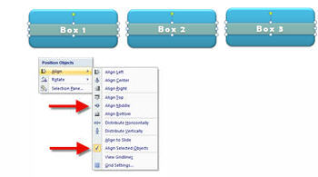
First, let’s look at how I made these elements. Each consists of two PPT autoshapes, a rounded corner box and a text box with a semi-transparent fill.

So what’s wrong with them? The left box’s text box is a few pixels lower than the others. The right rounded corner box is a few pixels higher than the others.

To fine tune this set of objects I would first select the 3 text boxes and use the ALIGN MIDDLE tool to have them all vertically line up – to the pixel. I would then do the same thing by selecting the 3 rounded corner boxes.

The end result is something that is in balance – and your eyes know it (or at least do not focus on it).

– Troy @ TLC

By |2016-11-17T13:16:58-08:00March 26th, 2008|PowerPoint, Tutorial|

PPT 2007 Charts (part 6)

No more importing an Excel chart and not having it play nice with PowerPoint. All of Offices uses a single charting engine, so a chart can be designed in Excel, Word or PowerPoint and be used (and edited) in all three with no issues.

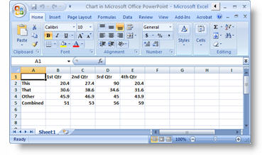
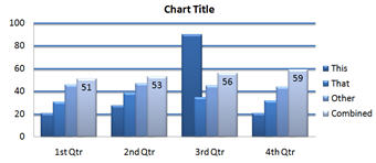
When you go to format a “PowerPoint” chart is now opens an excel window with the data. Here is the data used to create the sample chart for this series.

– Troy @ TLC

By |2016-11-17T13:19:12-08:00March 21st, 2008|PowerPoint, Tutorial|

PPT 2007 Charts (part 5)

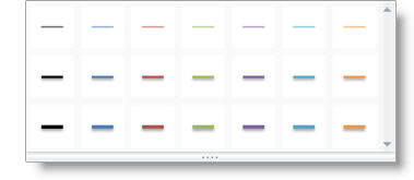
Individual elements can also be adjusted not only with easy, but using the new visual effects. Here I am selecting the horizontal gridlines of the chart. I can go to FORMAT >> SHAPES STYLES >> and choose any of the preset effects and colors:

Just like earlier the horizontal options are the colors from the Theme. The vertical options progress from simple/flat to rich/beveled designs.

With just a few clicks the gridlines can easily be updated to these:

– Troy @ TLC

By |2016-11-17T13:19:47-08:00March 19th, 2008|PowerPoint, Tutorial|

PPT 2007 Charts (part 4)

More two-click adjustments are found when a chart is selected and going to teh LAYOUT tab.

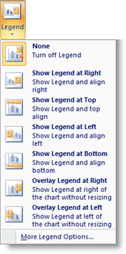
Each of these choices have a drop down to instantly adjust the entire chart. As example, if I want to format the chart legend I SELECT the chart >> LAYOUT tab >> LABELS section >> click LEGEND >> CHOOSE from any of these formatting options:

It is just as easy to adjust the data labels, axes, gridlines and more!

– Troy @ TLC
By |2016-11-17T13:20:08-08:00March 17th, 2008|PowerPoint, Tutorial|

PPT 2007 Charts (part 2)

One of the biggest improvements for charts comes in the ability to update them more effortlessly. No need to double-click the chart, right-click the area to format and then work through a series of dialog boxes.

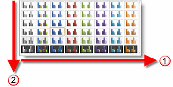
With PPT 2007 just select the chart, go to >> DESIGN tab >> Chart Styles section.

By choosing one of the options the color scheme and style of visual effects are instantly updated!

In using this feature it is helpful to understand how it is designed:
1. The horizontal shows all of the color options. Colors are based on the Theme Colors (think template color scheme).
2. The vertical starts with simple visual layout at the top and progressively adds more visual effects as you go down.

Troy @ TLC

By |2016-11-17T13:21:00-08:00March 12th, 2008|PowerPoint, Tutorial|

PPT 2007 Charts (part 1)

The visual capabilities of the new Office 2007 are fantastic and when it comes to the mundane chart – the better graphics really help!

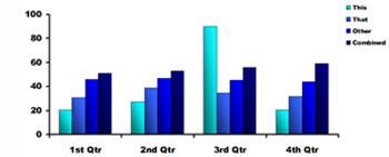
PPT2003:
Here I have really worked with the graphic options to create a nice, professional chart.

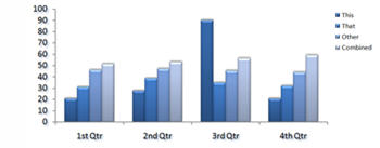
PPT2007
Here I have the same chart and same data, but with a few clicks I have added some graphic appeal (many of the subtle visual effects are lost in the small image here).

– Troy @ TLC

By |2016-11-17T13:21:21-08:00March 10th, 2008|PowerPoint, Tutorial|

Nuclear Fission Slide

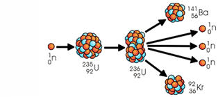
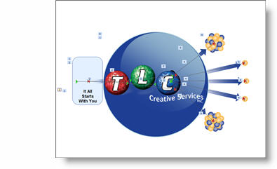
So here was my task – take this image (a very low quality .jpg)

and turn it into an animated slide to support the speaker’s analogy (“like nuclear fission, it all starts with one, and from your actions more can be created”!).

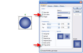
First was to recreate the nucleus balls as PPT objects. This was done by filling a circle with a gradient fill (shown in PPT2003).

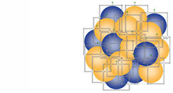
With two versions of the 3D ball, yellow and blue, they were grouped into clusters.

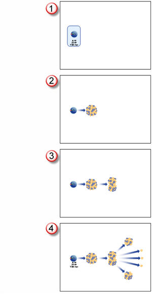
Here is the animation storyboard:

Click the slide below to download the final slide
(note: TLC logo put in place of client logo).

– Troy @ TLC

By |2016-11-17T13:22:18-08:00March 5th, 2008|PowerPoint, Tutorial|

You Need to Find The Selection Pane!

So sometimes the greatest feature is only great if you know it exists. Recently I showed a very talented designer the Selection Pane in PPT 2007 and she could not believe she did not know of it. So you are in the know, here is what the Selection Pane is and how to open it.

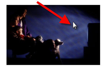
1. Here is my sample slide. Note there are 6 elements (visible) on the slide

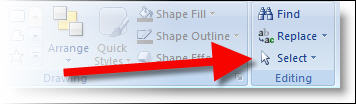
2. From the HOME tab, choose the SELECT all the way down on the right

3. In the SELECT drop down choose SELECTION PANE

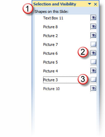
4. The incredible SELECTION AND VISIBILITY pane will open (next to the animation pane)

This powerful tool will let you turn on or off layers (like photoshop) and let you select a buried element! On this sample note that there are (2) visible items, which are seen in the above sample. But there are also (3) not visible items on this slide.

– Troy @ TLC

By |2016-11-17T13:23:48-08:00February 27th, 2008|PowerPoint, Tutorial|
Go to Top