Transforming Presentation Workflows with BrandIn – and we like it!
In episode 233 of The Presentation Podcast, the hosts talk about how deploying PowerPoint templates across an organization can be a nightmare. They are joined by guests Jamie Garroch and Hannah Harper of BrightCarbon to discuss “BrandIn” – a PowerPoint add-in that centralizes templates, assets, and brand resources for easy access and management in a seamless interface all within PowerPoint.
Jamie and Hannah explain how BrandIn streamlines template distribution, enhances brand consistency, and empowers agencies, designers and corporate users to access PowerPoint templates and assets to create on-brand presentations efficiently.
Listen on your favorite podcast app, or at The Presentation Podcast site here!

BrandIn is a PowerPoint Asset Management Tool that Works!

This is a continuation of the previous post, which introduced BrandIn along with our pro and con list. BrandIn is a new asset management solution for PowerPoint and Word, making templates, image assets, pre-designed slides, and text chunks – all accessible directly in PowerPoint without the need to go to a separate website or app to find and add assets to a presentation!
Let’s Try It!
Because BrandIn has a fully functional free version, try it! This post is from the perspective of our design team and our studio workflow of adding BrandIn. A special note that our workflow does diverge from some of the official BrandIn support info.
Install
Getting started with BrandIn is easy:
1. Requirements – a business Microsoft 365 plan which includes SharePoint Online (eg., Personal M365 plans will not work at the time of our review).
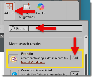
2. Download – BrandIn is a PowerPoint web add-in (eg., no separate .exe installer needed). This makes the installation easy and available to all but the most stringent IT-controlled companies. In PowerPoint, go to the HOME tab > ADD-INS > search for BRANDIN. Click ADD to install.
3. Setup – The BrandIn support info notes that the assigned M365 administrator must link BrandIn to their SharePoint library, then invite users to the BrandIn account, and do the shared asset organization within the SharePoint folders. Don’t let the “SharePoint” references scare you. Our experience at TLC Creative was that very little direct SharePoint activity was needed.
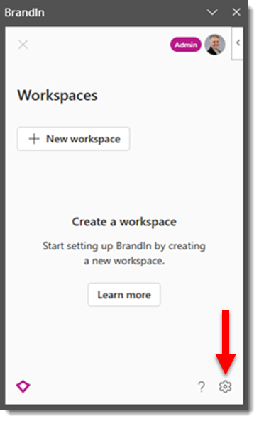
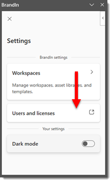
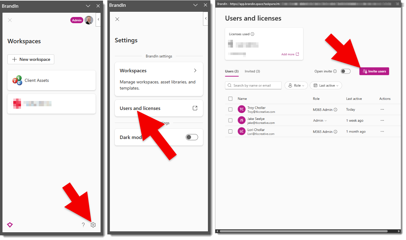
- From the HOME tab, click the BrandIn button to launch. Then click the settings (gear) icon at the bottom.
- Click “Users and licenses”
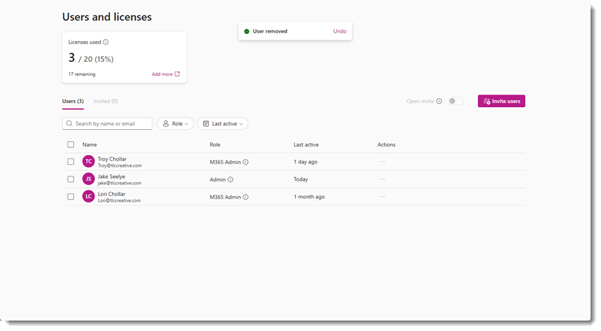
4. Invite Users – at the pop-up dialog, click “invite users” and follow the steps to invite users.
- The account must be set up by someone who is an M365 Admin.
- After this, anyone assigned as a BrandIn Admin (M365 Admin role is automatically a BrandIn Admin) can invite other users and create new workspaces.
BrandIn Workspaces
Workspaces are BrandIn’s way of creating separate areas to silo content for different brands, teams, or departments. The Free version is limited to 2 Workspaces, while the Business and Enterprise plans enable creation of as many Workspaces as needed. Each workspace connects to its own SharePoint site and can include its own asset library, templates, and custom settings, keeping everything organized and tailored to that group’s needs.
This is another area where the “SharePoint” reference does not need to scare anyone away. Below, we detail our workflow of using Teams to set up and organize the SharePoint folders and content – without needing to venture into “SharePoint”.
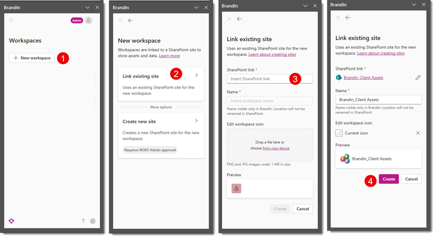
Add a Workspace to a BrandIn account:
- In the BrandIn pane, click NEW WORKSPACE (1).
- Select LINK EXISTING SITE (2).
- For the SHAREPOINT LINK (3), here is the TLC Creative simplified process (eg., we don’t really use SharePoint):
- Set up a Team (name the MS Team what you want to show in BrandIn as the Workspace name) > go to the Channel > go to the FILES tab > click the 3-dot drop-down menu > select OPEN IN SHAREPOINT
- Copy the web SharePoint browser URL
- Back in the BrandIn setup, paste this URL into the SharePoint Link field (3)
- Name the BrandIn Workspace, which will be seen in BrandIn (does not need to be the same as the Teams name, but we found it simpler for both the Teams name and the BrandIn Workspace name to be the same). Click CREATE (4).
- Note: the number of Workspaces that can be added is based on the account type (for example, the Free version is limited to 2 Workspaces).
User Access, SharePoint vs. Teams
BrandIn users have access to the BrandIn pane and each Workspace.
- Note: BrandIn users and access to Workspaces are separate, at least from our experience in using MS Teams for the BrandIn available assets. For example, everyone who has access to BrandIn does see all Workspaces, but they may not have access to go into the workspace folders based on the Team and who is set within Teams (more details below).
- Summary from the previous post on inviting BrandIn Users:
- In PowerPoint, open the BrandIn pane (e.g. click the BrandIn button on the HOME tab)
- Click the settings GEAR icon
- Click USERS AND LICENSES
- Click INVITE USERS (and follow the process)
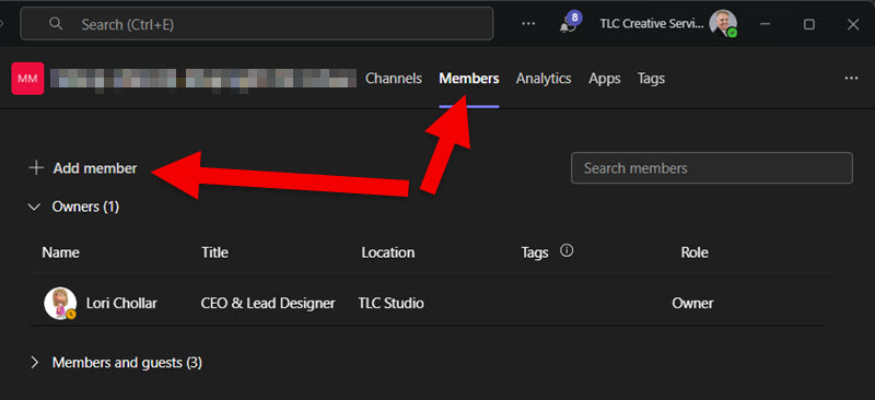
- MS Teams Users
- Once the Team is setup
- Go to MANAGE TEAM
- Add users and assign as Owners, Members or Guests (eg. someone external to the organization)
Using BrandIn
After the BrandIn account is set up, users are added, and the BrandIn add-in is installed in PowerPoint (and Word), things are pretty easy for users.
- In the PowerPoint HOME tab > click BRANDIN > the BrandIn pane opens
- From the BrandIn pane, select a Workspace > select an asset folder > click any asset to open or be added to the current slide.
- Done!
BrandIn Libraries and Assets
Organization and access to assets are the core of what BrandIn is. Understanding the combination of Library types and a plan for organizing the files/assets is going to make implementation smooth… or complex.
Each Workspace automatically has a “Template” library. Templates, both PowerPoint and Word, are available when clicking the NEW PRESENTATION (or New Document) link in BrandIn. Not only does this create a single folder for templates to be uploaded to, but it also means there is now a single location for templates, making the current template version easy to manage.
Libraries are basically folders in SharePoint with specific properties applied. The Library properties are added directly in the BrandIn interface (e.g. BrandIn applies the settings to the SharePoint folders for you).
Libraries (aka folders) can be any name and contain any files. Common libraries are Slides, Images, Icons, Slides (for predesigned, ready-to-use, individual slides), and Content (for things like preset text chunks – which is a really great BrandIn feature!).
As we quickly learned, having a central organization plan that everyone uses, is critical to a smooth setup of BrandIn. It is recommended someone on the planning side spend a few minutes reading about Libraries in the BrandIn Help Center.
BrandIn details setting up folders and assets within SharePoint; however, TLC Creative is happy to avoid SharePoint, and we’ve found that virtually everything can be done within the Microsoft Teams workflow. Once the folders are set up and connected to BrandIn, the SharePoint Library settings can be applied directly in BrandIn. The one exception is that the PowerPoint templates folder is specific to SharePoint, but BrandIn has a link to open SharePoint in a browser to the folder where template files need to be copied to.
Tips for MS Teams:
- When creating a Team, it is easier to manage if it is the same name as the BrandIn Workspace.
- Add users for access to each Team. We found this to be a great option for managing who can access assets in BrandIn (again, this can also be accomplished within SharePoint, but the MS Teams workflow was less “IT” and easier to implement for us). For example, everyone on our team sees all of the BrandIn Workspaces. But, if someone has not been given access to the MS Team, they can see the BrandIn Workspace, but do not see nor can access its assets from BrandIn.
- For assets to be available in BrandIn, it is as easy as copying the files into the Team, which can be set up in sub-folders, and the sub-folder structure also is in Teams. Go to the FILES tab > add folders and asset files.
- Everything added to the Team will be available in BrandIn (with the note that BrandIn needs to support the file types).
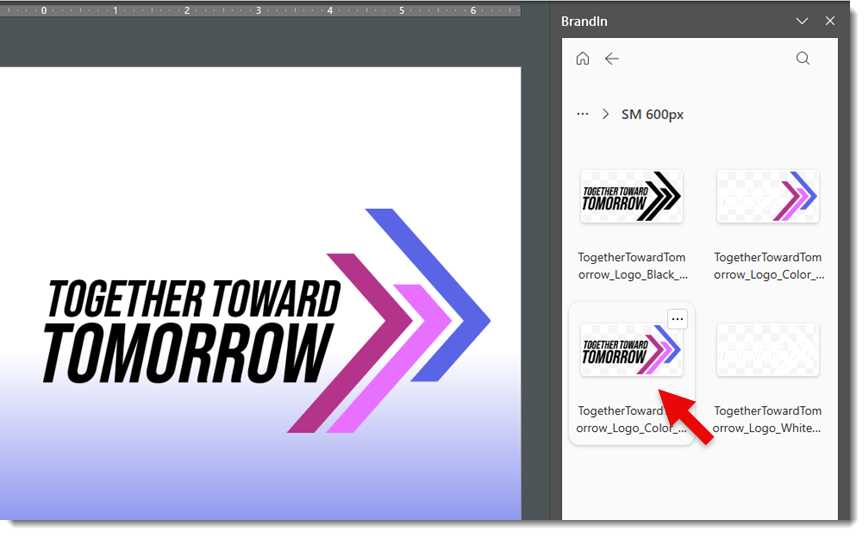
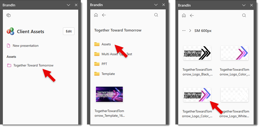
With the above steps complete, we can go to our demo BrandIn Workspace > Client Assets > and see a sub-folder, Together Toward Tomorrow.
- The CLIENT ASSETS Workspace is an MS Team
- We then added several clients and projects within CLIENT ASSETS
- The Together Toward Tomorrow folder in CLIENT ASSETS is a separate MS Team with its own assets folder structure, assets, and user access (based on who has been given access to this Team)
To see the logos for the Together Toward Tomorrow brand; open BrandIn > Client Assets > Together Toward Tomorrow > Assets > Logos > PNG > SM 600px > select the logo to add to the slide.
The best part is, everyone is accessing the same folders and assets. So if one of the logos needs to be updated, update it this central folder and everyone now accesses the newest version (YAY!!). Or if a new logo is added to the brand, add it to the logo folder(s) and everyone has access to it (double YAY!!).
Conclusion
Overall, this is one of the most intuitive DAM (digital asset management) systems for finding and inserting PowerPoint templates, image assets, pre-designed slides, and text assets (a new feature that is really helpful!), and overall is a powerful slide content tool.
The BrandIn install is available from within PowerPoint and more info is available on the BrandIn website. Additionally, BrightCarbon routinely offers BrandIn intro workshops.
TLC Creative receives no paid endorsement, but with our successful implementation of BrandIn, we have become a BrandIn Partner (eg., we have created documentation, processes, and training to assist companies with their BrandIn setup and adoption). Contact us at info@tlccreative.com any time. Whether you’re a small company or a large enterprise, if you are looking at BrandIn as an asset management option, we are happy to help.
-Troy @ TLC Creative
A Look Back to 2018 a Slide Makeover and a 2025 Slide Makeover
Earlier this month, the TLC Creative team looked back at slide makeovers the team has done over the years. And now, we’re looking at some makeovers the team recently made – of clients slides we pulled from back in 2018!
Here is the original slide from seven years ago:
We had five different team members give this slide a facelift. Here were the results!
This was Amber’s:

Christie’s:
Jake’s:
Mike’s:

And Troy’s:
Each slide conveys the information clearly, but makes use of different themes, color palettes, and graphics. Which slide design is YOUR favorite?
BrandIn is a New PowerPoint Asset Management Solution

When it comes to creating presentations, a major obstacle for companies is providing access to the same PowerPoint templates, base presentations, and assets for everyone. But we found a product that helps. BrandIn is a new asset management option that works directly in PowerPoint and Word and gives everyone access to the assets they need! AND those assets are easily managed in a central location, with updates instantly available to everyone!
What is BrandIn?
BrandIn is an add-in for Microsoft PowerPoint (and Word). It uses SharePoint to power its functionality. This means no additional websites to access or additional apps download and manage. Plus it leverages the full power of Microsoft SharePoint, and bonus, there is a free, full-function version!
BrandIn is a product from BrightCarbon’s team, the same people behind the Brightslide add-in. So they know PowerPoint!
After our internal testing of Brandin, we have implemented it into our TLC Creative design studio workflow because of its functionality directly within PowerPoint, and that it allows everyone easy access to a core asset library that is easily maintained.
The Pros
Here are some features BrandIn provides that we really like:
- Free! – Really! The base option is the full software with a limit of 4 users (the paid plans offer additional users and enterprise features).
- SharePoint – BrandIn leverages Microsoft SharePoint in a seamless interface, so users do not have to access SharePoint directly – and most users will not even realize they are using SharePoint (which is a win from our perspective!). Also, because BrandIn leverages the SharePoint library functionality, it works across Windows, Mac, and Office Online.
- Centralized – One location to access slides, templates, logos, icons, text, and images.
- Organized – Set up separate libraries for different brands, departments, clients, or projects.
- Search – Add metadata, categories, and tags to assets (and theses are Microsoft metatags, so the tags are native to PowerPoint and Word, travel with the files, and help users find assets quickly).
- Optimized Images – An (optional) automatic image compression function is built in (at TLC Creative, we leverage NXPowerlite to optimize presentation images, but BrandIn’s built-in function will be a good feature for many users).
- Unlimited – Storage is only limited by your SharePoint’s capacity (1 TB is the Microsoft default), so add as many assets as you need!
- Templates – BrandIn adds unique functionality to make PowerPoint templates AND “template slides” (slides that are pre-designed layouts that can be used to build presentations more quickly) easy to find and easy to assure everyone has access to the latest version!
- MS Teams – This is the really big differentiator for TLC Creative. As noted, BrandIn is powered by SharePoint. Yet, we at TLC Creative really appreciate the ability to work with and manage the assets BrandIn displays by using Microsoft Teams, without needing to go into the SharePoint environment.
A Few Cons
BrandIn is a valuable tool, but it is not perfect. It’s always good to know the limitations that may be encountered. Here are the ones we noted (with the caveat that we know the BrightCarbon team is very focused on this software and has already added new features and has a long road map of improvements):
- SharePoint – Yes, this is in our list of Pros, but we are adding it to the Cons too, because it does mean you need to have a Business or Enterprise M365 account that includes SharePoint. The personal M365 accounts that use OneDrive for cloud files will not work with BrandIn (at this time). And because when someone says “SharePoint” it scares away many users.
- Setup – Someone needs to curate and maintain the asset library to keep it useful and up to date (that being said, with BrandIn, this can be a shared responsibility and not something that only the IT Department can do).
- File Types – BrandIn SharePoint integration means it inherits the capabilities, and limitations, of SharePoint. For example, we can upload videos to the SharePoint folder. But the videos are not displayed in BrandIn as available assets, because SharePoint libraries do not (yet) support video files. Another example is white .svg images. SharePoint makes a .png preview of .svg images – and then displays the white preview image on a white tile. So, when searching for assets in BrandIn (or SharePoint) we see a white image on a white tile, which means we see a blank white tile… (so make sure your asset files are named well)
- Costs – BrandIn does offer a full-function plan for free. If you have more than 4 users, want more than 2 Workspaces, or want access to some of the more advanced features, a paid plan is needed (details on the BrandIn website). Or maybe this is a Pro because software we pay for means the Dev team will continue to support and improve it, which is definitely the feeling I have from the BrandIn Dev team.
- Adoption – This is a challenge for all software and processes. Getting everyone on board to use the new tool and not rely on old habits (like re-using outdated slides or incorrect logos) is hard!
BrandIn has a lot going for it. My recommendation is to test and try it. Over the years the TLC Creative team has used many DAM (digital asset management) systems with our clients, and internally, we have tested many, many others. BrandIn is the first truly-accessible-within-PowerPoint option we have found that is intuitive and full featured (feel free to reach out to Troy at TLC Creative for an end-user opinion).
The next post will be an in-depth look at the BrandIn install process and use examples.
-Troy @ TLC Creative
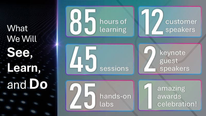
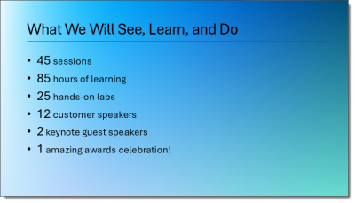
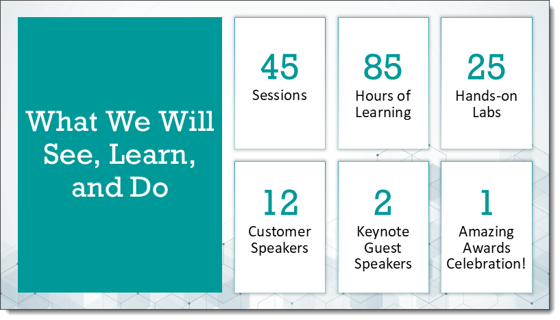
Learn, See, Do Slide Makeover (5)
We are showcasing the slide makeovers of the TLC Creative presentation design team. Everyone was given this slide, with the only design parameters of 30 minutes design time maximum – any color scheme, fonts, graphics and layout.
Client slide:
Amber’s slide makeover:
A Look Back at Slide Background Design with Text – and a New Background Text Idea!
We are looking back to February 2020 and the post entitled, “Use PowerPoint Text As Part of Background Design”. Click here to view the full 2020 post.

Looking back, I feel this was a pretty simplistic example of a slide design. I know it was inspired by a real client project (and like most of our design work, that project was under an NDA and not able to be directly shared). But I have a new project that incorporates text into the background that I feel is much more dynamic!
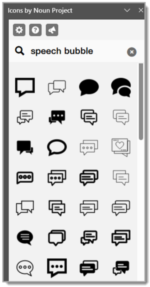
In this new slide design tutorial, we’ll use a speech bubble SVG from The Noun Project and transform it with shadows, bevels, AND a subtle logo texture as part of its background, all for a polished and presentation-ready design element. If you don’t have access to The Noun Project (highly recommended), you can replicate this slide using your own art.
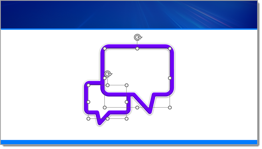
Step 1: Insert and Prepare the SVG
Start by downloading a speech bubble .SVG file from The Noun Project and inserting it onto your slide (I use the PowerPoint add-in, but you can also go to The Noun Project’s website).
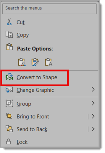
Once placed, right-click and choose Convert to Shape (if needed) so all the PowerPoint style options are available.

Step 2: Add a Drop Shadow
To give the icon a little depth, apply a drop shadow with these settings:
Size: 100%
Blur: 8.5 pt
Angle: 90°
Distance: 1 pt
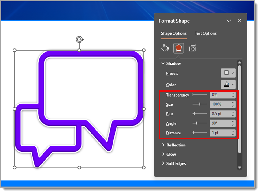
This creates a subtle, soft shadow that lifts the icon just enough off the background.
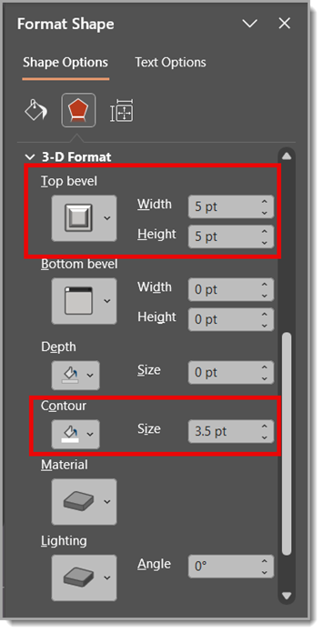
Step 3: Apply a Bevel and Contour
For extra dimension, use a Round Convex bevel:
Width: 5 pt
Height: 5 pt
Then, add a contour set to 3.5 pt. This gives the edges of the speech bubble a nice highlight and makes it feel more 3D.
Step 4: Fill the Speech Bubble with an Image
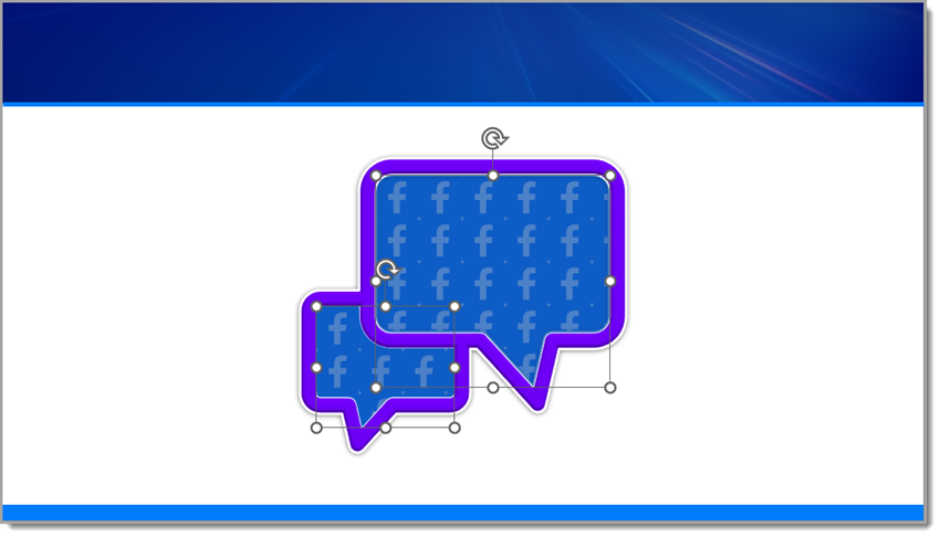
Next, fill the inner blank area of the speech bubble with an image of the Facebook logo:
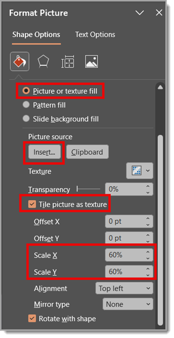
Go to Shape Fill > Picture or Texture Fill
Choose the Facebook logo image (this Facebook logo is also sourced from The Noun Project)
Check “Tile picture as texture”
Set Scale X and Scale Y to 5%
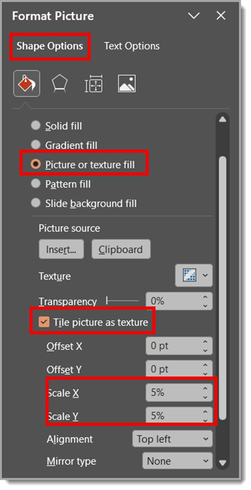
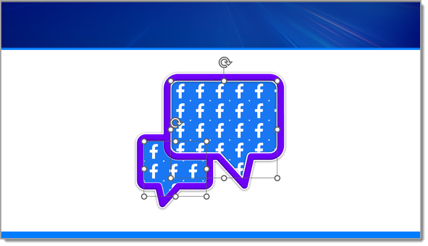
This creates a tiled pattern of the Facebook logo inside the bubble — a cool effect that works well for digital or social media-themed slides.
Step 5: Add a Soft Color Overlay
To blend the texture and unify the look, copy and paste the same inner shape directly on top. Then fill it with a solid color and set the transparency to 25%.
This soft overlay mutes the tiled pattern just enough while keeping the detail visible underneath, giving your speech bubble a professional, layered look.
Step 6: Add Text on Top
Now add a text box over the speech bubble and type something like: Add Facebook stat/callout here.
This is where you can highlight a key metric, social media insight, or fun engagement fact to make your design more informative and engaging.

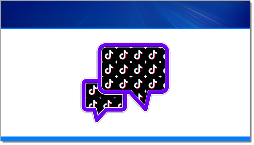
Now, Let’s Repeat the Same Steps Using a TikTok logo.
Repeat the same steps as before, but with one small edit (I sourced the TikTok logo from The Noun Project).
Back to Step 4: Fill the Inner Blank Area of the Speech Bubble with an Image of the TikTok Logo
Go to Shape Fill > Picture or Texture Fill
Choose the TikTok logo image
Check “Tile picture as texture”
Set Scale X and Scale Y to 5%
Note: You may need to adjust the Scale X and Y percentages depending on the size of the logo being used for the repeated texture.
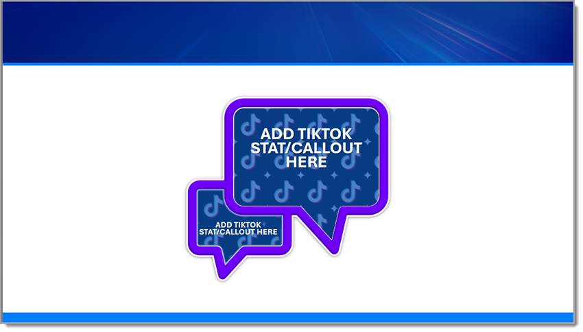
Final Result
The final result is a presentation-ready graphic because all of the design was completed directly in PowerPoint! Not only is the branded and dimensional speech bubble a standout slide element, it’s native to PowerPoint, so it can scale and be edited easily. It’s a great example of mixing vector shapes, styling effects, and rich surface detail – all directly in PowerPoint, no Photoshop required.
Want the final product for yourself? Download the editable TikTok PowerPoint slide HERE!
Hope you enjoyed these examples and design tutorial!
-Christie and the TLC Creative presentation design team
New Podcast Episode Available! “PowerPoint stories of horror – humor – and everything in between”
New episode of The Presentation Podcast now available!
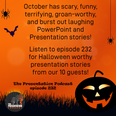
It is October, and Halloween, and scary things happen. For The Presentation Podcast, it is a perfect time to gather a group of presentation design experts and hear presentation stories that are funny, terrifying, or something that quote, “should not be done in PowerPoint”. Join Troy and Lori of TLC Creative Services as they talk with a group of our presentation colleagues. You get to hear amazing presentation stories that make us groan, shudder, or burst out laughing! Click play on your favorite podcast app, or at The Presentation Podcast site to hear presentation the Halloween haunts now!