A Look Back at How Much Easier Presenter View Is
Here’s a PowerPoint Tip: This is How You Quickly Turn Presenter View On or Off in Microsoft 365!
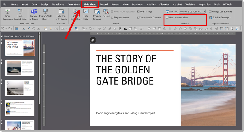
In the present day, the Office 365 version of PowerPoint makes managing Presenter View much easier, compared to older versions. No more digging through settings — it’s now right on the ribbon for quick access.
Here’s How to Find Presenter View
If you want find Presenter View:
1. Go to Slideshow
2. Then Monitors
3. Then click Show Presenter View
Then, you’ll see a simple checkbox to toggle Presenter View on or off.
This means whether you prefer the full Presenter View experience, or want to mirror exactly what your audience sees, you can switch modes in just one click — even right before presenting!
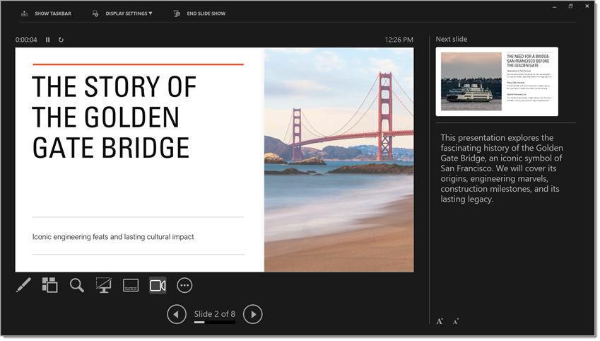
It may seem like small change, but trust us: it makes a big difference in keeping your presentations smooth and stress-free. When you’re about to give a presentation, the last thing you want to do is start rummaging through the settings to find just what you need, so we’re glad this issue has been resolved!
-Christie, TLC Creative Design Team
New Podcast Episode Available! “How Can You Master PowerPoint and Elevate Your Presentation Design Skills?”
New episode of The Presentation Podcast now available!
In this episode of The Presentation Podcast, hosts Troy Chollar, Nolan Haims, and Sandy Johnson explore where to learn PowerPoint and slide design. They discuss a wide range of resources, including online tutorials, webinars, training programs, professional organizations, books, webinars, conferences and communities. The overall takeaway, the importance of hands-on experience. The hosts also highlight key industry experts, and provide a robust list of options for mastering both the technical and creative aspects of presentation design.
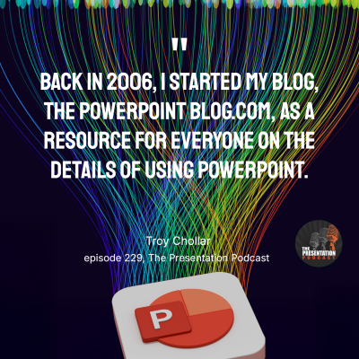
Listen on your favorite podcast app, or at The Presentation Podcast site at https://thepresentationpodcast.com
Mark Your Calendar – September 17 – The Better Deck Deck Webinar!
My good friend and co-host on The Presentation Podcast, Nolan Haims, is an in-demand presentation design trainer. This month, Nolan is (finally) offering his first open-to-the-public training! The Better Deck Deck: Designing Slides Without Bullet Points is September 17 at 11am PT / 2pm ET.

As the webinar title implies, this training is built on his highly successful Better Deck Deck that showcases 52 many ways to create slides without bullet points. There is a fee, but this is real presentation design training! Get webinar details at https://www.nolanhaimscreative.com/shop-collection/p/better-deck-deck-webinar.

Troy @ TLC
A Look Back to: Automatically Moving a Slide Forward After A Video Ends
It’s hard to believe it’s been almost nine years (9!) since we talked about this PowerPoint tip (the original post was published on March 11, 2016). Back then, embedded video was not as common as it is today. While some things have changed, this little trick still holds up so well!
So, let’s revisit this tip!
The Magic Auto Advance Shortcut
Using PowerPoint’s auto advance transition feature is pretty straightforward… but trying to calculate the exact duration of a video just to time a transition? That part can be exhausting.
Fortunately, there’s good news: you don’t actually need to know how long your video is! Why? Because PowerPoint will not auto-advance a slide mid-video – even if your timing says it should.
Is that good or bad? That depends on the desired action you want PowerPoint to do. Because the TLC Creative presentation design team has been at this for a long (long) time – we expect PowerPoint, and auto advance slide transition to work this way, so we exploit it in our slide design.
Basically, when an embedded video plays, PowerPoint patiently waits until the video finishes playing before doing an auto slide transition, if it has been set to auto transition. Of course, if an earlier slide transition is needed, your best option is to trim the video (eg. make it shorter) or advance the slide manually.
The 2-second Auto-Advance
Here’s how it works:
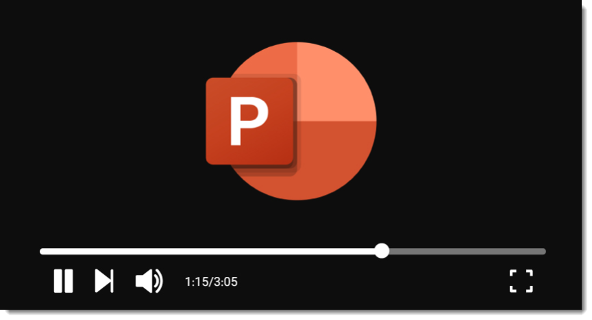
In our example, we want slide 1, which has the embedded video, to automatically advance to slide 2 once the video ends.
Set the slide 1 transition to auto advance after 2 seconds. This assumes the video is the only animation on the slide and set to start automatically.
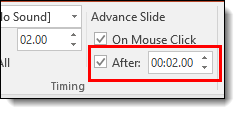
PowerPoint will go to slide 1, play the full video, ignore the auto advance at 2 seconds setting, complete the video playback, then automatically advance to slide 2!
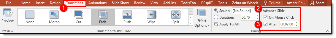
No need to match video duration and slide auto advance duration perfectly. This built-in behavior makes a simple and reliable way to create a smooth transition to the next slide that feels professional, vs. sitting on the last frozen frame until the presenter clicks to advance.
Want to see it in action? Here’s a quick video demonstrating how this setup works (still a great video – and slide setup, from our work in 2016!):
Still one of our favorite PowerPoint “tricks,” even years later.
– Troy and the TLC Creative Design Team
Add a Smart Phone Demo Video to a Slide
Want to make your presentation pop by showcasing a video inside a realistic iPhone frame? Whether you’re creating a product demo, UI walkthrough, or simply want a sleek modern look, this step-by-step guide will walk you through how to insert a video into PowerPoint, crop it, modify it to rounded corners (yes, video containers can have rounded corners!) – all while fitting seamlessly into a PNG or SVG image of an iPhone.
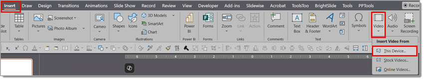
Step 1: Insert Your Video
- Go to the slide where you want the video.
- On the Insert tab, click Video → choose This Device (note, for some of the styling options being applied, it must be an embedded video, not a web-based video).
- Browse and insert your desired video file.
Step 2: Change Video Playback Settings to Set the Video to Play Automatically
- By default, when you insert a video in PowerPoint, it’s set to play “On Click” as part of the animation timeline.
- NOTE: Because this video is going to be underneath the iPhone image, it will not be manually clickable meaning you can’t “mouse over” the video to click it to play or pause. You can leave the animation setting to “On Click” but for our example we want the video to play automatically when the slide hits the screen.
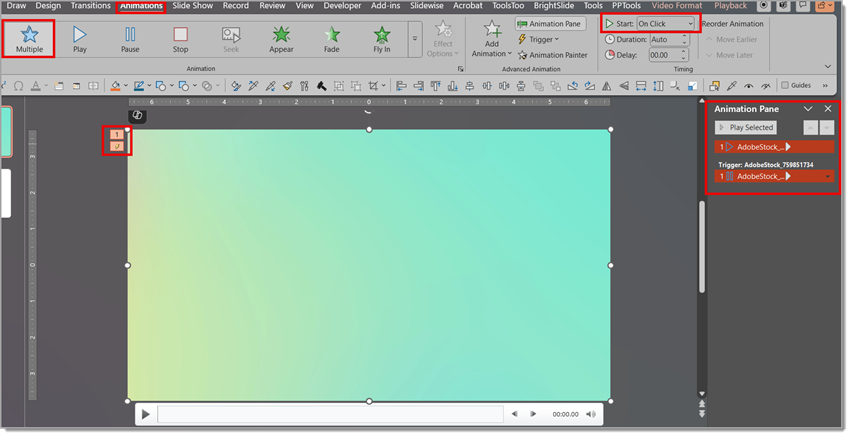
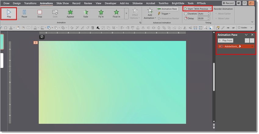
Click on the video to select it.
1. Go to the Animation tab on the ribbon.
2. Change to “Play” vs “Multiple”.
3. Look for the Start dropdown.
4. Change it from “On Click” to “With Previous.”.
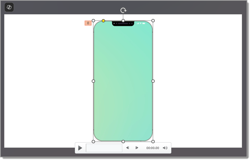
Now your video will begin playing as soon as the slide appears in Slide Show mode—no click required! For our example here, the video we chose is 1920×1080 (the teal gradation you see below).
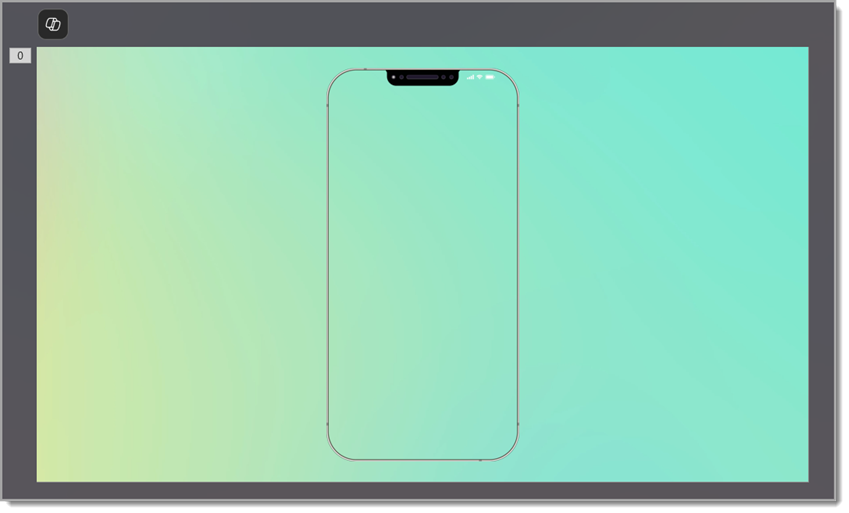
Step 3: Layer the Video Behind an iPhone PNG Image
Now, let’s place a phone on top of the video:
1. Source an image of a realistic phone (ideally a PNG with a transparent screen area showing just the phone “frame”) or edit your image to remove the background and the screen area of the phone.
2. Insert your phone image onto the slide.
3. Resize and position it as needed.
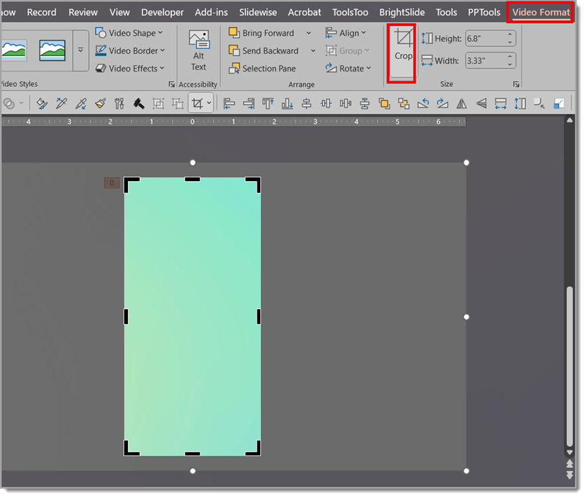
Step 4: Crop the Video to Align to the Phone Screen
To fit the video inside the vertical screen area of a phone (typically portrait aspect ratio), you’ll need to crop the video. You can do it like so:
1. Select the video and resize the video as needed to fit the phone (for our example, we’ve chosen a simple gradient with no content, so resizing isn’t critical).
2. With the video selected, in the Video Format tab, click Crop.
3. Use the black cropping handles to trim the edges and create a portrait orientation, aligning the edge of the video just inside the edge of the phone.
4. Click Crop again to apply changes.
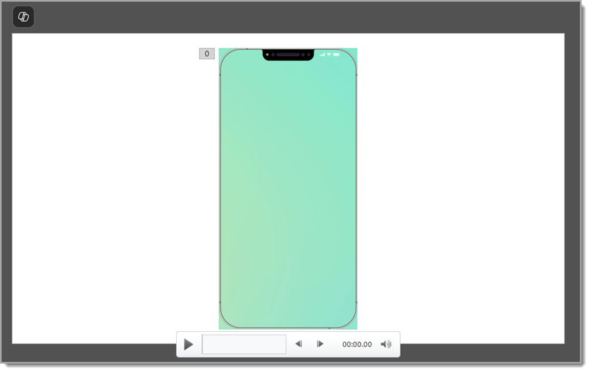
Step 5: Add Rounded Corners
Our video now fits nicely inside the phone but you can see the corners. The good news is that videos in PowerPoint can be changed to any (yes any!) of the PowerPoint shapes. For this slide, we need rounded corners, which is an easy customization to the video. Believe it or not, PowerPoint is easier for this than video editing apps!
1. Select the video.
2. Go to Video Format → Video Shape → Choose the Rounded Rectangle shape.
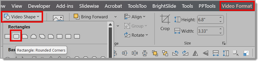
3. Now use the yellow shape modifier (dot) to adjust the rounded corners to match the iPhone image’s rounded corners
- TIP: zoom in on the slide for better control of the rounded corner adjustment.
With just a few clicks, you’ve created a high-end, device-framed video display — no video editing software required. Perfect for UI demos, mobile app presentations, or just leveling up your PowerPoint visuals.
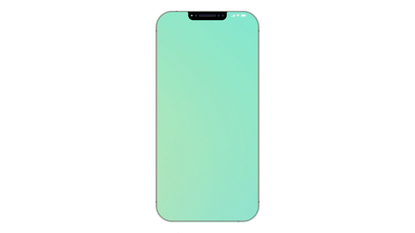
Let your slides scroll like a screen — and wow your audience!
-The TLC Creative design team
Add Live Camera to Slides

Make your PowerPoint presentations more dynamic and engaging by using a great PowerPoint feature to add a live camera feed directly onto your slide. Whether you’re hosting a virtual meeting, presenting at a live event, or recording a tutorial, showing your face in real time can help you connect with your viewers and make the message much more personal.
Cameo
Cameo is a feature that was added to PowerPoint in 2022 and provides many design options. For your slide layout and design, keep in mind exactly where on the slide (or slides) the live camera will appear. Make sure it does not cover any elements or distract from the slide content itself. This is definitely something to test before presenting, not only to confirm the slide layouts work, but also that animations and transitions work – and, of course, the technical connection of the camera to PowerPoint works.
Add a Cameo Live Camera to a PowerPoint Slide
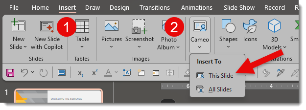
To add a live camera feed, we will be using the Cameo feature.
- Go to Insert > Cameo
- In the dropdown menu, there are two options – place a Cameo on “This Slide” or “All Slides.” Select the option needed.
- TIP: The live camera object that will be added can be adjusted or deleted from any slide, so “All Slides” is often the easiest workflow.
Once selected, a placeholder for your camera feed will appear on the slide, as seen in the example below. By default, PowerPoint adds the placeholder in the lower right corner as a circle shape.
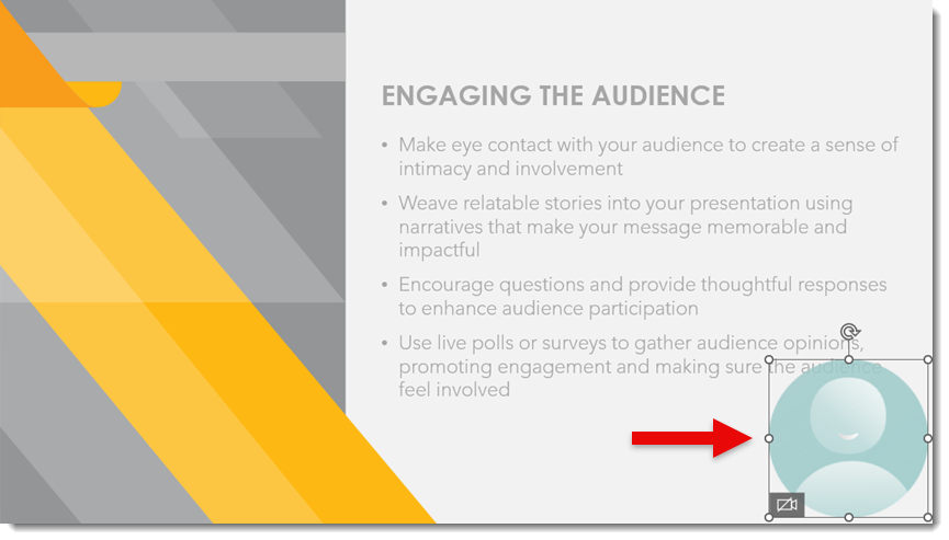
Preview the Live Camera
To preview how a live camera will look:
- Click the placeholder
- Click the camera icon
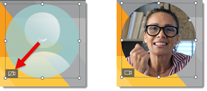
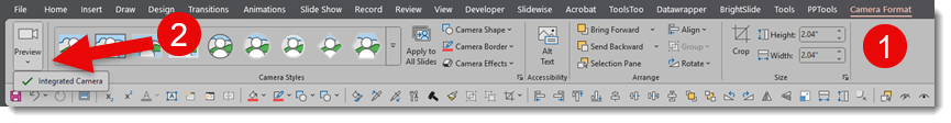
- Use the “Camera Format” tab to choose your desired camera
- TIP: The camera you are using can be changed at any time – a common workflow is to test simply with your laptop’s built-in camera and then change to an external camera when you are setting up for the actual presentation (an external camera is usually of better quality)
Modify the Cameo Live Camera Object
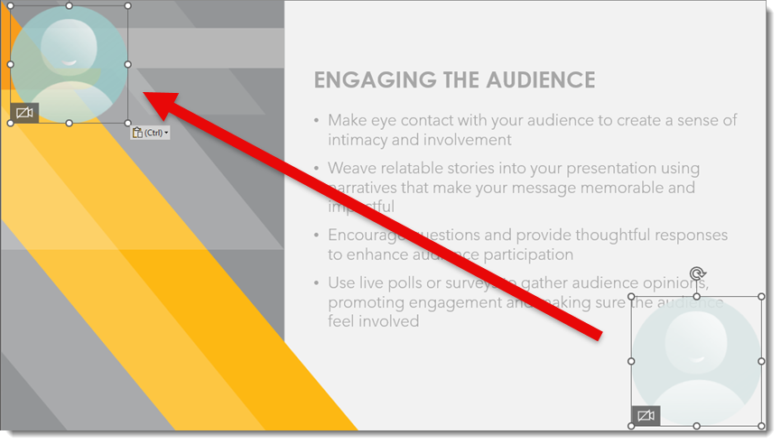
What is exciting is that the camera object can be modified like any PowerPoint shape. Moving, resizing, and changing shape are all options.
- Select the cameo placeholder
- Move and resize to fit the slide layout. For our example slide, we are moving the live camera to the upper left and downsizing it a little.
In addition to moving and resizing, you can add styles, shapes, borders, and other effects to the video feed. Go to the “Camera Format” tab to add an outline, change shape, add a drop shadow, or soft edge. Be creative!

Presenting
When going to Slide Show mode, the live camera will turn on automatically, and the live feed will be visible during your presentation.
A Few Tips Before You Go Live
1. Always test before presenting – that means making sure your webcam or other camera is working and positioned properly.
2. Use lighting! Good lighting can dramatically improve how you appear on camera.
3. Limit the distractions. Before going, live consider turning off any video effects or anything in the background that might distract from your message.
4. Smile!!
Conclusion:
Adding a live camera feed to your slides is possible – all using native PowerPoint features! There are technical considerations, yet in the right environment, this adds a nice visual touch and can be a fantastic storytelling tool.
-The TLC Creative Design Team
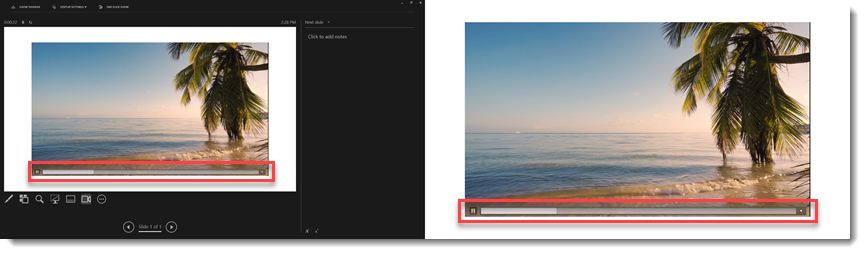
A Look Back at What Has Not Changed – The PowerPoint Slideshow Video Playback Bar
Nine years ago in 2016, we made a PowerPoint Blog post about Microsoft PowerPoint’s video playback media bar. Back then, the playback bar could be seen in slide edit view when selecting a video. It provided all the standard video controls; click to any point, scrub, pause, volume control, and the ability to see the time code.
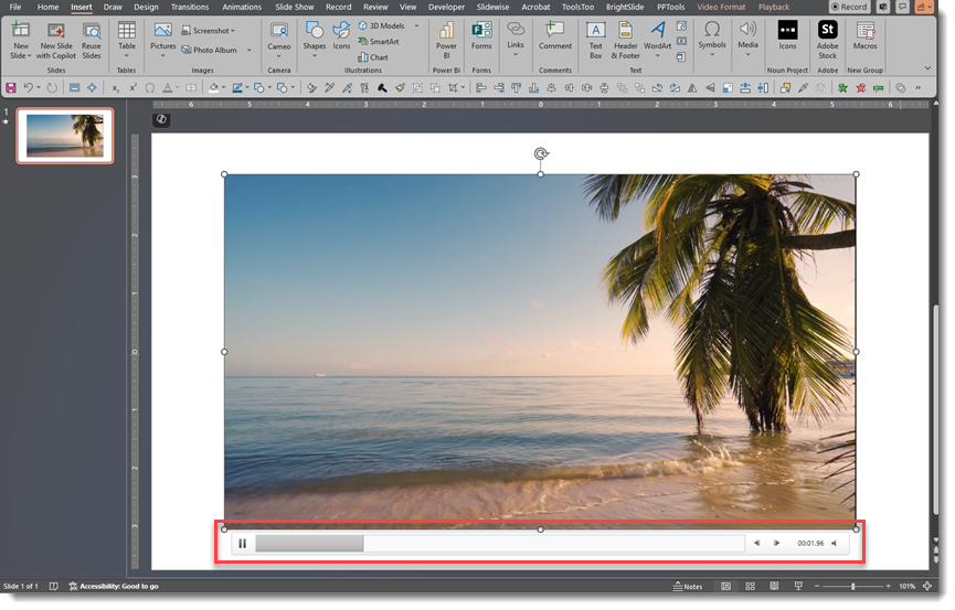
When in slideshow mode, the media bar would be activated by any mouse movement over the video, and its functions were then seen while presenting, displaying on the slide while in slideshow mode. However, once the mouse was moved off the video in slideshow mode, the bar would disappear.
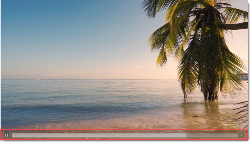
There were a few differences between the edit view experience and the slideshow experience. The most visible was the position of the media bar. It is below the video in edit view and overlaid on the video during slideshow. However, in slideshow mode, there are fewer control options (no fast forward or rewind buttons, and no time code is displayed).
One important note was that if you were presenting with Presenter View, the media bar was activated when the mouse moved over the video either on the slide OR in the Presenter View window.
Now nine years later, there have been no real changes, updates, or improvements to the video playback bar – and no changes to the media interactions and information in PowerPoint!
Here is our wish list for the Video Playback Bar (hey Microsoft PowerPoint Dev Team, are you listening?) in the form of a mockup of what we are dreaming about.
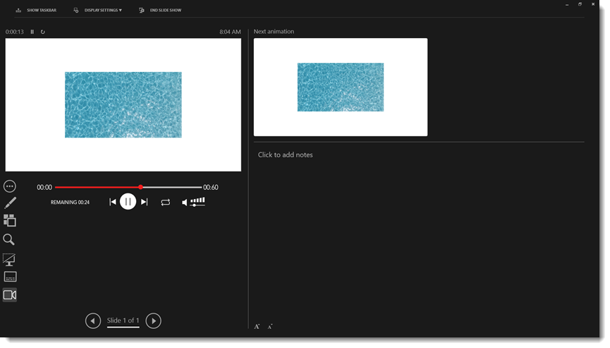
- First, while we realize this is not related to media control it’s something we strongly believe is sorely needed so we want to continue bringing this request to the top of the conversation – PowerPoint needs to support alpha channel video (eg. transparency), please!
- And when the media controls to play, pause, stop, rewind, and mute show up on the slideshow screen when triggered in Presenter View, we should have the ability to hide them from the slideshow screen (because we do not want the audience to see those controls)
- Make large, easy-to-use informative media controls in Presenter View (see above UI mockup)
- A live countdown showing duration until the video is complete
- Scrubbable timeline
- Duration of video displayed
- Pause, reset to the beginning, jump to end, loop, volume control
- The Loop icon would be color-coded to indicate if the video has any type of loop applied, and can be dynamically turned on/off by clicking the icon
- Finally, a user-selectable option for “no media controls on the slide if presenting with Presenter View” (because the media controls will be available on the Presenter View window now).
If anyone on the Microsoft PowerPoint Dev Team is reading this, thank you! Here’s hoping we’ll see improvements to PowerPoint’s video playback bar in the future. For everyone reading this post, I hope this is helpful information.
-Troy and the TLC Creative Design Team