Set An Angle In PowerPoint
As everyone that has worked in PowerPoint knows, matching rotated items to the same angle can be a challenge. This is especially true when using the rotation handle (the click and drag method). To take the frustration out of this task, let us walk you through manually setting the angle and easily getting multiple items exactly aligned with the same rotation!
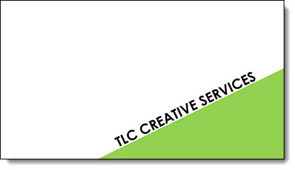
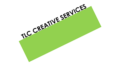
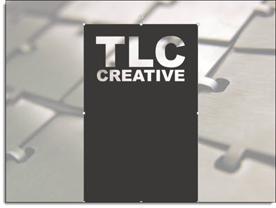
Here is our sample slide being created. It has a green rectangle (not a triangle, so we can know the exact angle), and a text box matched to the same rotation as the green rectangle.
1. First add a rectangle.

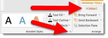
2. Next, bring up the Format Options Dialogue Box either by going to Format tab on the tool bar or by right clicking the shape.
– Select SIZE AND POSITION from the right-click pop up menu.
– The Format Shape pane opens to Size and Properties tab.
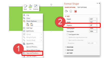
3. In the SIZE section is the ROTATION box.
4. Enter any angle needed (this has a live update, so you can see the angle applied to selected item). For this sample, we used -26 degrees.

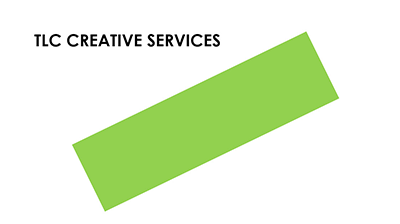
5. Add a text box and type (we added TLC CREATIVE SERVICES).
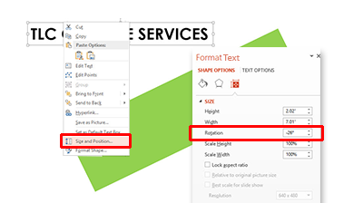
6. With the text selected, we followed the same steps above to rotate the text. Using the Format tab on the tool bar, or by right clicking the text, bring up the Format Options Dialogue Box.
– Select SIZE AND POSITION from the right-click pop up menu.
– In the ROTATION box, enter the angle as the rectangle (-26 degrees in our sample).
7. Position the angled text box above the rectangle.
8. Select both the rectangle and text box and move to the lower right of the slide for a great visual layout using perfectly aligned and angled elements for your design!
– Troy @ TLC
Design Idea – Group Text Into A Visual Layout
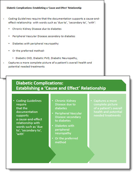
Slide design is usually thought of as making the content professional and visual – which it is. It is also about understanding the message and purpose of the presentation and each slide – something TLC Creative Services enjoys working with clients to uncover. For this slide from a recent project our design team developed a new layout that grouped the paragraphs of text into information chunks, and created a visual styling that coordinates with the clients overall visual branding.
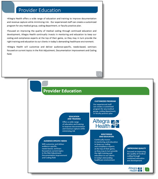
This slide is a handout provided to everyone in the training, so large font size was not a primary need. The ability to identify sections of text within the 3 paragraphs was important for the group discussion. Working with the client we identified 5 topics and added subheads to each, then the full text from the provided paragraph. The end result is a slide that would not be ideal if just presented on a screen (too much small text), but a slide that works as a handout and aids the trainers group discussion.
– Troy @ TLC
Design Idea – Image Fill Text (Part 2)
As a continuation of the previous post, we are looking at some of the advanced image sizing and placement options for Image Fill Text. Thanks to TLC staff designer, Christie, for this step-by-step tutorial and examples.
We are working from the same sample text.
1. Select the text to add an image fill too.
2. Open the FORMAT SHAPE pane to the text options.
– How to…
3. Select TEXTURE OR PICTURE FILL.
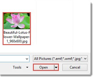
4. Click FILE.
5. Select an image. For this example, I am using a nice flower image that has lots of vibrant colors.
6. The auto fill position and size do not really do much for the overall visual.
7. Select TILE PICTURE AS TEXTURE. This will allow access to additional formatting options.
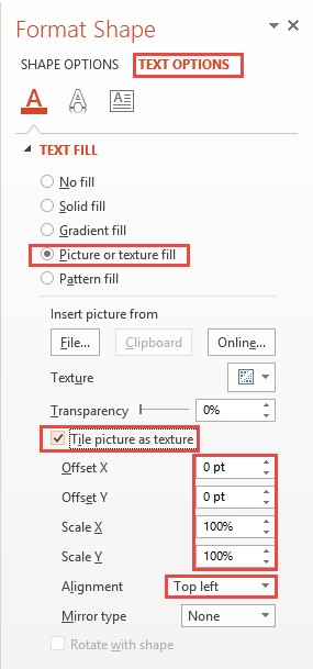
8. Adjust the OFFSET (X and Y), SCALE (X and Y) and ALIGNMENT options to size and position the image for the best visual.
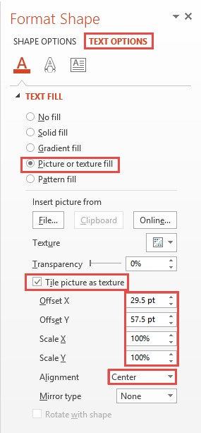
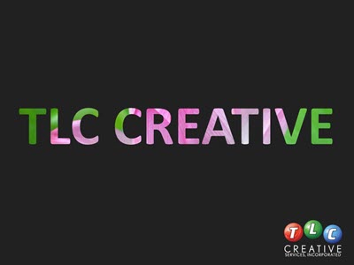
8. Now the image fill adds a lot of the pink tones and a bit of the green on the edges.
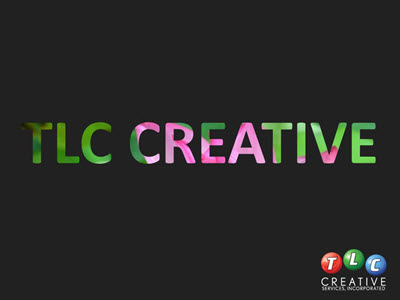
Design Idea – Image Fill Text (Part 1)
The previous post walked through how to “knock out” text from a shape. One negative to that technique is the text is no longer editable. In this post, we are adding a visual styling to text AND keeping it editable. All text can have a color fill, gradient fill, texture fill or PHOTO/IMAGE fill.
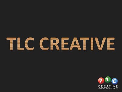
Here is my sample text slide, one a black background to help the fill options display.
1. Select the text to fill (*Tip: It does not have to be all of the text in a text box, select just the text you want – this can be a great solution for adding accent focus on specific text).
2. Go to FORMAT >> WORDART STYLES section >> FORMAT TEXT EFFECTS to open the FORMAT SHAPE pane to the text formatting tab.
3a. Select PICTURE OR TEXTURE FILL.
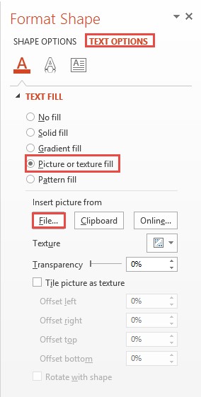
3b. This defaults to filling text with the first texture in the Microsoft library.
4. Click FILE.
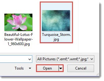
5. Select an image to use as the fill – I am using an abstract image.
And here is the stylized text, which is editable (change the font, size, text, etc.) and can have any PowerPoint styling options applied (drop shadow, bevel, glow, etc.).

– Troy @ TLC
Slide Design Idea – Negative Space Text
A very nice design strategy used in print design is creating callouts and bold graphics with text created from the negative space.
This same style is easily created within PowerPoint for slide design. The above example image was created in PowerPoint 2013 – here is how (thanks to Michelle on the TLC Creative design team for this tutorial).
By using PowerPoint Combine Shapes tools (Combine, Intersect, Fragment, Subtract), the process is pretty easy.
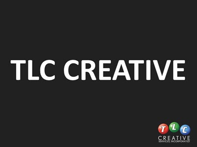
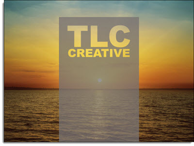
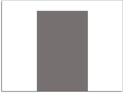
1. Add a shape of your choice – I am using a tall vertical bar.
2. Add a separate text box with the text of your choice and format as desired – I am using “TLC Creative” in a typography styled stacked layout.
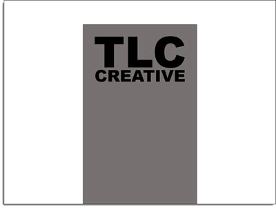
3. Select both objects – Note: Select the RECTANGLE first.
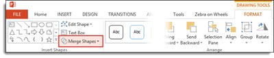
4. With both objects selected, go to FORMAT >> Merge Shapes >> Combine
5. The text is “cut out” of the rectangle. Note: The text is no longer editable as it has been converted to a custom vector shape.
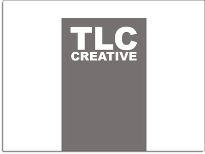
6. The shape is editable, like any other shape. All shaping styling options are available: fill color, gradient fill, transparency, bevel, drop shadow and more.
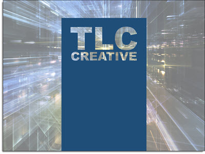
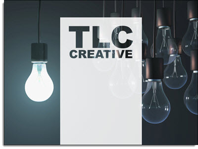
To really see the effects, place an image behind the new shape. A few examples:
Diabetes Before-and-After Slide
Continuing this month’s theme of Slide Design ideas, this is a before-and-after slide from a project we completed.
The before is a common slide: title and bullet list as provided by Microsoft’s default template. Our design team reviewed the presentation message and made the recommendation that this list be converted into a 3 column visual layout. The idea is to help the audience group the content to be able to quickly identify the message and focus on the presenter. Ideally, we would like to help the audience further by reducing the amount of text on slide, but for this one the request was to maintain the provided content. The end result, even with the same amount of content, is a much more lively slide designed for the audience.
– Troy @ TLC
TLC Top 10
[iframe src=”https://www.screencast.com/users/TLCCreative/folders/PPT Blog Videos/media/abc74bfa-5c1d-4b66-9dcf-9664255e61e7/embed” width=”100%” height=”360px”]