New Podcast Episode Available! Episode 216, “Does the Storytelling Animation design trend apply to us in the presentation design space?”
New episode of The Presentation Podcast now available!
“Does the Storytelling Animation design trend apply to us in the presentation design space?” In the latest episode of The Presentation Podcast, Troy, Sandy, Nolan, and Lori delve into the evolving role of animation in presentation design – particularly within PowerPoint. They explore how storytelling animation is becoming a significant trend in many aspects of graphic design and discuss how animation can be effectively incorporated into presentations to support the message. Listen on your favorite podcast app, or at The Presentation Podcast site here.
PowerPoint Animation Using Image Crop
Previously we discussed how to cover sections of an image to achieve animation as different sections in this post from February 12th. The issue that we learned was that by covering the sections with white boxes, that this would be more difficult to see while reviewing in slide sorter. The solution was to animate the images as separate elements. But how did we crop the image into 3 sections? Let’s review how.
Insert the Image:
- Click on the “Insert” tab in the ribbon.
- Choose “Pictures” or “Online Pictures” to insert an image from your computer or from the web.
- Select the image and click “Insert”.

Once we have the original image, now we can split it into 3 sections.
Duplicate:
We now need to duplicate the image 2 more times. This will come in handy to have 3 images in the same position so the cropping sections will look seamless. There are a few ways to duplicate the easiest is selecting the image and PC: ctrl + c then ctrl v Mac: cmd + c > cmd + v.
Let’s crop the first image then we will duplicate this process for the other 2 shapes. Here is a trick to map out the sections on how we are going to crop them.
- Create a shape that’s the same height as the image

- Next is duplicate the shape 2 more times.
- Align the 3rd shape the right of the image > then used “Distribute Horizontally” in the ribbon tool, to evenly space out the 3 shapes equally across the image.

Now we have a clear guide on where to crop each section.
Crop:
- Click on the first image to select it.
- Go to the “Picture Format” tab that appears when the image is selected.
- In the “Size” group, click on “Crop”.
- Position your mouse over the cropping handles
(the black squares around the image).
- Drag the cropping handles inward to crop the image to the first section you want. You can adjust the cropping by dragging the handles until you’re satisfied with the section.
- Click outside the image to apply the crop.

Repeat for the Other Images:
- Click on the second image to select it.
- Follow the same steps to crop it into the 2nd and 3rd section you want.
- Remove the 3 orange shapes as those are no longer needed as guides.

Now we have 3 sections of the one image that we can animate individually

Christie @ TLC
FREE Valentine’s Day PowerPoint Template – A Look Back to February 2016
It’s Valentine’s Day today! And it’s also Friday, which means it’s time for another Look Back post.
This week, we’re looking back at free template we developed for Valentine’s Day a full nine(!) years ago. Everyone at TLC Creative Services wants you to have a wonderful Valentine’s Day this weekend! For your valentine (class, office announcements, etc.), here is a professional, full featured PowerPoint template to download and use – for Free!
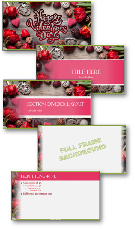
Download with this link: Valentines_2016 (1.8MB)
This is from our Look Back series, rediscovering previous blog posts with relevant PowerPoint tips, tricks and examples. The original post from February 8th, 2016 can be viewed here.
PowerPoint Animation and “Breaking” a Table
PowerPoint unfortunately does not have the capability to animated individual cells, rows or columns of tables. PowerPoint offers the ability to animate a table as a whole unit. Let’s talk about a workaround to overcome this limitation. By using the Microsoft PowerPoint BrightSlide add-in (which is free and has Windows and Mac versions!) several table formatting options become available to us, specifically the ability to break apart table cells – which we can use to achieve animation needs!
First, select the table.

Right-click on the table and go to table > BrightSlide > Split Table > Split into Rows.

For this sample table, this instantly creates 4 separate tables – one for each row! Note: I have spaced them apart for this demo.

Because PowerPoint can only animate an entire table, we now have 4 tables, which can easily be animated! As example, this table now animates in one row at time, each row on click (yay!)

As a second option, going back to our original table, we can split it by columns in a few clicks. Right-click the table > BrightSlide > Split Table > and now select “Split into Columns”.

Done – 5 separate tables, one for each column!

Apply PowerPoint animations as needed; entrance, exit, emphasis. Here I have set the table to build left-to-right automatically.

And now is where things get good! Going back to our original table, right-click > BrightSlide > Split Table > Split into Cells.

20 individual tables are created instantly!

The option to animate each cell is available, as I have done in this example. BUT, if you just need to animate on a few areas of a table, use this to create the individual cells needed for the animation (works great with Morph!). The options available are limitless now.

TIP: BrightSlide also has fantastic options to “put a table back together’. The two options are “Merge as Columns” or “Merge as Rows”. We want to make a single column, select “Merge as Rows” and it will give you 4 rows in a single column.


Continue with the same steps for the other columns, then select both, and click “Merge as Columns” to place the table back together.

BONUS TIP: Duplicate that original the table, and turn it off in selection pane to always have a secret version of the original table available for any future needs.
Troy @ TLC
Adobe Express – Part 3
This Jake at TLC Creative, and I am continuing our series on the new Adobe Express. I am focusing on the collaboration features, tutorials and some other fun design tools within the free to access and use, Adobe Express.
INVITE
One of the biggest features of Adobe Express is the ability for a team or group to collaborate on a project. You can invite others to work with you by sharing single files, projects or brands, by using the main navigation bar at the top and clicking INVITE:
![]()
There’s also another way to do this and that’s to click “Share” to share the file(s) within the editor, which allows you to add people or groups to it:

Note that “Share” and “Invite” are pretty much used interchangeably within Adobe Express. The only requirement is everyone must have an Adobe account (free or CC subscription).
SHARE
Along with inviting/sharing files and collaborating with others, the share feature also allows you to create and then upload posts to your social media accounts, all from Adobe Express. You would click “Share”, the same button used to invite others to collaborate, and then click on the “Share to Social” button. You can connect your accounts from Facebook, Instagram, Twitter (X), LinkedIn, Pinterest and TikTok. You can also add a caption or even generate a caption with AI. From there you can choose to publish immediately or schedule for the future.

LEARN
If you’re new to Adobe Express or looking to become well versed in it, the LEARN section is your best friend. Also located in the top toolbar (as a lightbulb icon) it has an extensive collection of tutorials. Each tutorial comes with examples that show the tools in action, making it easier to grasp how to use them.

CHARTS
For those working with data visualization, Adobe Express includes a CHARTS feature. You can build charts and tables directly within the platform and export them as images (JPEG, PNG), PDFs or Videos with animations.
Of course, while Adobe Express offers these features, it’s worth noting that PowerPoint remains a much more robust tool for creating detailed charts and tables. One area Adobe can improve on is the ability to export chart videos with transparent backgrounds or in alpha format, as PowerPoint currently doesn’t have this feature either (exported charts from Adobe Express are on a solid color, white in this example). This would give even more flexibility in how animated charts are used within presentations.
THE CATCH
Like any other tool, Adobe Express has its pros and cons. One thing to keep in mind is that several add-ons are pay-to-use, such as the “Video Effects Pro” add-on, which requires its own subscription for the full version. Also, there are limits on the number of Firefly AI-generated content pieces you can create unless you upgrade to a premium plan. Additionally, while there is a free version, accessing some advanced features requires a subscription.

Firefly itself can actually be accessed via its own website at https://firefly.adobe.com/, “Photos” within the media section are powered by Adobe Stock (which of course also can be accessed via its own website), Remove Background as well as other effects are powered by Photoshop which can also be used in its native application. It’s no surprise that Adobe Express leverages all of the power and features across its Creative Cloud applications. However, some add-ons are free and require no Premium subscriptions, it’s best to explore within the “Add-ons” tab.
GENERATE TEXT
Remember the fun yet now outdated WordArt from early 2000s Microsoft Word? Adobe Express has its own version called Generate Text that actually utilizes generative AI. Of course, we had to experiment with this feature to see it in action:
Create:

Result:

I will continue to experiment with Adobe Express features (I am looking at the plugins options next), and hope this small series on Adobe Express has provided some insights and inspiration.
-Jake @ TLC
Why Are The Shadows Not Animating? – A Look back to April 2012
This is another PowerPoint how-to that was originally posted over a decade ago! You can jump back to 2012 with PowerPoint animation how-to tip. Today we see the same animation error in presentations, so this qualifies as a past, but still relevant blog post! As an addition, Amber on the TLC Creative design team, updated the PowerPoint app screen captures, from the original post, to show the current icons, and added a nice, animated gif showing the animation issue created when applying text animation to the shape and not the actual text.
Have you run into the issue of during the slide show an animated bullet list of text has the text shadow visible and then the full text animates on top of the shadow? It is a scenario that started with PPT 2007. The good news is, it is not a bug in the program and it is easy to “fix.”
Scenario
You have shadow effects on your text and a great on-click animation.

But when you view as a slide show, the shadow of the text is there before the animation! Click and the text animates on as expected – but how come the shadow was not part of the animation?

To Fix
1. Select the text box.
2. Go to FORMAT >> SHAPE EFFECTS >> SHADOW and change the selection to NO SHADOW.

3. With the text box still selected, go to FORMAT >> TEXT EFFECTS >> SHADOW and choose the shadow style needed.

4. Now when you run as a slideshow everything appears when animated!
Why
PowerPoint has always had two types of shadows: Shape and Text shadows. Way back in PPT 2003, there was really no visual difference between them (at the code level, the two shadow types were different, but when animating they just worked). Starting with PPT 2007, the difference between the two shadows types made a difference in how things are displayed. The non-animating text shadow is a most common way this shows up. Because it is a text animation, the shape shadow (even though it looks like text, if the shadow styling is applied as a Shape effect, it is a shape) has no animation applied to it.
– Troy @ TLC
This is from our Look Back series rediscovering previous blog posts with relevant PowerPoint Tips, Tricks and Examples. Original April 2, 2012 blog post here.
New Podcast Episode Available! “Dollars and Designs: Essential Financial & Business Tips for Presentation Designers”
New episode of The Presentation Podcast now available!
Episode 215 of The Presentation Podcast has the hosts, Troy Chollar, Nolan Haims, Sandra Johnson, and Lori Chollar delve into the financial side of running a presentation design business. This episode is a treasure trove of insights on managing finances, from invoicing and insurance to business structure and studio operations. Listen on your favorite podcast app, or at The Presentation Podcast site here.