
It Must Be The Water
So the secret to Microsoft’s success is in the water!
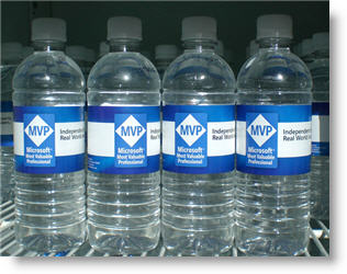
One of the benefits of working at Microsoft, or being an invited guest, is that beverages are free. For the week of the MVP Summit there was a special blend of water on hand.
– Troy @ TLC
Listening to Bill Gates
Last week was the Microsoft MVP Summit – a great time! Even more impressive was that Bill Gates himself gave a live keynote address – A definite sign that I am in good company. Hear is a photo of Mr. Gates opening statements, this would be after the ‘please no photography or video taping’ announcement (notice the hundreds of cameras being held up – mine included!).

– Troy @ TLC
PowerPoint Contest (with Guy Kawasaki)
Slideshare, a new PowerPoint website that looks to me like youtube for PowerPoint, has announced a competition. What makes it interesting is that Guy Kawasaki will be judging.

Here is the announcement I found at The Techsplodder. But interestingly, the press release they show is dated March 19, 2007 – but today is the 18th! Click here to go to the slideshare.net website.
– Troy @ TLC
I’M IN !!!!!!!!!!!!!!!!!!!!!!!!!!
It has been a great week spent as a guest at Microsoft.

It has been a painful week – due to some almost unbelievable occurances I have been locked out of the blog and unable to access it. After spending the afternoon armed with lots of notes and suggestions, and working way outside my realm of expertise (ie. PHP administration) I have successfully hacked my own blog database and given myself access once again!
Stay tuned for some delayed photos and highlights from this past week at the Microsoft MVP Summit.
– Troy @ TLC
Align, Equal Size and Balance
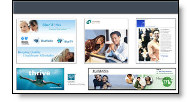
On this slide the elements where nice high-resolution images. But they blend together and do not have a strong sense of balance.

The presentation I was working on involved converting all to a 16×9, widescreen, format. Having the extra space was great for this slide, allowing me to keep the images large. From a design perspective each had a black stroke applied to keep it from blending into the background, they were made equal size with the other elements on its row, the left and right elements were aligned with one another and all were equally distributed (horizontally). The overall goal was to help the images stand out as individual elements and be presented in a visually balanced layout – here is the slide developed:
– Troy @ TLC
Oh ,The Colors
It is often beneficial to color code the data. But sometimes to much color makes things difficult to interpret and ends up looking like the circus has arrived. Here is a great diagram that provides a lot of vital information – it just gets lost in all of the colors and shapes.
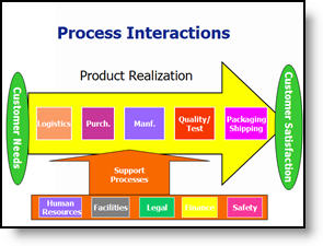
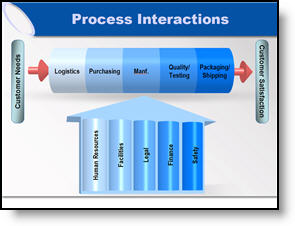
My goal was to minimize the distracting colors, make the diagram fit within the slide and emphasis the relation and process. Here is the revised diagram:
– Troy @ TLC
Great Graphic – For an Engineer
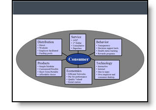
Here is the original graphic provided. It has all the needed information, is nicely balanced, has good contrast – and has all the factors an engineer would appreciate.
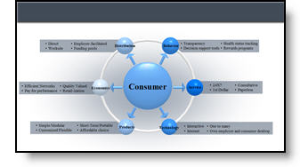
Taking the same content, basic layout, and even color scheme, here the revised version of the diagram developed for the (16×9, widescreen) presentation.
– Troy @ TLC