
Accurate Graphic, But Wrong Emphasis
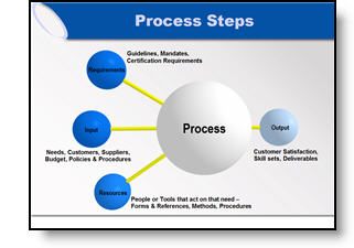
Here the original graphic from a presentation. It is a universal company-wide depiction of their process. No problem, I initially recreated the graphic using the 3D spheres for a more professional look.
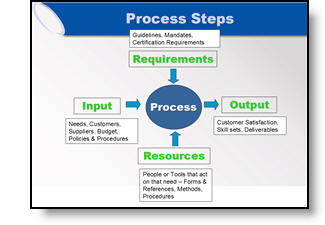
But listening to the presenter during rehearsals he was discussing how three elements drive the final element (output). We adjusted the graphic for this presentation to be in line with the message being discussed.
– Troy @ TLC
Show It A Story
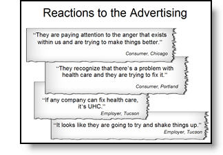
Lots of presentations show quotations. Here is the original slide with a lot of quotes – each animates on with a click.
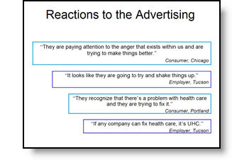
To put the quotes in a visual environment a series of ‘torn paper’ graphics where designed, font sizing and line spacing were also adjusted.
– Troy @ TLC
Tell the Right Story
Here is the graphic from an original slide.
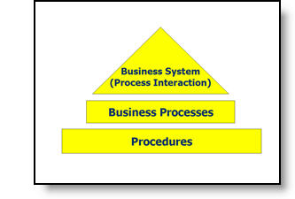
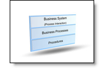
After discussing with the presenter, the message was not really about a hierarchy, but that all three processes where controlled by one business unit. Here is the revised graphic that was more aesthetic, cooridinated with the presentation color scheme, and showed a more accurate story.
– Troy @ TLC
Access to PowerPoint
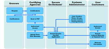
After I have interpretted what the data is saying (relative to content of industry and presentation), the need is to often recreate in a PowerPoint-friendly format. Here is the original provided, an MS Access piece.
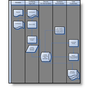
To make a clearer, easier to read, symmetrical and more aesthetic graphic here the same data recreated using semi-transparent autoshapes, color coordinated arrows and a layout that was as large as the template permitted.
– Troy @ TLC
Knowledge Does Not Equal Design
I had a recent conversation while updating a series of presentations that I found very insightful. The conversation was along these lines:
Client – Thank you for updating all of our presentations, making them look consistent and just ‘better.’
Troy – Thank you for the opportunity to assist.
Client – I can see the ‘graphic designers touch’ over what our engineers do.
Troy – Well, after I actually figure out and interpret what the intended message of the slide is, my biggest goal is to bring focus to it.
Client (and this was the key to the whole conversation) – You know, our people have taken lots of classes on how to use PowerPoint, but there is a big difference between knowing how to add things to a slides, and knowing how to design a good layout.

Over the next few days I will pull some before-and-after examples that focus on redesigning the visual layout of the slide.
– Troy @ TLC
Desk Space – again
PowerPoint for a corporate event can require a lot of computers. In this case it was a primary and backup for the main screen, another for a logo and countdown when the IMAG screen was not on camera, and one additional for production work. Deskspace becomes an issue when you show up and have only been allocated 4 feet of table…

– Troy @ TLC
Side-by-Side Comparison of Streaming Movie Formats
This may not appeal to everyone, but with all of the PowerPoint-to-Webcast and streaming video projects this website really got my attention!
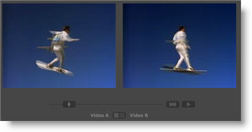
Select a movie clip, then select any of the main Flash streaming formats and see a side-by-side comparison of the quality. A really good example is On 2 Flix Flash 7 (first real streaming encoding software I used) with the newer On 2 Flix Flash 8 (which I use extensively and Camtasia Studio uses as its encoding engine).
A bit geeky, but very interesting! Click here to go to the Flash Video FAQ.
– Troy @ TLC