The LA28 Design System is Impressive!
I just bought tickets for us to see a sport climbing competition that is over 2 years away. In July 2028 to be more precise! That’s right: for the 2028 LA Olympics. And with the 2028 Olympics being nearby in LA, I was excited to be able to use the “locals” advance purchase option for us to see a few events in person.
Quick backstory…rock climbing is something Troy and I have a long history with, including during our pre-presentation design years, when we owned and ran one of the original premiere-level rock climbing gyms in America.

(Troy still rock climbs today, but more casually perhaps)
Now, while I was preparing to buy said Olympic competition tickets (and let me tell you, it is a process…well planned out and communicated…but a process nonetheless), the LA Olympics people suggested I watch a video about the ticket buying process. This is when I stumbled upon another video detailing the LA28 design system…and it’s really cool!
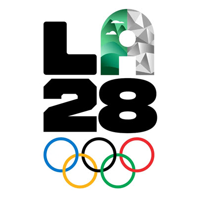
From a very versatile letter “A” (think MTV logo of old) to the event color scheme (think flower superbloom and LA specific flowers) to the patterns of the 2028 LA Olympics design system…I can’t decide which I like best (okay, the patterns win).

(Our local 2023 superbloom on a drive to LA)
Everyone who works in design will appreciate the 2028 LA Olympics design system in this less than 3-minute video!
I love that the video highlighted design systems from past Olympics and from what I see, LA28 is going to represent LA extremely well – I can’t wait to see the colors and patterns play out. Funny enough, I’m not a fan of the LA28 font system. However, I see the strategy and am curious if I’ll change my mind as I see the whole system play out over the next couple of years.
Enjoy!
-Lori @ TLC Creative