I work with PowerPoint on a daily basis and I am very honored to be a Microsoft PowerPoint MVP. We have a talented team of presentation designers at TLC Creative Services and ThePowerPointBlog is our area to highlight PowerPoint tips, tricks, examples and tutorials. Enjoy! Troy Chollar
Are Google Fonts Variable Fonts?

Microsoft Cloud offers many fonts that can complement any PowerPoint presentation design. These fonts are not only visually appealing, but they are cloud based and require no installation. But, if you’ve ever struggled to find the perfect Microsoft font for your slide designs, there is another choice. Google fonts are a great resource that offers hundreds of options for all design projects. While these fonts can be used for PowerPoint presentations, there are some limitations that you need to consider.
If you do decide to go with Google, realize there is a big difference between Google fonts and Microsoft Cloud fonts. PowerPoint utilizes their unique Cloud fonts so every user, anywhere, can use these fonts without the worries of corruption. When these fonts are added to a PowerPoint presentation, the fonts are automatically downloaded and will not affect the look of the slides.
In order to use a Google font, you’ll have to download from the company’s website and install into your computer’s system. Also, each additional user of this presentation will have to install the same fonts to display properly.
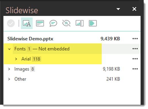
There is a catch though – PowerPoint doesn’t natively support variable fonts.
That all being said, at TLC Creative, we do not use Google fonts as an option in PowerPoint. Unless it is a custom font from the client, we stick to the Microsoft Cloud choices to avoid problems during presentations.
What Are Variable Fonts?
Variable fonts are amazing because they let one font file handle multiple styles like weight, width, and slant. This means you can have a ton of design flexibility without needing a separate file for each style. While PowerPoint doesn’t support variable fonts just yet there are options. You’ll just need to download the font in its variable format (like regular, bold, italic, semi-bold, etc.) and install it manually to display properly.
How to Use Google Fonts in PowerPoint
Even though you can’t fully use variable fonts in PowerPoint, you can still find something from Google Fonts that will work.
1. Go to the Google Fonts website

2. In the left column, use the filter option to display only variable fonts under Technology.

3. Select a variable font. We’ll use Oswald as an example. You will be able to view all the weight variations to see what is available. In the upper right select the blue “Get font” button.

4. In the next window, download the .zip file.

5. Find the downloaded font file on your computer and extract the .zip file.
WARNING: when obtaining fonts from Google to install on your system, you will download a .zip file. When the .zip file is extracted, you might see a font in the main folder that includes “VariableFont” in the name. Ignore this file! Open the folder named “Static” and install these fonts instead.
6. Within the font folder, open the static folder.

7. Select the desired variable fonts and right click to install.

Now when you open PowerPoint, the newly installed Google fonts will be available in the dropdown menu. (Note: if you have PowerPoint open while you are installing, you will need to close and re-start for fonts to show)
Even though PowerPoint isn’t fully on board with variable fonts, but we are hopeful that Microsoft adopts Variable fonts soon! You can still enhance your presentations with Google Fonts. Don’t let this hold you back. Get creative and find the perfect font for your next presentation.
– The TLC Creative Presentation Design Team