The PowerPoint® Blog

I work with PowerPoint on a daily basis and I am very honored to be a Microsoft PowerPoint MVP. We have a talented team of presentation designers at TLC Creative Services and ThePowerPointBlog is our area to highlight PowerPoint tips, tricks, examples and tutorials. Enjoy! Troy Chollar

Oh ,The Colors

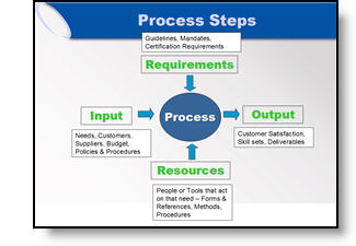
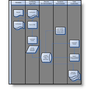
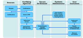
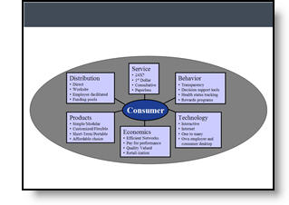
It is often beneficial to color code the data. But sometimes to much color makes things difficult to interpret and ends up looking like the circus has arrived. Here is a great diagram that provides a lot of vital information – it just gets lost in all of the colors and shapes.
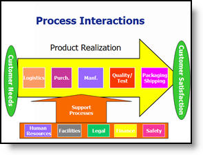
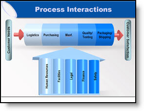
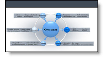
My goal was to minimize the distracting colors, make the diagram fit within the slide and emphasis the relation and process. Here is the revised diagram:
– Troy @ TLC
By |2016-11-17T15:46:07-08:00March 7th, 2007|Portfolio, Tutorial|

Great Graphic – For an Engineer

Here is the original graphic provided. It has all the needed information, is nicely balanced, has good contrast – and has all the factors an engineer would appreciate.

Taking the same content, basic layout, and even color scheme, here the revised version of the diagram developed for the (16×9, widescreen) presentation.

– Troy @ TLC

By |2016-11-17T15:45:31-08:00March 5th, 2007|Portfolio, Tutorial|

Accurate Graphic, But Wrong Emphasis

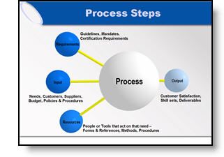
Here the original graphic from a presentation. It is a universal company-wide depiction of their process. No problem, I initially recreated the graphic using the 3D spheres for a more professional look.

But listening to the presenter during rehearsals he was discussing how three elements drive the final element (output). We adjusted the graphic for this presentation to be in line with the message being discussed.

– Troy @ TLC

By |2016-11-17T15:44:31-08:00March 3rd, 2007|Portfolio|

Show It A Story

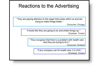
Lots of presentations show quotations. Here is the original slide with a lot of quotes – each animates on with a click.

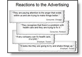
To put the quotes in a visual environment a series of ‘torn paper’ graphics where designed, font sizing and line spacing were also adjusted.

– Troy @ TLC

By |2016-11-17T15:44:00-08:00March 1st, 2007|Portfolio, Tutorial|

Tell the Right Story

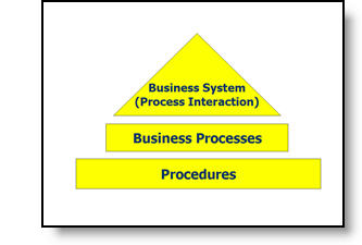
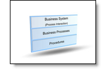
Here is the graphic from an original slide.

After discussing with the presenter, the message was not really about a hierarchy, but that all three processes where controlled by one business unit. Here is the revised graphic that was more aesthetic, cooridinated with the presentation color scheme, and showed a more accurate story.

– Troy @ TLC

By |2016-11-17T15:43:22-08:00February 27th, 2007|Portfolio, Tutorial|

Access to PowerPoint

After I have interpretted what the data is saying (relative to content of industry and presentation), the need is to often recreate in a PowerPoint-friendly format. Here is the original provided, an MS Access piece.

To make a clearer, easier to read, symmetrical and more aesthetic graphic here the same data recreated using semi-transparent autoshapes, color coordinated arrows and a layout that was as large as the template permitted.

– Troy @ TLC

By |2016-11-17T15:42:58-08:00February 25th, 2007|Portfolio|

Knowledge Does Not Equal Design

I had a recent conversation while updating a series of presentations that I found very insightful. The conversation was along these lines:

Client – Thank you for updating all of our presentations, making them look consistent and just ‘better.’

Troy – Thank you for the opportunity to assist.

Client – I can see the ‘graphic designers touch’ over what our engineers do.

Troy – Well, after I actually figure out and interpret what the intended message of the slide is, my biggest goal is to bring focus to it.

Client (and this was the key to the whole conversation) – You know, our people have taken lots of classes on how to use PowerPoint, but there is a big difference between knowing how to add things to a slides, and knowing how to design a good layout.

Over the next few days I will pull some before-and-after examples that focus on redesigning the visual layout of the slide.

– Troy @ TLC

By |2016-11-17T15:41:49-08:00February 23rd, 2007|Personal, PowerPoint, Resource/Misc|

Desk Space – again

PowerPoint for a corporate event can require a lot of computers. In this case it was a primary and backup for the main screen, another for a logo and countdown when the IMAG screen was not on camera, and one additional for production work. Deskspace becomes an issue when you show up and have only been allocated 4 feet of table…

– Troy @ TLC

By |2016-11-17T15:41:26-08:00February 21st, 2007|Personal, Portfolio|

Side-by-Side Comparison of Streaming Movie Formats

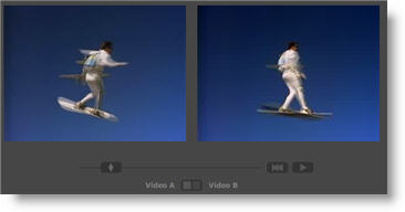
This may not appeal to everyone, but with all of the PowerPoint-to-Webcast and streaming video projects this website really got my attention!

Select a movie clip, then select any of the main Flash streaming formats and see a side-by-side comparison of the quality. A really good example is On 2 Flix Flash 7 (first real streaming encoding software I used) with the newer On 2 Flix Flash 8 (which I use extensively and Camtasia Studio uses as its encoding engine).

A bit geeky, but very interesting! Click here to go to the Flash Video FAQ.

– Troy @ TLC

By |2016-11-17T15:40:59-08:00February 19th, 2007|Software/Add-Ins|

Pictures of Earth, or your house, in Presentations

I have seen a huge increase in the use of aerial photography in presentations. Of course this is from the availability of services such as Google Earth, Microsoft VE and others.

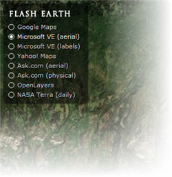
Here is a great website that lets you find a spot on earth and then move between a number of online mapping systems to see how each looks. Check out Flash Earth by clicking here.

– Troy @ TLC

By |2016-11-17T15:40:08-08:00February 17th, 2007|Software/Add-Ins|
Go to Top