I work with PowerPoint on a daily basis and I am very honored to be a Microsoft PowerPoint MVP. We have a talented team of presentation designers at TLC Creative Services and ThePowerPointBlog is our area to highlight PowerPoint tips, tricks, examples and tutorials. Enjoy! Troy Chollar
20 Years of Sharing Presentation Insights—and What’s Next for 2026
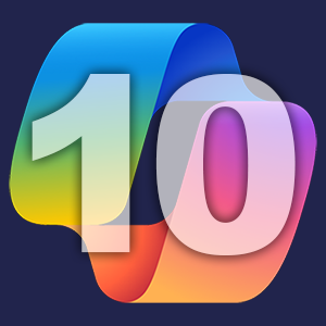
20 Years!
This is a momentous blog post. I started sharing presentation-related content online in 2006 – that was 20 years ago!

I started here with ThePowerPointBlog.com, then added Facebook and later LinkedIn posts. Over the years, the voice of TLC Creative Services has grown beyond just me to include our incredibly talented presentation design team, who added to many of the posts.
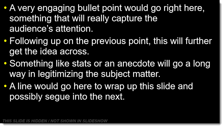
In 2025, we took a big step forward by bringing on a dedicated social media manager. Her role has been to keep our posting consistent, and core themes each month. One of my favorite initiatives this past year, which was suggested by our social media manager, was our “Looking Back” series. Each Friday, we revisited a past blog post that was still relevant to PowerPoint and presentation design today. There is a lot of information and knowledge here, and the “Looking Back” series included posts originally shared 18 years ago! This series was shared on both The PowerPoint Blog and our TLC Creative LinkedIn account. It was a fun way to reflect on how far presentation design has come, and how far we’ve come with it.
What’s Ahead for 2026?
We’re excited about what’s next! Here’s a quick look at what we’re cueing up for 2026:
- For the blog: We’ll share two new posts every week (Tuesday & Thursday)
- For our Presentation Podcast: We’ll continue dropping two episodes each month (on the first & third Tuesdays)
- TLC Creative Facebook & LinkedIn: Posts aligned with blog content, plus more behind-the-scenes photos and updates.
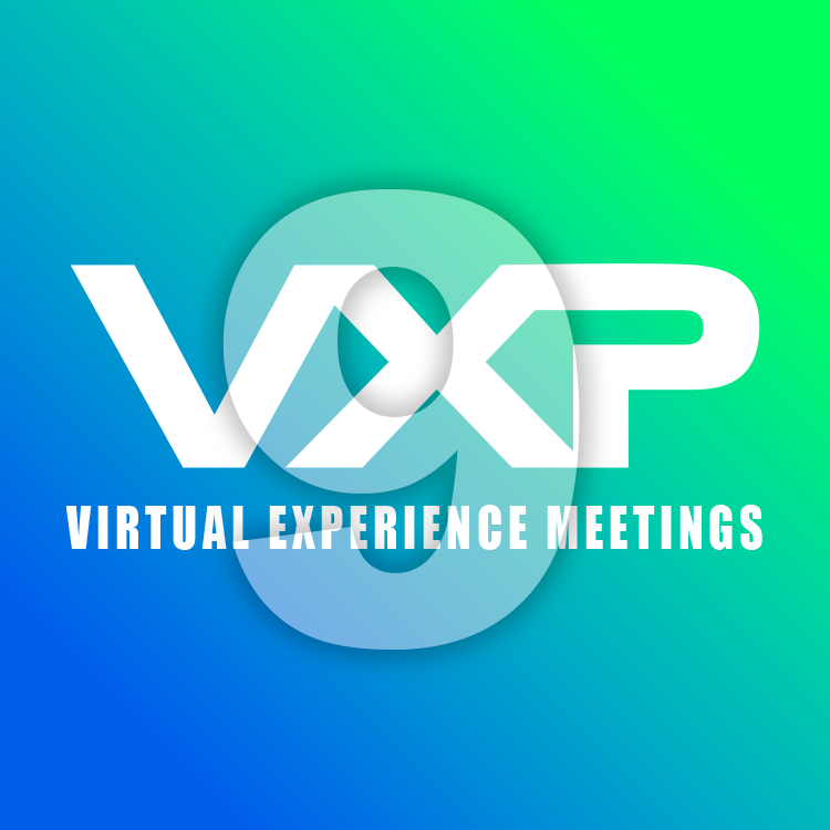
- VXP Meetings LinkedIn: This is a new channel for 2026 where we are (finally) sharing information focused on our virtual meeting tools and production; specifically, tutorials, case-studies, and real-world projects
The Goal?
My goal is the same: sharing resources, tutorials, example files, and conversations about presentations. We are happy to have TLC Creative Services, Inc. as part of everyone’s presentation journey in 2026. Whether you’re looking for inspiration, practical tips, or just want to see what’s possible in the world of presentation design.
Thank you for joining us at TLC Creative, as we are all part of the presentation community. Here’s to a creative and connected 2026!

-Troy @ TLC