I work with PowerPoint on a daily basis and I am very honored to be a Microsoft PowerPoint MVP. We have a talented team of presentation designers at TLC Creative Services and ThePowerPointBlog is our area to highlight PowerPoint tips, tricks, examples and tutorials. Enjoy! Troy Chollar
Use Copilot to Create an Editable PowerPoint Table!

AI tools like Microsoft Copilot are making many everyday workflows faster and smarter. And as a result, the TLC Creative design team has been putting Microsoft 365 Copilot to the test!
This time, we wanted to test a common presentation design task we often have: to see if Copilot can streamline the process of converting an image of a table into an editable PowerPoint table.
Note: We at TLC Creative Services are using the paid Microsoft M365 Copilot subscription, vs. the free Windows M365 Copilot. With the paid subscription Copilot is available within PowerPoint, but for this post, all of the Copilot prompting was done in the M365 Copilot app, not from Copilot inside PowerPoint.
Goal
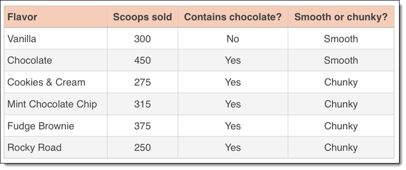
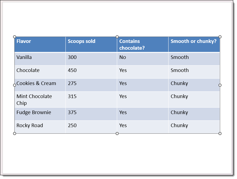
We started with a simple goal: turn this image of a simple data table into a usable, editable table on a PowerPoint slide.
Our Process
- Open M365 Copilot.
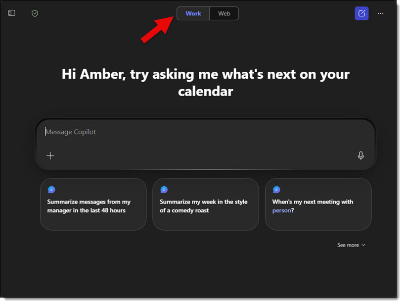
- With the paid version of Copilot, the options of “Work” or “Web” are available. We opted to keep the information internal to our organization and used the “Work” option.
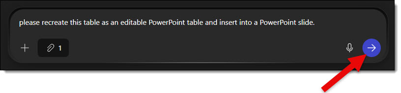
- We used this prompt: “Please recreate this table as an editable PowerPoint table and insert it into a PowerPoint slide.”
Note that we included 2 phrases we felt were important in order to get a workable result: “editable PowerPoint” and “insert into a PowerPoint slide.”
- Then we clicked the “+” icon and the ADD CONTENT option to give Copilot our image of the table.

- We then uploaded the image of the data table from our computer.
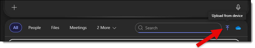
- Next, we clicked the process button to complete the upload.
Copilot then analyzed the image and provided a downloadable PowerPoint file.
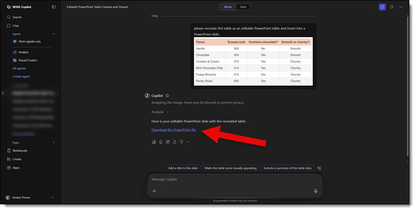
Opening the slide Copilot gave us, it is great to see that the table Copilot generated wasn’t just an image. It is a fully functional table with editable data in each cell! Here is the slide and PowerPoint table – and yes, Copilot gave us a 4×3 aspect ratio slide (weird!).
As expected, we discovered that the prompt verbiage can make a big difference. Testing some alternate prompts didn’t yield editable tables and simply produced an image of the original image, but said image was placed on a slide. And with one prompt, Copilot simply inserted the original image onto a slide – not helpful. But as summed up by one of our design team members, “It was kind of difficult to get Copilot to fail. It almost always produced a slide with an editable table.” And this is a good thing to hear!
Using our same test table image, here are a few prompts that did fail, along with the results:
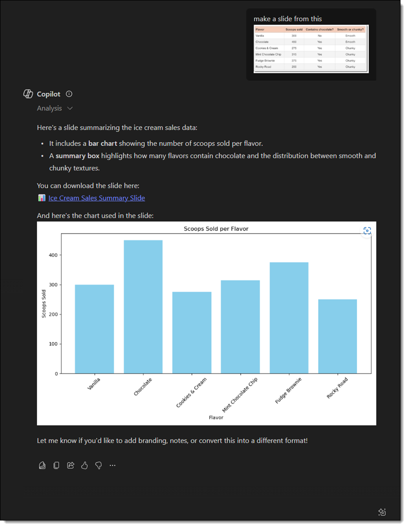
1. “Make a slide from this.” Copilot created a chart using the data and gave a summary – no PPT slide produced.
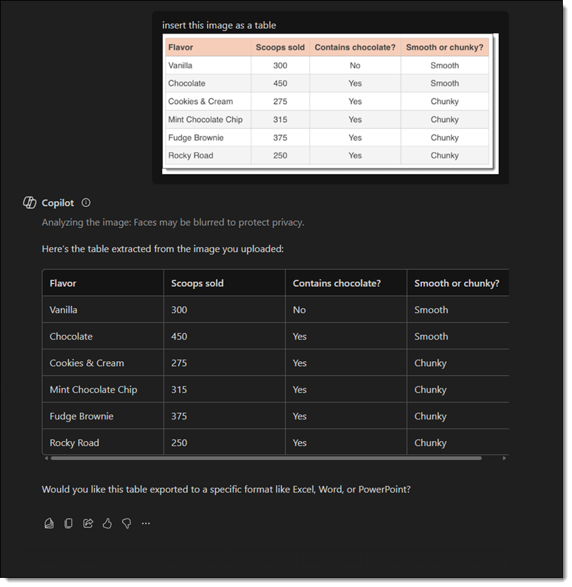
2. “Insert this image as a table.” Copilot created a table, but it was within Copilot itself – no slide produced. The text was able to be copied/pasted, and Copilot did ask if I wanted the table in a specific format, which included PowerPoint.
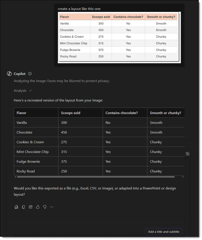
3. “Create a layout like this one.” Same result as #2 – a table and summary of the table were created in Copilot.
While Copilot won’t always interpret things perfectly, with the right prompt, it can be very helpful in converting a data image into real, editable content, saving a lot of manual effort. It’s simply all about how you phrase your prompt!
-The TLC Creative Design Team