AI is making amazing advances in language translation, both in written/captions and spoken/heard. But this is all very recent. Looking back to 2018, we had a post about a very cool PowerPoint add-in Microsoft released, called Presentation Translator. If you want to read the full post and see the screen capture examples, read here.
Microsoft retired the Presentation Translator add-in back in March of 2021. What was not kept was the very ambitious feature to translate all on-slide content to other languages (see the 2018 blog post for examples of that in use).
But some of the features from Presentation Translator did make it into PowerPoint, including the subtitle captioning translation feature. PowerPoint now has a simplified and consolidated set of controls for text subtitles. Look for this on the SLIDESHOW tab in the CAPTIONS & SUBTITLES section.
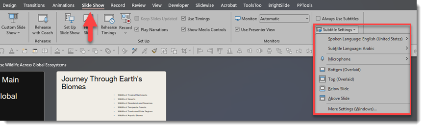
SUBTITLE SETTINGS
The ALWAYS USE SUBTITLES checkbox, in my opinion, should be renamed to TURN ON SUBTITLES. In reality, you can ignore this checkbox and see further below how I recommend dynamically turning on this feature. There are 3 settings in the SUBTITLE SETTINGS that I recommend setting before starting the slide show:
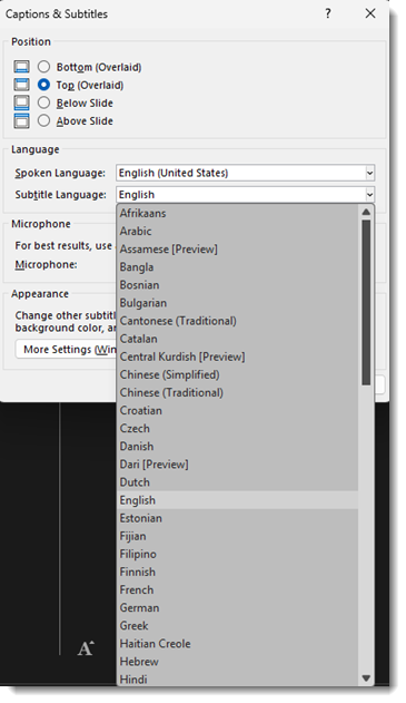
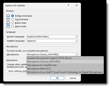
1. Select the spoken language. This is the language the presenter on stage is speaking.
2. Select the subtitle caption language. This is the language that will be displayed as text. It can be the same as the presenter’s language, or a different translated language.
3. Select the microphone that PowerPoint will hear the presenter through (more recommendations on this below).
With these settings, start the slideshow – speak – and see the subtitles (or live captions) automatically display!
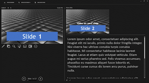
DYNAMICALLY TURN ON/OFF SUBTITLES
During a slideshow, the subtitle settings are hidden – but accessible if you know where to look!
- Right-click anywhere on the slide
- In the right-click menu is START SUBTITLES and SUBTITLES SETTINGS. The issue is this big menu on screen is a distraction to the audience, so instead…
- In presenter view, right-click on the active slide
- The same right-click menu is available to you, but invisible to the audience!
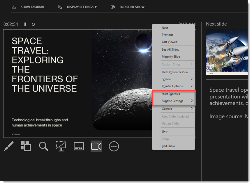
- Select START SUBTITLES and the subtitles are added to the screen for everyone to see (see below for more details on the settings options)
TIP: Subtitles can be dynamically turned on/off seamlessly during a presentation. For example, if one presenter is native Spanish speaking, turn on subtitles via the Presenter View method described above to “hear” Spanish and display English subtitles for just that segment of the meeting.
POWERPOINT SUBTITLES VS. MICROSOFT TEAMS PRESENTING TRANSLATION
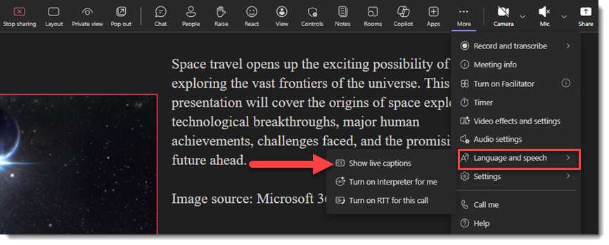
When you share your screen or use PowerPoint Live in a Teams meeting, a similar translation subtitle option is available. However, in Teams, subtitles are called “Captions” (Microsoft, where is the cross-app consistency?!).
The other big difference in a Teams meeting is that captions are turned on individually by each attendee. The presenter has no setup or control over the captions being used. In a Teams meeting, each attendee has the option to go to the MORE tab, in the language and speech section, click “show live captions”, and select the language they want to see or read.
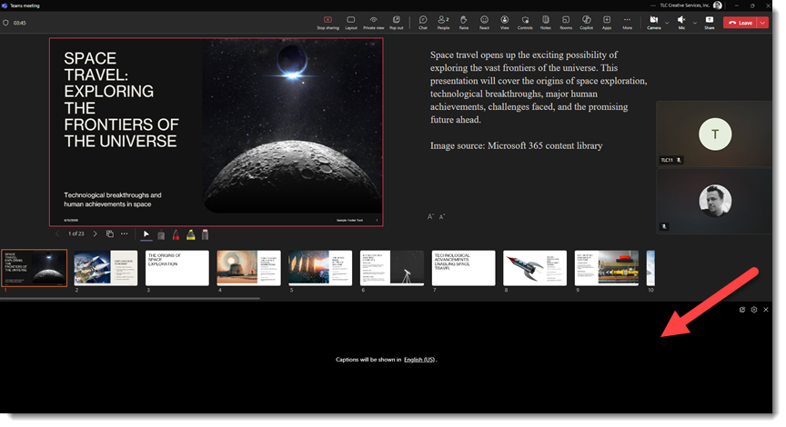
During a regular presentation (e.g., not a Teams meeting), when the subtitles are active, the presenter’s screen is the slide plus the subtitles, and everyone in the audience will see the same thing.
SETTINGS
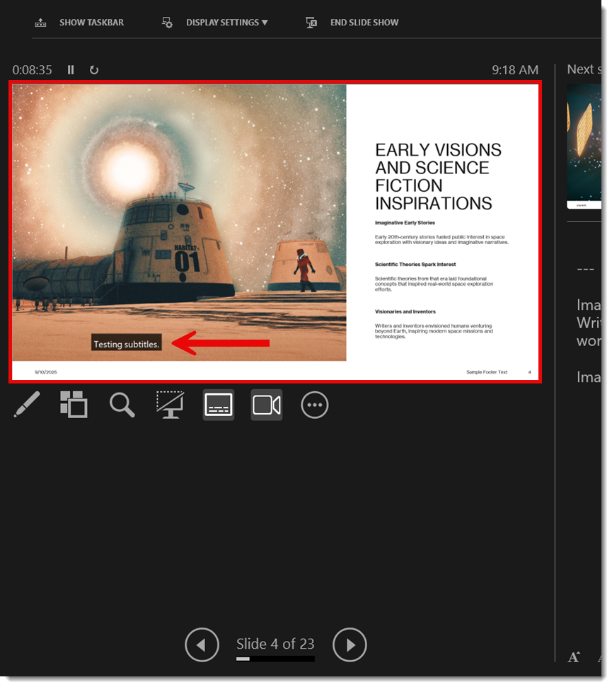
You can customize and control the placement of subtitles in native PowerPoint (you cannot do this with PowerPoint Live in a Teams meeting). Choose from:
- Bottom of the slide (this is the default)
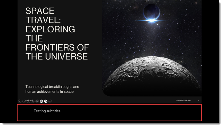

- Bottom, overlaid on top of the slide content
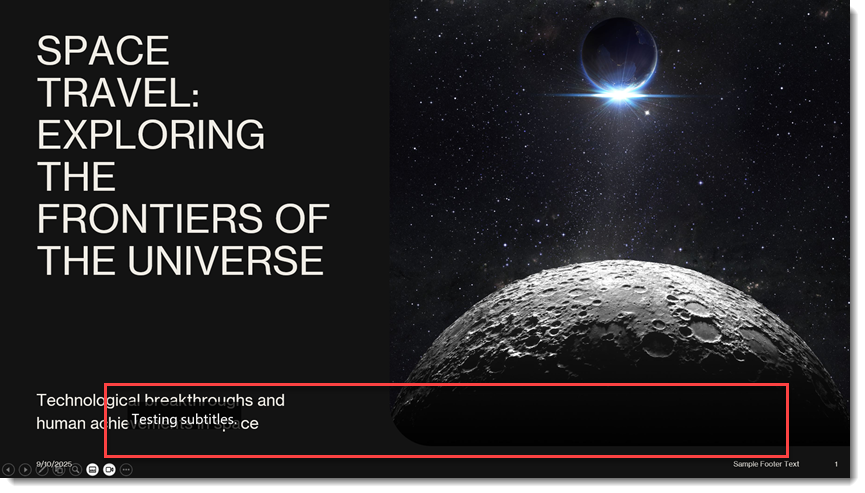
- Top, overlaid on top of the slide content

In addition, the MORE SETTINGS gives you control over the colors, font used, and more (note that we change over to using “captions” in these menus – consistency, Microsoft?).
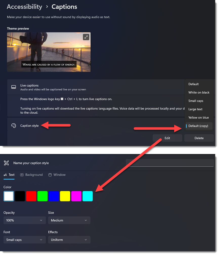
TIP: Any changes you make to the caption styles will persist after closing and reopening PowerPoint. However, because these settings are controlled through Windows OS, this feature won’t work the same on a Mac.
At this point in time during our use, the number of languages is approximately 63 so far, which is fantastic!
MICROPHONE
As a presenter, the microphone is a consideration. If you are presenting from the stage, then you (the presenter) are most likely not directly at the presentation computer and therefore PowerPoint cannot hear you speak. The presenter must have a lavalier or handheld microphone from the AV team, and how the computer gets access to that microphone for the live subtitles to work is a consideration to be worked out before the presentation begins!
CONCLUSION
Back in 2018, Microsoft was ahead of the AI revolution, and through its specialty PowerPoint add-in, we were offered some very advanced translation capabilities at the time. While the ability to translate the slide content is gone (and ironically something I have not seen any AI presentation system do better than Microsoft’s 2018 feature!), the live subtitles feature was preserved and is still part of the PowerPoint app for everyone to easily use.
Of note, for our live events, the PowerPoint subtitle feature has been used many times – and always amazes not only to the AV Production team but is thrilling to the client and audience (note to Microsoft – please do not remove this feature from PowerPoint!).
-Troy and TLC Creative design team