PPT Web vs. Desktop Slideshow
I have been using the Office Web Apps beta and created this presentation to test how things look and animate when run as a slideshow on my desktop and then uploaded and run through the online PPT Web App.
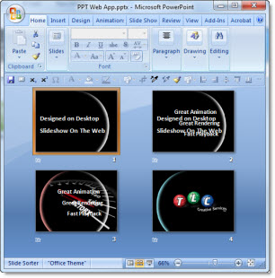
– 4 slides
– Fade transition on each
– Inserted graphics (arch and speedometer)
– PPT text
– All elements animated
Slideshow on desktop:

Slideshow on web:

*Note last animation changed from Faded Zoom to Zoom In
– Troy @ TLC