It’s Leap Year 2016
Finally, Leap Year explained (thanks to Sara and some more great Morph animation use!).
Happy Leap Year, February 29th!
-Sara @ TLC
Finally, Leap Year explained (thanks to Sara and some more great Morph animation use!).
Happy Leap Year, February 29th!
-Sara @ TLC
We let the TLC Creative Presentation Design Team loose to experiment with PowerPoint 2016’s new Morph transition/animation – the results are fun, great and inspirational!
Here is our design team’s Morph ideas compiled and output as a video.
– The Design Team @ TLC
My example is a standard 4×3 slide. The goal was to create a picture frame that was full slide size and for the picture frame to have motion. By layering a video under the photo and sizing it to the same aspect ratio as the photo, the result is a dynamic motion picture frame. The steps to make it happen are pretty easy.
Add the photo to the slide (we prepped this image in Photoshop by making it semi-transparent and saving out as a .png).

Add the video to the slide, send to back, resize and crop to proportionally be a bit larger than the photo.

Fine tune position of video and photo. Select both and use the ARRANGE > ALIGN > ALIGN CENTER and ALIGN MIDDLE to make them exactly centered on each other.

Set video animation. Select the video, remove the current trigger animation, add a new PLAY animation set to WITH PREVIOUS.
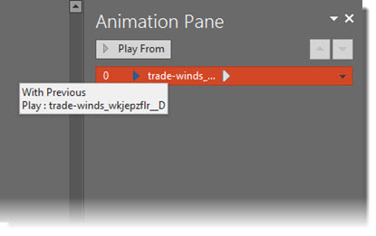
Set video to loop. Select video, go to PLAYBACK > VIDEO OPTIONS > LOOP UNTIL STOPPED.

Stylize video with an outline and drop shadow. Stylize photo with an outline and inner shadow.

View in slide show!
[KGVID]https://thepowerpointblog.com/wp-content/uploads/2016/02/unnamed-file-1.mp4[/KGVID]
-Troy @ TLC
PowerPoint 2016 Auto Layout Designer is a new feature in this version. I wrote a post earlier this month with a review and example. It really is a great feature.
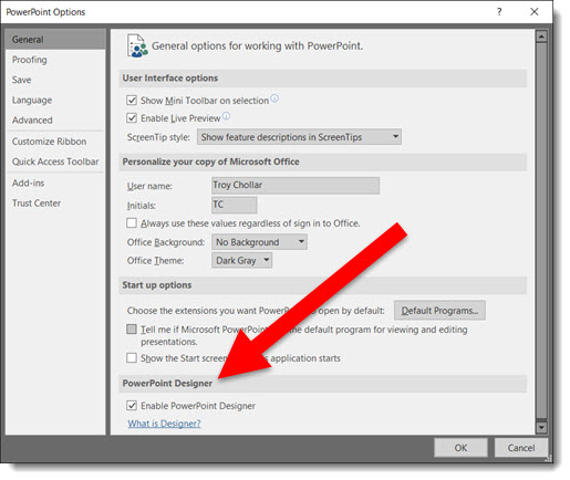
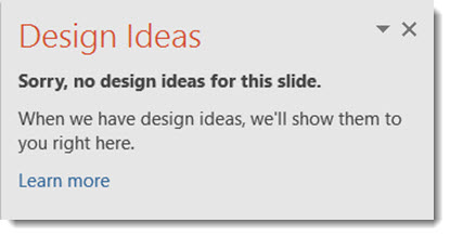
But, if you do not use Microsoft templates (or themes) for your presentations, the Designer tool is not helpful. Using a custom template does not stop Designer from popping open its action pane and offering to help design slides (even though it currently cannot). I have opted to turn off the Designer feature – at least until it has expanded use to work with custom templates.
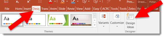
1. Go to FILE > Options > General Tab > PowerPoint Designer
2. Check or Uncheck to turn on or off
3. Click OK
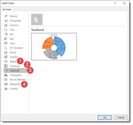
New Chart Types in PowerPoint 2016 for subscription users of Office 365 are being automatically added to your app (Note: This is only in subscription users of Office 365, PowerPoint 2016, and I have only looked at the Windows version).
There is bigger news than just some new styles. Microsoft is moving all charting to a new charting engine, and these new charts are coded with this new engine. Eventually, all legacy charts will be ported to the new charting engine, and, fortunately, this is still an in-process engine development (I am certain everyone will encounter a chart limitation depending on their chart data and the way they create charts) – so my take on things is “Yay new charts! But the new charting engine is not fully functional, so some options in the new charts are not fully functional yet.”
The good news is even though only subscription users can create these charts, all versions of PowerPoint (dating back to 2010 and Mac versions) can display chart types – editing and animation is somewhat limited when using previous versions…
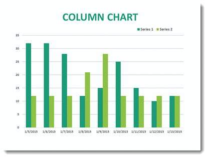
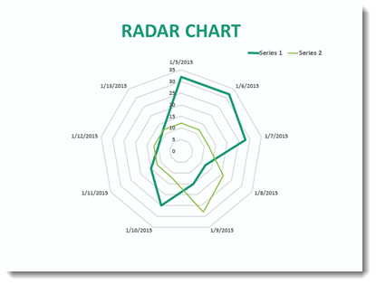
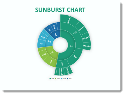
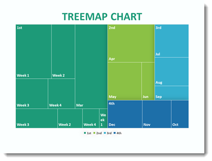
Here are 4 of the new chart types currently available (we will continue to see more chart variations added over time, look for another new chart type in the February updates).
Follow these Steps:
Go to INSERT > CHART
A standard Chart.
That same data in the Bar Chart can instantly be updated.
This a great addition to the native PowerPoint chart options vs. going to external charting apps to develop.
This Chart is new to PowerPoint 2016 native chart options.
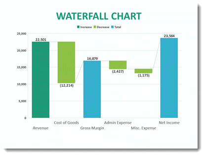
This standard Column chart with negative data.
-Troy @ TLC
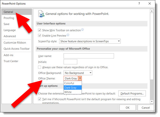
PowerPoint 2016 User Interface Color Options allow you to modify your interface by choosing up to 3 preset color schemes: Colorful (Orange), Dark Grey, White. You can change the ribbon, border and canvas area outside the slide.
Ideally, we, the users, could modify the color scheme to meet our needs – but that’s not something available. All three options are available and can be changed at any time. (Note: This is an Office wide update, so all other Office apps such as Outlook, Word, Excel, etc. will also get the same User Interface color scheme.)
To adjust, go to FILE > OPTIONS > GENERAL tab. Then, go to OFFICE THEME drop down menu.
Colorful (Orange on light grey):
Dark Grey (Only option with no orange):
White (Less Orange on White):
-Troy@TLC
Image Export Improvements in Powerpoint 2016 have made things more interesting. Depending on previous version used, this may have been an okay result to a not-so-good result. But that has changed for the better with PowerPoint 2016.
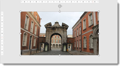
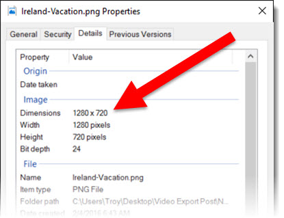
Here is my sample slide to demo the PowerPoint 2016 image export. Single widescreen slide (13.33″x7.5″) with a full frame image.
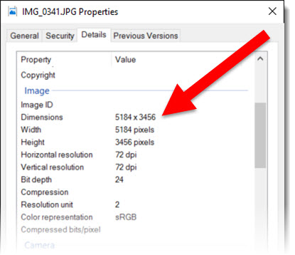
The original image inserted was very large (for PowerPoint needs) at 5184x3456px.
A great way to export a number of slides as images is through the SAVE AS option. This export option can be used for a single slide, a selection of slides, or an entire presentation.
Go to FILE > SAVE AS > and click the SAVE TO TYPE drop down.
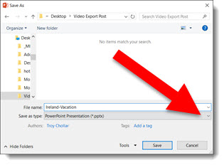
From the available list, select .PNG or .JPG format (personal preference).
Exporting this way creates good image at 1280×720 – the low end of HD resolution.
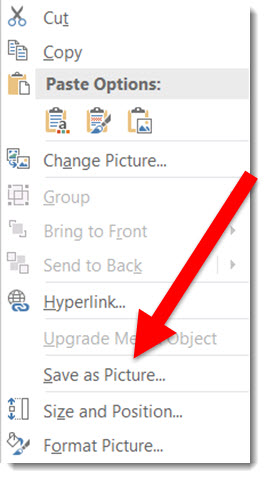
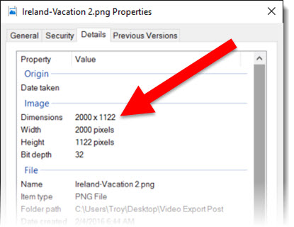
To export a single image, not a full slide, multiple images or slides. The advantage is a much higher resolution image.
Select the image, right click and select SAVE AS PICTURE.
Exporting this way creates a much higher resolution image (depending on the original image size). This image exported to 2000x1122px.
The 2 options are available and use based on what is needed. I will also say that when working with very unique page sizes (e.g. 50″x 9″), slide export as images do a much better job than previous versions. Note: there are several 3rd party add-ins that export slides as images in a variety of formats and to any pixel size needed (Here at TLC Creative, all computers have PPTools Image Export installed).
-Troy@TLC
Another behind the scenes upgrade in PowerPoint 2016 is the video export size options. Now true, 1920×1080 HD video can be exported from PowerPoint.
Go to FILE > EXPORT > CREATE A VIDEO
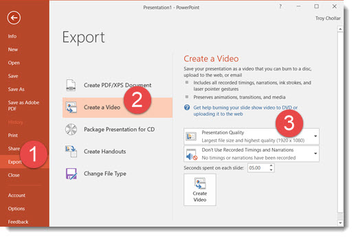
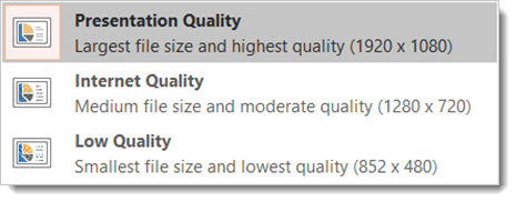
The export size options have been revised to 1920×1080, 1280×720 (the PPT 2013 highest res option), and 852×480.
-Troy @ TLC
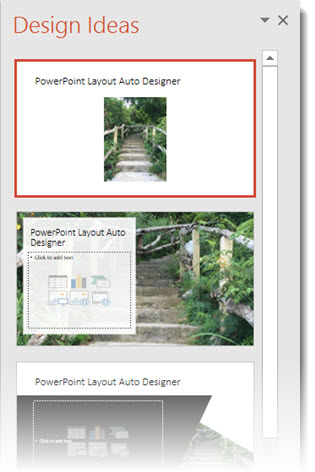
Another new feature of PowerPoint 2016, only available to subscription users, is DESIGNER, which is an automatic layout tool. Here is an example of how it works.
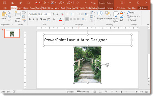
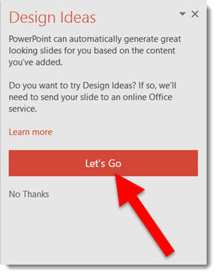
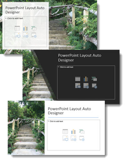
Fantastic feature for both the designer and non-designer! But at this stage there are a few downsides to the new DESIGNER tool.
Overall, a great idea and smooth implementation. But because TLC virtually never uses a Microsoft template (or theme), this feature has very limited use for us – but I am hopeful Designer will continue to expand its capabilities.
-Troy @ TLC
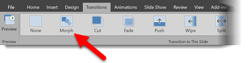
Office 365 subscription users have a new feature in PowerPoint called Morph, which was automatically added* (and you may not even know it is there). There is a long list of animation requests, but this feature is a slide transition that creates animation visuals, all without looking at the animation tab. Here is an example animation that took less than 3 minutes to create.
Morph Demo:
[KGVID]https://thepowerpointblog.com/wp-content/uploads/2016/02/unnamed-file-2.mp4[/KGVID]
The process is easy. If you have used Mac Keynote’s Magic Move, the concept is similar – but PowerPoint’s Morph has a few distinctions. Slide setup is easy. For this sample, I added an arrow to the first slide, duplicated that slide and moved the arrow to a new position. Then, I duplicated that slide and re-positioned the arrow, flipped it, and recolored it. Finally, I duplicated the slide 1 last time and added in a collection of additional arrows. No animation.
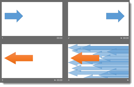
After designing the 4 slides, it just needed to have a few slide transitions. To find Morph, go to the slide transition tab and look for the new transition option.
(1.) Slide 1 = Fade slide transition
(2.) Slide 2 = Morph slide transition
(3.) Slide 3 = Morph slide transition
(4.) Slide 4 = Wipe from Right slide transition
Again, all of this motion is achieved with no animation!
Download this Sample Animation.
*Morph is available as of this post to Office 365 subscription users that has opted in for the Insiders Program (basically Microsoft’s Beta release program).
-Troy @ TLC