Tutorial

Different Desktop Background Images… for Windows 11

Maintaining a polished and professional appearance is crucial for PowerPoint presentations and other presentations – especially when using multiple monitors. One good practice is to set up your desktop backgrounds so they align with your meeting or event theme.

However, you might want the themed desktop visible only on the external monitor where slides or visuals are displayed, leaving your primary screen more neutral for your daily work.

Fortunately, Windows 11 simplifies setting different desktop backgrounds for each monitor, enhancing your presentation experience (BTW, this has been a Mac OS feature for many years – it’s great that Windows finally added this!).

How to Set Desktop Backgrounds Individually for Each Monitor in Windows 11

1. Open Personalization Settings:

  • Right-click your desktop and select Personalize, or navigate through Settings > Personalization.

2. Access Background Options:

  • In the Personalization menu, click on Background.

3. Choose Individual Backgrounds for Each Monitor:

  • Under “Choose Your Picture” or the “Recent images” section, right-click the desired image.
  • Select “Set for Monitor 1,” “Set for Monitor 2,” or the specific monitor you intend to use for your presentation visuals.

This simple and efficient method allows each monitor to have distinct backgrounds. Your audience will see a well-branded and thematic display on the external screen, while your main monitor remains optimized for your workflow.

Implementing individual desktop backgrounds keeps your presentation visually coherent, professional, and perfectly aligned with the meeting theme.

-The TLC Creative team

By |2025-05-17T09:28:12-07:00May 19th, 2025|Resource/Misc, Tutorial|

Many Charts, 1 Legend To Rule Them All!

Presentations are meant to communicate ideas clearly and effectively, but too often, slides are cluttered with redundant elements that distract and hide the information to be conveyed. And as we look at charts this month, we find that they are often full of unneeded visual distraction. But this is a specialty scenario where the slide content with multiple charts creates opportunity to simplify the visual elements.

Three Charts: Three Legends

In this presentation, many slides had multiple charts, and each one included its own legend. At first glance, this might seem harmless—after all, each chart needs a legend, right? But in reality, this redundancy forces your audience to process the same information multiple times, making it harder to focus on what actually matters: the data trends and insights.

Our design goal is to remove adds unnecessary visual clutter and enable to audience to process the slide and quickly identify the message. The layout is good. All the charts visually align, accurately display the same Y axis metric, have the same color coding ̶ and have the same legend.

Three Charts: A Unified Legend

Because the legend is identical, instead of repeating it three times, we streamlined the slide by using just one legend beneath all three charts. This simple adjustment immediately reduces the visual clutter and makes it easier for the audience to focus on the data.

We are happy with this “1 Legend To Rule Them All” update. Which was similarly done on many other slides in this presentation. The cognitive load is reduced, and the message comes across quicker and clearer.

Why This Works

  • Improves Readability – A cleaner layout allows the audience to process information faster.
  • Reduces Redundancy – Eliminates unnecessary repetition, keeping attention on the data.
  • Enhances Aesthetics – A well-organized slide looks more professional and engaging.
  • Guides the Audience – With less distraction, viewers can focus on what’s important.
  • Small Tweaks, Big Impact
  • Great slide design isn’t about adding more—it’s about removing what doesn’t serve the message. By centralizing your legend, you create a more effective and visually appealing slide that helps your audience focus on what truly matters: the insights behind your data.

The TLC Creative presentation design team always takes a step back and asks: Are there unnecessary repeating elements? A little decluttering can go a long way in making a slideshow presentation more impactful.

– Christie on the TLC Creative design team

By |2025-06-26T07:55:25-07:00April 30th, 2025|PowerPoint, Tutorial|

Pies or Bars?

If you’ve ever built a PowerPoint presentation, you’ve probably faced the classic dilemma: Should I use a pie chart or a bar chart? Both have strengths, but they serve different purposes. So, let’s break it down.

Which is Which – The Bar Chart

A bar chart is a simple way to compare numbers across different categories. One axis lists the categories, and each category has a bar next to it. The length of the bar shows the value for that category—the longer the bar, the bigger the number. In the example below, the bar chart shows how an app’s users are spread across different device types. You can also flip a bar chart so the bars run horizontally instead of vertically.

Which is Which – The Pie Chart

A pie chart is a way to show how a whole is split into different parts. It looks like a circle (kind of like a pie) that’s divided into slices. Each slice represents a category, and its size shows how big that category’s share is compared to the total. The chart below shows the same data as before, just in pie chart form.

Pros: Why Use a Pie Chart

A pie chart is a classic choice when you need to show proportions. If you’re comparing parts of a whole—like how your monthly budget is distributed or the market share of different companies—it’s a solid option. Here’s why:

  • Visually Appealing: People love circles. Pie charts are easy on the eyes and make data feel approachable.

  • Great for Simple Comparisons: If you have just a few categories (ideally under five), a pie chart makes it clear how they relate.
  • Emphasizes the Big Picture: Want to show that one category dominates the others? A pie chart makes it obvious.

Cons: Why Avoid a Pie Chart

  • Difficult to Compare Small Differences: If one slice is 26% and another is 24%, it’s hard to tell them apart without looking at the numbers.

  • Messy with Too Many Categories: The more slices you have, the harder it is to read. A pie chart with 10 categories looks like a rainbow explosion.
  • Not Good for Trend Analysis: Pie charts show a snapshot in time, but they won’t help you see patterns over time.

Pros: Why Use a Bar Chart

Bar charts are the Swiss Army knives of data visualization. Whether you’re comparing values, showing trends, or displaying rankings, they get the job done. Here’s why they’re a go-to choice:

  • Easy to Compare Values: The length of each bar makes differences easy and clear.
  • Works Well for Many Categories: bar charts work in almost every situation, and are able to handle a lot of data without turning into chaos.
  • Good for Trends: If you’re showing changes over time, a bar chart (especially a horizontal one) is a much better choice.
  • More Precise: Since people are better at judging length than area, bar charts tend to be more accurate for data comparison.

Cons: Why You Should Avoid a Bar Chart

  • Not as Visually Engaging: Let’s be honest—bar charts aren’t as “fun” as pie charts. They can look boring if not designed well.

  • Can Get Cluttered: If you have too many bars or categories, your chart might end up looking like a barcode.
  • Might Not Highlight Proportions as Clearly: If you’re trying to emphasize how different pieces make up a whole, a pie chart does this better.

So, Which Should You Use?

  • Use a pie chart when you’re comparing parts of a whole and have five or fewer categories. Example: How your budget is divided between rent, food, transportation, savings, and entertainment.
  • Use a bar chart when comparing values, showing trends, or handling many categories. Example: Yearly revenue growth across multiple product lines.

Ultimately, your choice should be based on what will best visually communicate the data you’re presenting. As a point, the TLC Creative presentation team tends to utilize bar charts far more often. No matter which chart you choose, keep it simple. Your audience will thank you!

By |2025-06-26T07:57:18-07:00April 28th, 2025|Tutorial|

F1 Coolness at Almost 8K!

This week I am having a lot of visual fun working on exciting slides like this

The LED wall is almost 8K in resolution and the slides are designed to fill the screen with a custom “Ultrawide” presentation. But as the presentation approached 2GBs it was time to pause on design and manage the content for an optimized file size. I trust the NXPowerlite add-in to optimize images in presentations, and the Slidewise add-in to give me insights into what images are oversize, if there are unneeded master slide layouts and much more.

But working with 8K wide slides poses some issues for letting NXPowerlite optimize images. I created a custom 8K resolution profile, so any image LARGER than the profiles 7,680px wide (aka 8K) will be automatically re-rendered to that resolution. But what about a slide like this where the two images; the F1 logo and the awesome F1 vehicle are not 8K images, and need to be optimized to their on-screen size?

The answer, for me, is a feature that is part of PowerPoint – but not well known. Here is the process:

  • Copy the image (eg. the race car)
  • Use the Thor Hammer add-in to copy the image size and position
  • Delete the image (yes delete!)
  • Use PowerPoint’s Paste Special > as .PNG (or use the “PNG” icon on my QAT)
  • This adds the original image, but at the size it was copied at (eg. an optimized image!). For the F1 car image it originally as a 8.4 MB image (as reported by Slidewise’s image audit). The pasted in optimized .png is 2.8 MB. Same image, at the pixel size needed, so no quality loss, and over 5MB file size reduction!
  • Last, use Thor’s Hammer to position the new image exactly where the original image was

Yes, it is a manual process with a number of clicks. And yes, it took me approximately 10 minutes, but I went a 2GB file to a 1.5GB file with no qualify loss!

Back to creating amazing slide layouts!

Troy @ TLC

By |2025-04-22T22:49:28-07:00April 23rd, 2025|PowerPoint, Tutorial|

Which Chart Tells 1 Story?

In a presentation, clarity of data is the goal. When presenting charts, our goal is not only to convey information, but to do so efficiently, so much that our design team goal is for a chart to convey its story in just one second. A chart where the viewer immediately understands the core message, without having to think through a lot of unnecessary visual noise.

Let’s look at some examples of PowerPoint’s default charts and how TLC Creative team transforms it into a streamlined, highly effective visual.

The Cluttered Default Chart

Let’s start with a traditional chart, complete with all the usual visual elements.

This chart contains every possible visual component:

  • Axis lines – both horizontal and vertical.
  • Axis labels – showing the scale of values.
  • Axis demarcation lines – to show intervals.
  • Legend – to explain the different data series.
  • Title – to provide a description of what the chart is about.
  • Data labels – showing the exact value of each data point.

While this chart is technically “correct” in that it has all the necessary elements to be fully interpretable, it’s also overwhelming. The amount of information in the presentation makes it hard for the viewer to focus on any one key insight.

What’s the Problem?

This chart is packed with details, but the viewer might struggle to extract the one key takeaway quickly. Maybe you want to highlight a single data point or illustrate a trend without making the viewer sift through a lot of information. The goal is to cut out the visual clutter so that the data speaks for itself.

Streamlining the Chart Styling

Now, let’s transform that chart into one that can be absorbed in just one second.

What has changed?

  • Grey bars represent the general data, but they are now muted to draw attention away from them.
  • One green bar stands out. This bar is the focus of the chart, the key data point that the viewer should immediately notice.
  • The large data label on the green bar clearly shows the value, reinforcing its importance.
  • No gridlines to distract the viewer.
  • The legend and title have been removed because they’re unnecessary for this simple, focused visualization.
  • The Y-axis only shows the minimum and maximum values, which immediately sets the scale without additional numbers cluttering the view.

The Goal of the 1-Second Chart

By eliminating the excess, we create a 1-second chart. A chart that tells you exactly what you need to know. In this case, you might see that one data point is much higher than the others, immediately identifying it as the key takeaway from the chart. The viewer doesn’t need to spend time interpreting axis labels or other extraneous elements – the message is crystal clear.

Why Does This Work?

  • Simplicity: Humans process visuals much faster than text or numbers. By focusing on the most important data point, the chart makes a quick impression.
  • Focus: The viewer’s attention is drawn directly to the green bar, the focal point of the story.
  • Instant comprehension: When there’s minimal distraction, the brain processes the key insight more efficiently.

1-Story Line Chart

Let’s now look at a typical line. Axis titles, chart title, legend (that matches the axis labels), data points (generically positioned) all together is a lot to process. It is a lot of visual clutter. Line charts are often used to show trends over time or the relationship between variables. In the lower version of the line chart, lots of visual clutter has been removed and the important data point for this part of the talk is quickly and clearly identified.

  • One green line stands out as the key focus, indicating the primary trend or the data point that is most important.
  • The green line is accompanied by a bold green data label clearly showing the exact value of the message.
  • Data labels have been moved from the default positioning to beside each data point.
  • Gridlines are a lighter grey.
  • Legend and titles are removed to simplify the chart, letting the viewer focus on the essential data.
  • The Y-axis units simplified to whole numbers, which also reduces the number of gridlines.

Conclusion: The Power of Minimalism in Data Visualization

In data visualization, less can be more. A well-designed chart should prioritize clarity over complexity, especially when you want to convey a key point quickly. The 1-second chart is an exercise in simplification, removing the excess and letting the data shine. By focusing on the key message and eliminating everything that doesn’t support it, we create a PowerPoint that delivers its story in a flash.

So, next time you’re preparing a chart, ask yourself: What’s the one thing I want my audience to walk away with? And then design your chart to make that insight as clear and immediate as possible.

By reducing distractions and focusing on the essentials, you can create charts that don’t just inform—they communicate.

-The TLC Creative Presentation Design Team

By |2025-06-26T08:11:44-07:00April 14th, 2025|Tutorial|

Is My Chart Too Skinny?

If you’ve ever inserted a bar chart into PowerPoint and thought that the bars look too thin and awkwardly spaced — you’re not alone. The styling solution is available within PowerPoint, let’s walk through adjusting the bar thickness, and reducing that gap between bars.

1: Select Your Chart

Click on the chart to make sure it’s selected. Once it is, you’ll see the Chart Tools menu pop up at the top with two tabs: Design and Format. Along with the Format Data Series option, these are your go-to tabs for making all the visual adjustments you need.

2: Format the Data Series

To start adjusting your chart, right-click on one of the bars and select Format Data Series from the dropdown menu. This will bring up a panel on the right side of your screen, where you’ll find various options for fine-tuning your chart.

3: Adjust the Gap Width

Within the Format Data Series panel, navigate to Series Options. Here, you’ll find the Gap Width slider, which controls the width or height or your bars. Reducing the Gap Width will make the bars skinny. Increasing the Gap fattens them up. This step will also reduce (or increase) the gap between each of the series bars. In the two examples shown, notice the gap in the between the Black Cars and Green Cars. Play with the slider and adjust it based on your preferences.

4: Adjust the Overlap

If you’re working with a clustered bar chart, you might also want to tweak the Series Overlap setting, located just below the Gap Width slider. Increasing the overlap percentage will cause the bars to slightly overlap, while decreasing it will add more separation. A range of 0% to 20% usually works well, but adjust as needed for your design.

5: Fine-Tune and Customize

Once your bars are spaced to your liking, it’s time to add those finishing touches. Experiment with colors, add data labels, or remove gridlines for a cleaner look. You can do all of this from the Chart Elements button or through the Chart Design tab. Little tweaks like these can make a big difference in how professional and polished your chart looks.

Bonus Tip

If your bars still aren’t quite right, try resizing the chart by dragging its edges. Sometimes a wider or taller chart gives those bars the breathing room they need to stand out. Adjusting the size can be an easy fix for better proportions.

And that’s it! Now your bars should look bold, clear, and way more polished. It’s all about finding that sweet spot with the gap width and overlap.

By |2025-03-31T14:31:45-07:00April 9th, 2025|PowerPoint, Tutorial|

Adjust The Chart Size… Inside the Chart Frame!

There is a secret when it comes to PowerPoint charts (bar charts, line charts, pie charts, etc.) The secret is: charts have two elements for sizing; the overall chart element bounding box (or frame), and inside that the chart bounding box.

Keep the chart’s overall size as is, which can be helpful for alignment on a slide, or when multiple charts are on a slide. Click the chart, then click the data to make the inner bounding box active. Resize and position as needed – within the outer bounding box of course!

The same goes for chart and axis titles and legends. Each is resizable and moveable within the overall chart bounding box.

TIP: use the legend preset location options; top, bottom, left, right to adjust all chart elements positions, then fine tune the legend size and position).

The functionality is there. It is finnicky. And now it is no longer a secret, hidden formatting option!

-The TLC Creative design team

By |2025-06-26T08:13:53-07:00April 7th, 2025|PowerPoint, Tutorial|

Chart Tip from 2008 that is Still Relevant Today! – A Look Back to November 2008

TLC Creative’s theme for April is “PowerPoint charts”. And that had me looking way, way back to our past blog posts. Back in 2008 (17 years ago!) this posts contains tips to overcome the common frustration of “I edited the chart, but need the original version.”

The original post from November 3, 2008 is here.

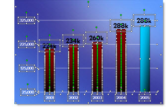
For many projects I find myself ungrouping charts for custom animation or any number of other reasons. But what often happens is there is need to adjust the chart… oops it is now 50+ individual text boxes and autoshapes.

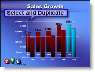
My solution is before I break apart a chart is to create a duplicate it.

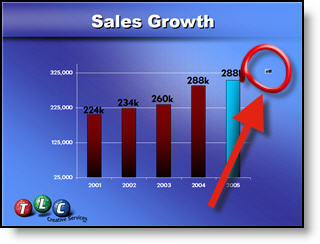
Then shrink the duplicate to a miniature size.

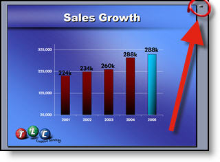
I then move the miniature version off the slide so it is not seen during a slide show (or I have also ‘hidden’ it under another graphic).

Now I can ungroup the chart on the slide and do whatever the special needs are – and still have a backup option should the data need to be adjusted.

– Troy @ TLC

This is from our Look Back series, rediscovering previous blog posts with relevant PowerPoint tips, tricks and examples. The original post from November 3rd, 2008 can be viewed here.

By |2025-06-26T08:16:13-07:00April 4th, 2025|PowerPoint, Tutorial|

Wait, PowerPoint Can Embed Fonts?

PowerPoint can embed fonts! On the surface this sounds like an amazing idea, especially when it comes to sharing presentations among multiple people. However, there are plenty of downsides that make this feature something that the TLC Creative team avoids.  But if you’re looking to embed fonts into a PowerPoint file, here’s how:

  • First, if the fonts used are Microsoft fonts, these do not need to be embedded as they will automatically download and dynamically install when the presentation is opened.
  • Open the presentation in PowerPoint
  • Navigate to File > Options > Save
  • Near the bottom, is EMBED FONTS IN THE FILE checkbox. After checking, there are two options for embedding the fonts.

  1. Embedding only the characters used in the presentation – best for reducing file size (there is not a lot of file size in fonts, so this is not our recommendation).
  2. Embed all characters – best for editing by other people (this is the better – and obvious – choice).

Select an embed option, save the presentation, and the fonts would be baked into the file itself.

SOUNDS GREAT – BUT…

Before deciding to embed a custom font, it’s best to check its licensing restrictions as some fonts won’t allow embedding.

  • To verify, go to your system fonts folder (often C:\WINDOWS\FONTS)
  • Right-click the font, select Properties, then Details
  • Look for the embeddability value:
    • Installable or Editable: Embedding allowed
    • Preview/Print or Restricted: Embedding not allowed

There’s also other downsides of Embedded Fonts:

  • They can bloat file size
  • May cause editing issues
  • Have limited cross-platform support
  • Risk potential corruption

Best Practices:

  • Use System or Microsoft Standard/Cloud fonts for maximum compatibility
  • If necessary, share custom fonts with viewers (check license allowances)
  • Google Fonts are all embeddable (see “How to Use Google Fonts in PowerPoint” post)
By |2025-02-10T10:23:21-08:00March 26th, 2025|PowerPoint, Tutorial|

How to Use – and install – a Custom Font for PowerPoint

Custom fonts are tricky, because PowerPoint needs them installed on the computer to accurately display text with the custom font. However, Microsoft PowerPoint does not tell us if a font is missing on that computer, and “helps” us by swapping the missing font with a Microsoft font, which may or may not (and usually does not) keep the slide formatting as intended. Often, we are left looking at slides wondering why the text is jumbled and wrong… with a puzzle, a missing piece is obvious. With PowerPoint, the user needs to first on their own identify the piece is missing, then work on fixing the issue.

Once you know custom fonts are needed and missing, the solution is to install the custom font(s) on the computer, so PowerPoint slides display as they were designed.

Here’s a quick how-to for adding custom fonts to PowerPoint, with two notes:

  1. these steps are for Windows computers. Mac users have a similar process (using the default FontBook app).
  2. These steps assume you have know what custom fonts are needed, and have the font files on the computer (SlideWise is a great third party app for auditing a presentation and knowing what fonts are used on the slides).

The process is easy on Windows computers. First close the PowerPoint app. In File Explorer, right-click the font(s) and select “Install”. Done. The font will be added to the computer’s font folder (c: > Windows > Fonts).

It’s important to note that if you have PowerPoint open when you install the font, it will not show up in the font dropdown menu. Simply close and restart the application. Don’t just close and reopen the presentation; the entire app needs to be closed and then restarted. When launching PowerPoint includes all installed custom fonts in the font library dropdown menu (same for Word, Excel, etc.).

Troy @ TLC

By |2025-03-14T08:55:42-07:00March 10th, 2025|PowerPoint, Tutorial|
Go to Top