Here’s Why You Should Probably Check Your Internet Plan (A Real‑World IT Story)
Hello! I’m Eddie, the IT Manager here at TLC Creative Services, Inc. In the design studio, there’s always plenty to keep me busy. Whether it’s maintaining the staff computers (over 35 high‑performance presentation show computers), managing our onsite servers, or keeping our entire Microsoft 365 ecosystem running smoothly. On top of that, most of our design team works remotely, so I handle a lot of VPN‑related support and remote access procedures.
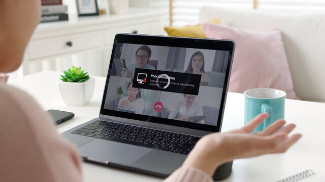
Recently, one of our remote designers reached out with an issue: their VPN connection to the Studio kept dropping.
Time to investigate.
The Unexpected Culprit
I connected to their machine using our remote support tools and quickly noticed something strange—their connection speeds were painfully slow. After gathering a bit more info, the truth came out:
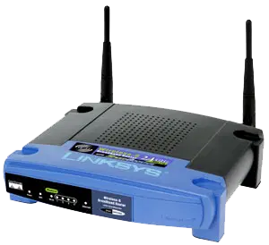
Their home router was over 10 years old, and worse, they were still on a 100/100 Mbps fiber plan.
For today’s workflows (large design files, real‑time cloud syncing, video calls) that speed is extremely outdated. To put it into perspective: most modern providers offer ten to twenty times that bandwidth as their entry-level plans.
Since I’ve worked with this designer’s ISP many times over the years, I already had a good sense of the current offers and price points. After a little digging, I found something surprising… and exciting.
A Huge Upgrade for Almost No Additional Cost
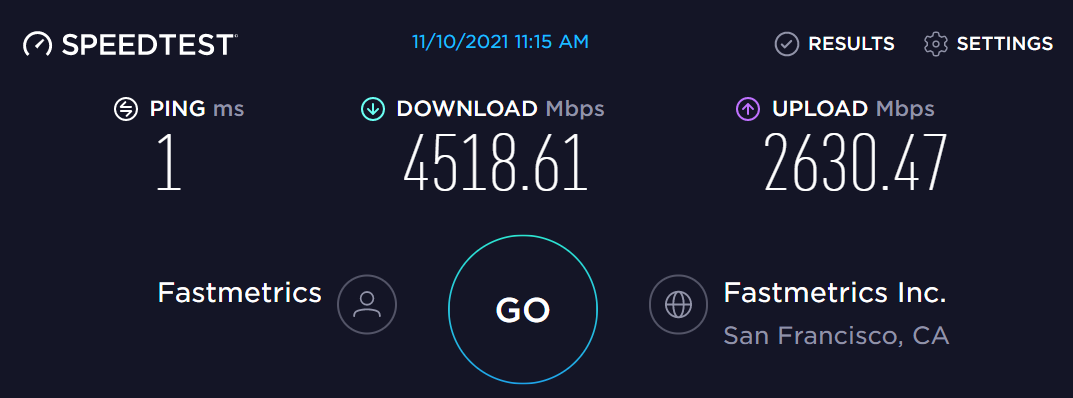
I walked the designer through a quick chat session with their ISP, helping frame the right questions and watching out for the usual sales tactics. In the end, we secured a new 2000/2000 Mbps fiber plan, a brand‑new WiFi 7 router, and only $10 more per month!
Yes, nearly 20× the speed and bandwidth for about the same price!
Immediately after setup, their VPN connection stabilized, file transfers sped up dramatically, and their entire workflow became far smoother.
Why This Happens More Often Than You Think
With more than a decade in enterprise IT, I’ve noticed a recurring issue: people upgrade their phones, laptops, and apps—but completely forget about their internet plan and hardware. Internet providers love to advertise things like “Price Lock for 12 Months!”, but here’s the catch:
- They almost never reach back out when:
- New speeds become available
- Prices drop
- Infrastructure upgrades hit your neighborhood
This leads to thousands of people (and many businesses) paying yesterday’s price for yesterday’s speeds without realizing better options exist.
My Recommendation
If you haven’t checked your home, or business, internet plan in 2–3 years, it’s probably time.
- Look up your provider’s latest speeds and prices
- Compare your current plan to today’s offerings
- Check whether your router or modem is more than 4 years old
- Ask about fiber upgrades or promotional pricing
If newer speeds are available in your area, you can usually move to them, often for the same price or close to it. Who knows? You might find an upgrade as dramatic as our designer did!
By Eddie Prieboy, IT Manager at TLC Creative Services