Creating the Theme Logo (3)
Hey this is good stuff! But after some more discussion it was back to Illustrator and PhotoShop for a few more options – so when do I get busy working on those presentations…
![]()
– Troy @ TLC
Hey this is good stuff! But after some more discussion it was back to Illustrator and PhotoShop for a few more options – so when do I get busy working on those presentations…
![]()
– Troy @ TLC
After some discussion regarding colors and use of logo (to include presentation template, event signage and print pieces), it was back to the drawing board for a few more ideas:
![]()
– Troy @ TLC
So on this project I was given the theme text, “The Ride of Your Life”, and the visual direction. From there it was up to me to select color scheme, graphics, etc.
Here are the first two logo concepts:
![]()
– Troy @ TLC
A recent project had me reminiscing about my childhood. This “presentation” was basically very large wall art to accompany the event theme. Remember doing Spin Art projects…
Using some graphics designed in Illustrator (vector based, exported as .EMF’s, and imported into PowerPoint) and some creative animation I recreated these red spin art elements.
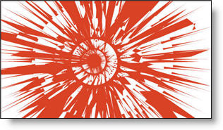
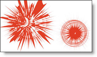
Full presentation had several different spin art elements and was a 9 minute loop. Happily, the SpinArt was a huge success and spun all night long!
To see a quick movie of two of the spin art elements animation click here.
– Troy @ TLC
To add the rounded corners to the table I just cheated a bit…
First I set the upper-left and lower-right cells to no fill (note the text in the upper-left is now the same color as the background and cannot be seen).
Second I created two rounded corner autoshapes. Each filled with same color as the table background and sent to back. I then positioned them to align with the edges of the table.
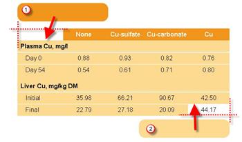
Finally I grouped all three elements so they could easily be moved. The final result is a table with two rounded corners.

– Troy @ TLC
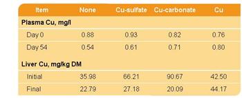
Tables contain lots of data – but often they do not blend with a presentations overall color scheme or design cues. Here is one example from a recent project that incorporated both the color scheme and design elements.
Color Scheme:
I filled the header bar with same color used for the bullets, bold text, and slide title area. The body of the table is filled with the presentation secondary color that was used throughout on several elements.
Design Cues:
The upper-left and lower-right feature rounded corners. Circles and rounded corners where a major design element throughout the presentation.
Up Next: How the rounded corners where created.
– Troy @ TLC
The final element was to create a placeholder for the financial information. I added another custom fill autoshape, this time a rectangle. After sized it was ‘sent to back’ and the appropriate text was added.
If you would like to download this slide, click here.
– Troy @ TLC
Here is the finalized background with the title area drop shadow.

Click here to download PowerPoint file.
For virtually all presentations I develop the custom background art and elements in Photoshop. But with creative use of the available tools in PowerPoint, some great effects can be achieved!
– Troy @ TLC
On a recent project the specs were to develop a visually dynamic presentation, but maintain an extremely small files size (goal = under 2MB for 75-100 slides – with images!).
The first place was to begin with the template backgrounds. Because native autoshapes are vector based, they have the smallest files size – especially when needed as full screen images.
Here is the content slide developed using just autoshapes:
Over the next few posts we’ll build the background one autoshape at a time.
– Troy @ TLC
On this slide the elements where nice high-resolution images. But they blend together and do not have a strong sense of balance.

The presentation I was working on involved converting all to a 16×9, widescreen, format. Having the extra space was great for this slide, allowing me to keep the images large. From a design perspective each had a black stroke applied to keep it from blending into the background, they were made equal size with the other elements on its row, the left and right elements were aligned with one another and all were equally distributed (horizontally). The overall goal was to help the images stand out as individual elements and be presented in a visually balanced layout – here is the slide developed:
– Troy @ TLC