PowerPoint

Quotes and Full Frame Images

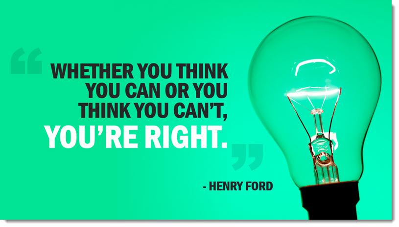
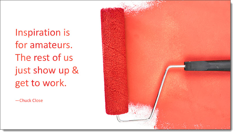
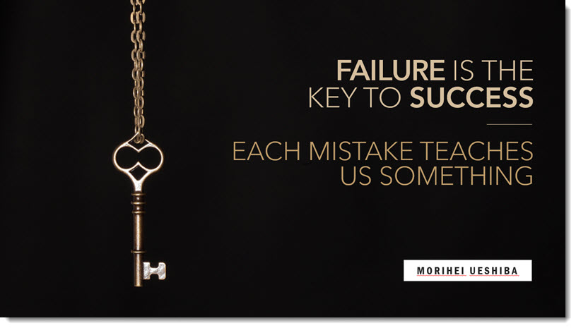
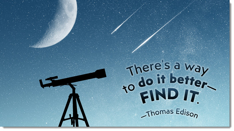
I am wrapping up this series on slide layout ideas for Quotes and PowerPoint formatting tips with a set of slide layouts created by several designers on the TLC Creative Services team. They all share the concept of using an image that provides an open, focal point area for the quote text to be positioned.

This does not mean each image was ready to use when downloaded. Most were sized, cropped, and positioned to fit the slide. All were cropped to have a focal point area for the quote text. All also used PowerPoint typography for the text.

Troy @ TLC

By |2021-08-22T11:43:06-07:00September 3rd, 2021|PowerPoint|

Quotes and Curved Text

Thank you to Kelli Willcoxson for the inspiration slide.

Design Process:

  • Find an image to support the quote
  • Size, position and crop the image to create a clear area for the quote text
  • Stylize and position the quote text

PowerPoint Formatting Tip:

  • This layout has a lot of custom PowerPoint formatting applied to the text. Easy to do in Adobe Illustrator, a bit harder in PowerPoint.
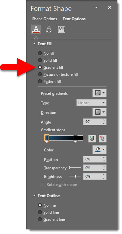
  • The text is filled with a gradient giving it a subtle blending effect with the background
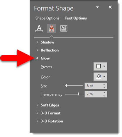
  • The text also has a subtle glow effect applied, making it seem to glow like the stars in the background
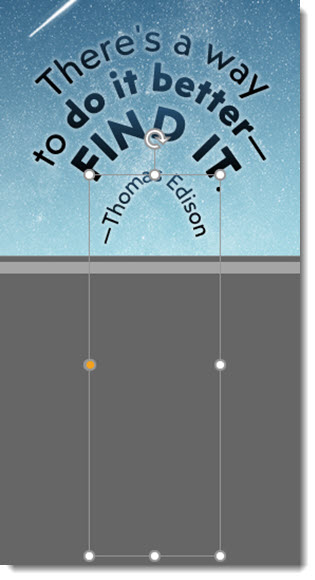
  • But most impressive, and difficult, is the text has a curved layout – using PowerPoint options, and remains 100% editable!
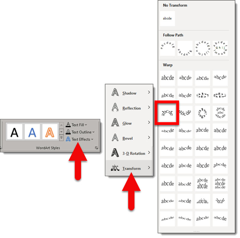
    – Applying the curve effect is a hidden feature in PowerPoint
    – Select the text > go the SHAPE FORMAT tab > go to the WORDART STYLES section of the ribbon > click TEXT EFFECTS > click TRANSFORM (I believe this is the only way to access the text transform feature in PowerPoint) > select a WARP effect, the curve down effect was selected for this slide layout
  • Note: the text warp effect has no interface adjustments, but it is adjustable.
    – By stretching and adjusting the text box the warp changes. As example, make the text box very tall and thin and the curve becomes more pronounced

    – All warp effects have an adjust node, the yellow dot. Sometimes the adjustment is helpful, other times… well, it is obvious we are not using Adobe Illustrator with its greater control options 🙂

Download the editable version of this slide HERE.

Troy @ TLC

By |2021-08-22T11:37:27-07:00September 1st, 2021|PowerPoint, Tutorial|

Quotes with an Overlay Block

Thanks to … for this post’s inspiration slide.

Design Process

  • Locate an image that coordinates with the quote
  • Create a color scheme for the slide (tip: download the editable version of this slide with the link below and look for the awesome image transparency trick!)
  • Create a semi-transparent PowerPoint shape for the quote text
  • Format the quote and attribution text in the PowerPoint shape (no layered text boxes to keep aligned!)
  • Add the quote marks as separate text boxes (okay, not everything can always be formatted in a single text box)

Formatting Tip

  • The text overlay block has transparency so the image can be seen through it, creating a smooth flowing layout
  • Here is the same overlay block on another background to better see its transparency
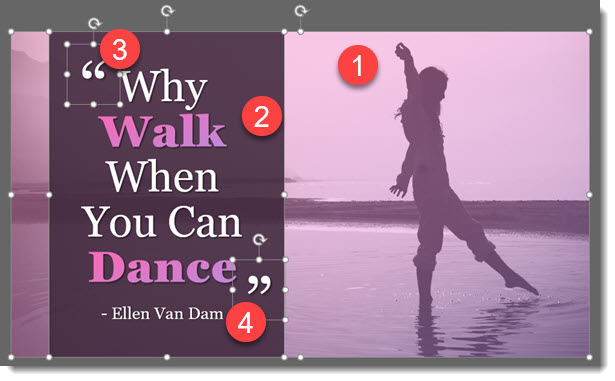
  • 1 – The image was cropped from the larger original and created the open area for the quote
    2 – The text box has a fill and set to 10% transparency, AND all text is in the single text box
    3-4 – The quote marks are editable text, but are layered on top as separate text boxes to make the unique line spacing and positioning possible

Download the editable version of this slide HERE.

Troy @ TLC

By |2021-08-22T11:13:39-07:00August 30th, 2021|PowerPoint, Tutorial|

Quotes – Rotate the Text

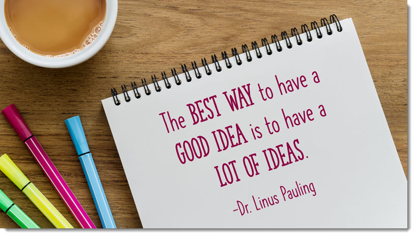
Thanks Kelli (who has moved to another great design job – great for Kelli, sad for TLC Creative) for today’s quote inspiration.

Design Process:

  • This slide started with finding a great image, then researching a quote to use with the image
  • The original image showed more, and it was cropped in PowerPoint to create the layout
  • Typeset the text, select the font, set the size, adjust the line spacing, set the color (pulled from the pink pen in the image)

Formatting Tip:

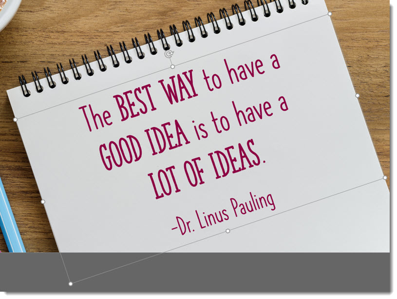
  • Use PowerPoint’s ability to rotate shapes and text boxes
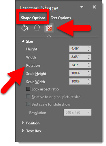
  • Adjust the angle of any text box by click-and-dragging the rotate icon at the top of the text box, or manually in the FORMAT SHAPE dialog

Troy @ TLC

By |2021-08-22T11:01:44-07:00August 27th, 2021|PowerPoint, Tutorial|

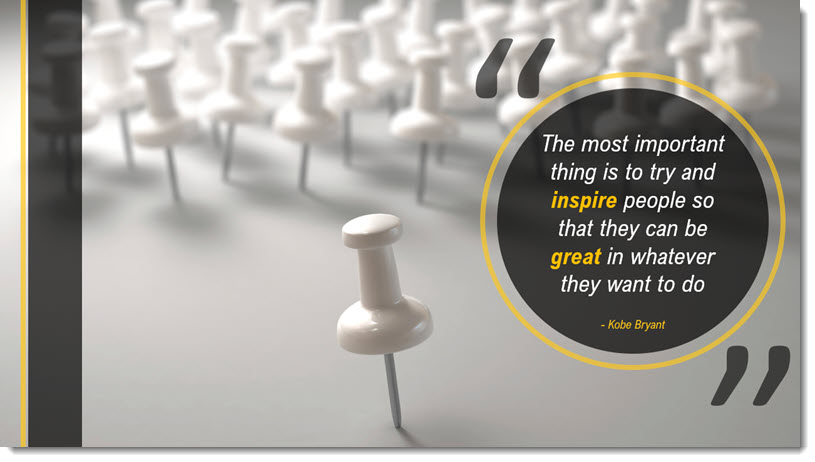
Quotes in a Circle

Thanks to Jake on our design team for today’s slide design.

Design Process:

  • Review the quote
  • Search for an image that aligns with the quote
  • Develop a slide layout that highlights the quote as the focal point, integrates the coordinating image, and use PowerPoint shapes to create accent graphics

PowerPoint Formatting Tip:

  • Text in circles is not always easy!
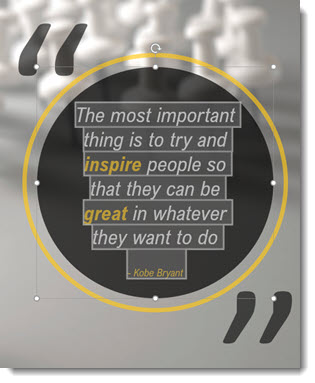
  • For the slide quote, all text is inside the circle shape (not a second text box placed on top of the circle). All text is in a single text block. So the bold text, colored text and the smaller attribution text is all formatted in the same text block.
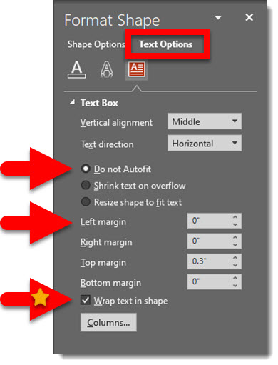
  • Formatting text in a circle requires making some adjustments to the shape formatting properties.
    – Right-click the circle and select FORMAT SHAPE
    – Go to the TEXT OPTIONS and TEXT BOX options
    – [Personal preference] Select “DO NOT AUTOFIT”
    – Adjust all margins to zero’s (although for this example the top margin was manually set to compensate for the smaller font size text at the bottom and keep the layout vertically centered in the circle shape)
    – WRAP TEXT IN SHAPE: this is generally turned on, so the text automatically stays inside the circle. But if the text needs to be just a bit closer the edge, maybe even slightly overlapping the edge, turn this off and use SHIFT+RETURNs to manually create the line breaks

Troy @ TLC

By |2021-08-22T10:54:21-07:00August 25th, 2021|PowerPoint, Tutorial|

“Rounded” is the New Look

With the Microsoft new office look, there is a generous use of rounded corners, which Microsoft labels “Soft Corners.” But is this good for presentation design?

As example, all four corners of the Ribbon, and in my setup the top of the Ribbon and bottom of my QAT because it is positioned below the ribbon, have a subtle rounded corner styling.

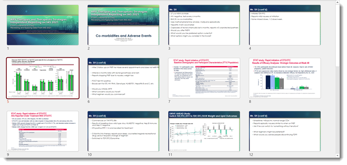
In edit view, the left film strip slide sorter has been changed so all slides have a subtle rounded corner design. Very mobile app and social media inspired. The actual work slide area maintains the full rectangle shape.

New is not always better. Are rounded corners on the slide sorter better? While I appreciate the creativity the Dev team has implemented, I am voting that this update can impact visual reference of the slide design. As example, this presentation in the full slide sorter view – which also has the rounded corner styling applied.

The template, developed here by the TLC Creative design team, has a very linear styling. These newly introduced rounded corners to the slide preview add to, alter, and impact the viewer interpretation of that design. In addition to cutting out (small) portions of the content at each corner. For reference, here is the Title slide layout in full (rectangle) view. I feel the above slide sorter view of the slides and this full slide have very different design aesthetics, even though they are the same slides.

That’s it, just an observation. As an end user we cannot turn off this new view, it is what PowerPoint gives us. The Microsoft PowerPoint team has already received lots of feedback on this aspect of the new Office look and I am hopeful that this specific update revert to the more practical slide shape is what is represented everywhere.

Troy @ TLC

By |2021-07-21T16:21:24-07:00July 28th, 2021|PowerPoint|

My QAT is All Words! Give Me Back My Icons!

Part of the New Office look are some improvements to the QAT. But in the excitement to showcase what is new, Microsoft steps on our customized settings and alters the QAT for those users that rely on it. Aside from the initial shock of my QAT becoming virtually useless, there are good improvements.

So here is my standard QAT; 37 curated action icons set in specific groupings and order that enable the TLC design team to work faster and more efficient in PowerPoint. The QAT on all TLC design computers is positioned below the ribbon.

After the New Office Look update, my QAT looked like this. 12 icons + the word description of those action items. This rendering my QAT, and my workflow virtually useless.

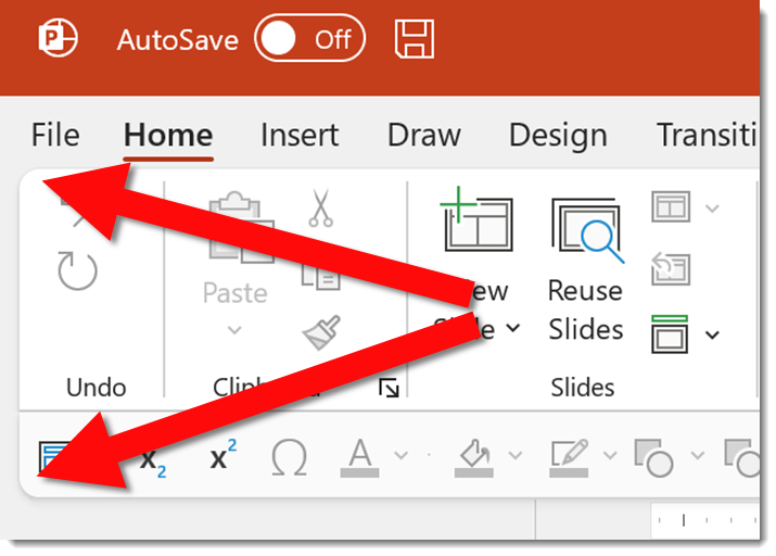
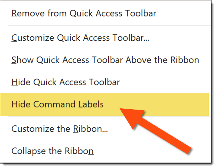
It took some looking. Here is the action item you want to know and do. Find an open space on the QAT between the left most icon and the right most icon. Right click to bring up the QAT right-click options menu (it will most likely take several attempts). I am sure this menu is accessible in another location, but I have not found it yet.

The important new addition is the HIDE COMMAND LABELS option. Click it and your QAT will return to the efficient icon layout and presentation work can return to normal.

Troy @ TLC

By |2024-11-22T11:55:04-08:00July 26th, 2021|PowerPoint|

Microsoft Office Apps have a “New” Look

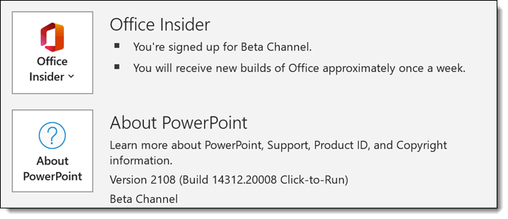
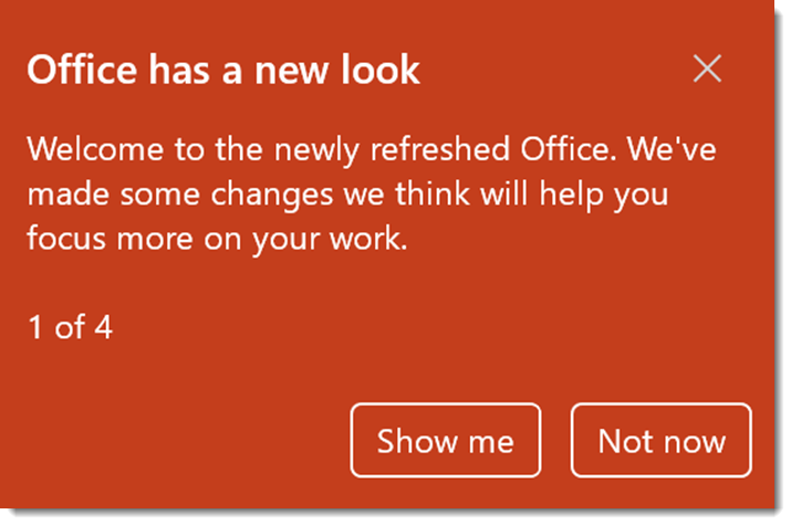
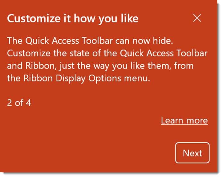
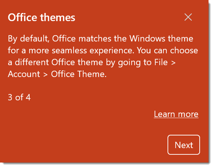
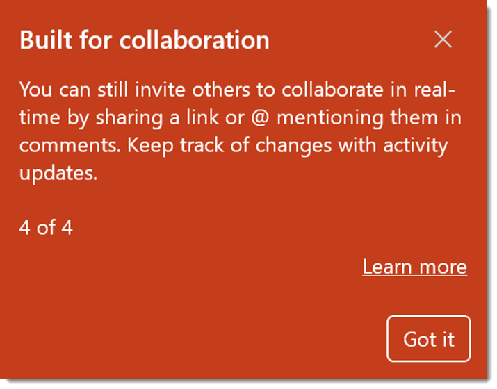
Microsoft has started rolling out the “new Office look”. On my test computer, running the Office Insider, Beta Channel build the “new” Office look was updated last week. So, all builds of Office 365 should see this in their updates within the next few weeks.

If you clicked the “not now” message to the mini info tour of what the new Office look is all about, here are the 4 information screens – when clicking “Show Me”.

Troy @ TLC

By |2021-07-21T16:13:43-07:00July 23rd, 2021|PowerPoint|

What is the Salary of a Presentation Designer?

This episode on The Presentation Podcast Troy, Nolan and Sandy to talk money. They are joined by Bethany Auck, President of the Presentation Guild, to talk about the “2021 State of the Industry and Salary Survey Report.” The report is full of great data collected specifically about compensation of presentation professionals and we will tell you how to get a copy of it for free!

Listen to episdode 130 through you favorite podcast app or on The Presentation Podcast website here.

By |2021-07-20T07:56:23-07:00July 20th, 2021|PowerPoint|

.TTF vs .TTC Fonts and PowerPoint for the Web

Our design team recently noted a problem with a template project we were developing. Having a problem with PowerPoint is unfortunately part of the design process, it is part of “working within the limitations of PowerPoint.” But this problem was not making sense. After lots of internal troubleshooting, I started an email conversation with Microsoft Dev and Product Managers about it. This led to discovering something new. Unfortunately, the discovery did not fix the problem, and it led to discovering what Microsoft shows as working, does not – ugh!
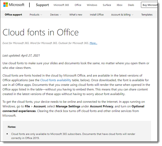
So, here’s the deal, PowerPoint is really, really bad at helping users with font management. One glimmer of positive news is Microsoft’s investment in Cloud Fonts. These are fonts that Microsoft owns (or owns usage rights to), that Microsoft applications recognize, and if a font is not installed on your computer, it is automatically downloaded, installed and the document updates to display the correct font. We call these “Microsoft Safe Fonts” and encourage clients to stay within this set of fonts so everyone knows everyone will see the same thing.

I am going to avoid going into all the ways MS Office fails to manage, help or inform users if a non-standard font is not available when a presentation is opened – or this will become a very long, very negative rant. I am going to stick to Microsoft Cloud Fonts, because these are the good thing, but also the bad. Microsoft has a webpage, Clouds Fonts in Office, with information about what Cloud Fonts are and a list of every cloud font available (go to the page here). It is also fairly up to date showing as of this post, it was last revised just a few months ago on April 27, 2021.
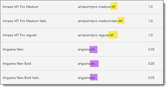
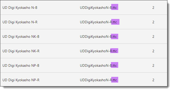
Expand the “Cloud Fonts List” and it is (now) important to note there are two file formats for the fonts. They are either .TTF or .TTC. On the technical side, .TTF is “true type font” which is a mainstay in the font file format options. .TTC is “True Type Collection” and less used. But it should be used more because it is on the technology side of things, a great option. The “collection” part of the True Type Collection format means it can have several variations of a font in a single file vs. needing to manage multiple files, one for each variation. On the image below, left is the font name, middle the file name with file type extension, and right is the version number of that file.
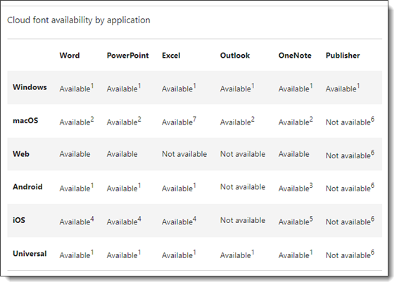
Expand the “Cloud Font Availability by Application” section and there is a nice, organized cross reference of what devices and versions of PowerPoint will work with what (note: it is wrong, we will get to that shortly).
For TLC Creative Services we have studied this information in detail, and I have had the opportunity to interact directly with the Microsoft developers asking clarifying questions. I feel I have a particularly good understanding of fonts on the technical side (hey, years of print design and production makes you obsess over fonts), and a very good understanding of how Microsoft applications, especially PowerPoint, are setup to work with fonts – including where they do not work (that list is much longer than what does work). So when one of our design team emails me saying there is a font display problem, I am prepared to address it and find a work around.
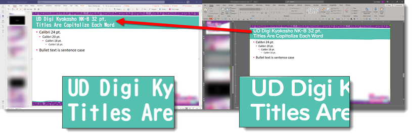
This is same PowerPoint template open in two different versions of PowerPoint. The slide title font is clearly not displaying the same. The immediate questions are; is this a custom font that is not installed on one device? Are we sure this is a Microsoft safe font (eg. font listed on the Microsoft Cloud Fonts in Office web page)? What are the devices? Are both connected to the internet (a cloud font cannot download and install if there is no internet available)? And many other questions to go down the list of potential problems.

This is the same presentation template file open on the same computer, each on a separate monitor, each in a different PowerPoint application. The left image is the file open in Microsoft Teams (aka PowerPoint for the Web). The right part of the image is the file open in the Windows Desktop version of PowerPoint. So, the availability of the cloud font is the same for both because they are the same file being viewed on the same computer – WHAT IS HAPPENING HERE $#@%!?

Here is where things went even further down, in regard to trust. We now know, because of this accidental discovery, there a HUGE MISSING COMMUNICATION piece from Microsoft. Before I rant any further, one of the internal Microsoft managers did promise that a fix for this is in process. No timeline given to this issue we have all been living with for the past 2-3 (?) years of using Microsoft Cloud Fonts, but I am hopeful this blog post will be outdated and just a timestamp of an old problem soon.

The .TTC file format for fonts is very cool. It allows a single file to hold all of variations of a font. As example, the font being used for slide title text is UD Digi Kyolasho. It has 6 styles, or variations, as it extended font family. With a .TTC, a single file is all that is needed, because it has all 6 variations within it.
Well, it turns out that the .TTC format is to cool for PowerPoint, specifically PowerPoint for the Web (without testing to confirm, I am expanding this to include PowerPoint for Android, IOS and any other version that is not a desktop version). PowerPoint for the Web is unfortunately not able to use those multiple versions of the font in the .TTC file. PowerPoint for the Web can only use the first version of the font family. We would all be okay with this limitation – if we knew about it. The cross reference compatibility chart above makes no mention of .TTC fonts not being supported by PowerPoint for the web and implies they are supported (big oops!).

From our template project, the UD Digi Kyolasho font is a Microsoft Cloud Font. Why the left image (PowerPoint through Microsoft Teams) displayed the N-B variation, which is the correct font family, but wrong version, and the right image (PowerPoint through Desktop PowerPoint) displayed the correct NK-B variation has been a painful journey. We had to explain to the client that the template design will not display the slide title text as expected when viewed in Microsoft Teams or anything other than the desktop PowerPoint app. This is a corporation that has adopted Microsoft Teams and file collaboration as a workflow (Microsoft should be ecstatic!). This is a large corporate client (I am guessing a Microsoft customer with 5000+ seats to Microsoft Office) that trusts us to provide guidance on how best to work with PowerPoint, and they are not excited about Microsoft right now…

I mentioned above that Microsoft said they have a fix in process. This is not a Microsoft only problem. PowerPoint for the Web and other web-based applications cannot fully use .TTC fonts. We can live with another limitation; I just wish Microsoft would have informed everyone of the limitation. The solution that is in process is converting all .TTC fonts to individual .TTF files. When rolled out, the above template will work on all PowerPoint end points, because there will be 6 separate font .TTF files, one for each variation of the UD Digi Kyolasho font. Until I see the font list updated to .TTF files, we are removing .TTC fonts from our “safe fonts” list… ugh!

Troy @ TLC

By |2021-07-11T23:17:22-07:00July 12th, 2021|PowerPoint, Resource/Misc|
Go to Top