A Look Back at Slide Background Design with Text – and a New Background Text Idea!
We are looking back to February 2020 and the post entitled, “Use PowerPoint Text As Part of Background Design”. Click here to view the full 2020 post.
Looking back, I feel this was a pretty simplistic example of a slide design. I know it was inspired by a real client project (and like most of our design work, that project was under an NDA and not able to be directly shared). But I have a new project that incorporates text into the background that I feel is much more dynamic!
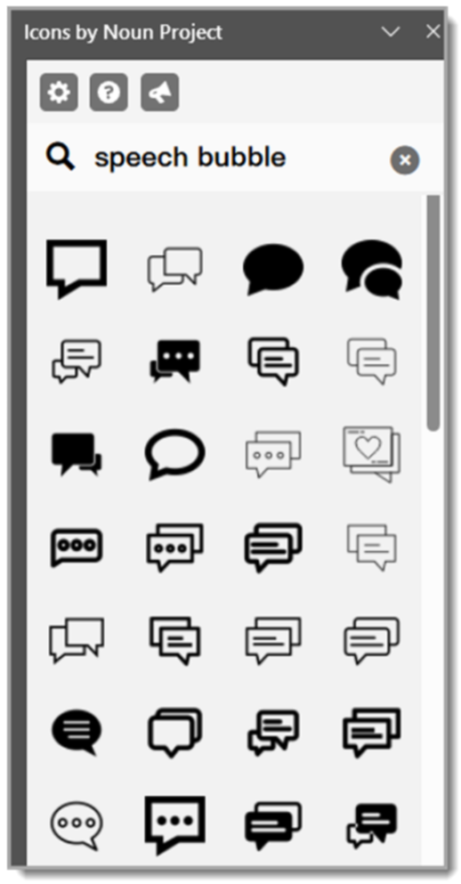
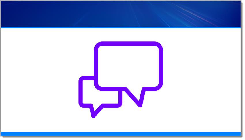
In this new slide design tutorial, we’ll use a speech bubble SVG from The Noun Project and transform it with shadows, bevels, AND a subtle logo texture as part of its background, all for a polished and presentation-ready design element. If you don’t have access to The Noun Project (highly recommended), you can replicate this slide using your own art.
Step 1: Insert and Prepare the SVG
Start by downloading a speech bubble .SVG file from The Noun Project and inserting it onto your slide (I use the PowerPoint add-in, but you can also go to The Noun Project’s website).
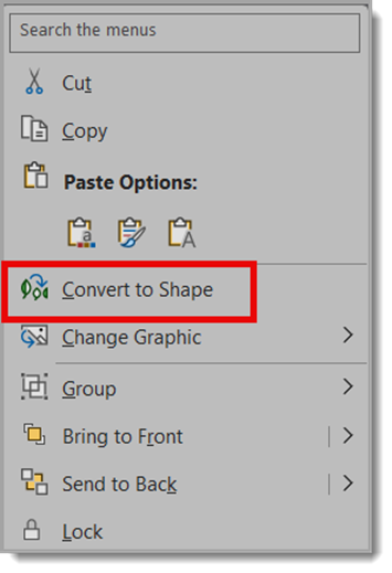
Once placed, right-click and choose Convert to Shape (if needed) so all the PowerPoint style options are available.
Step 2: Add a Drop Shadow
To give the icon a little depth, apply a drop shadow with these settings:
Size: 100%
Blur: 8.5 pt
Angle: 90°
Distance: 1 pt
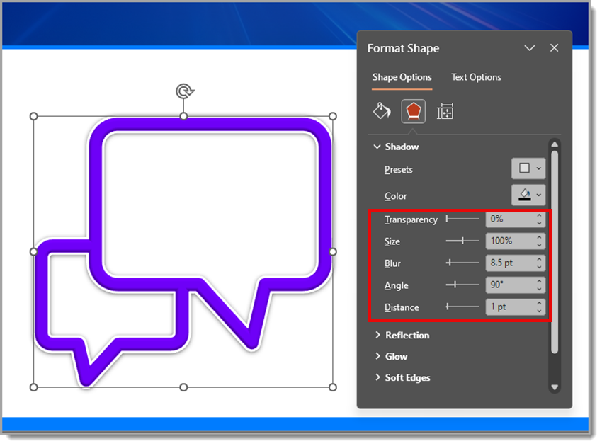
This creates a subtle, soft shadow that lifts the icon just enough off the background.
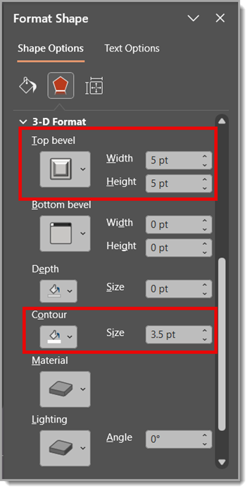
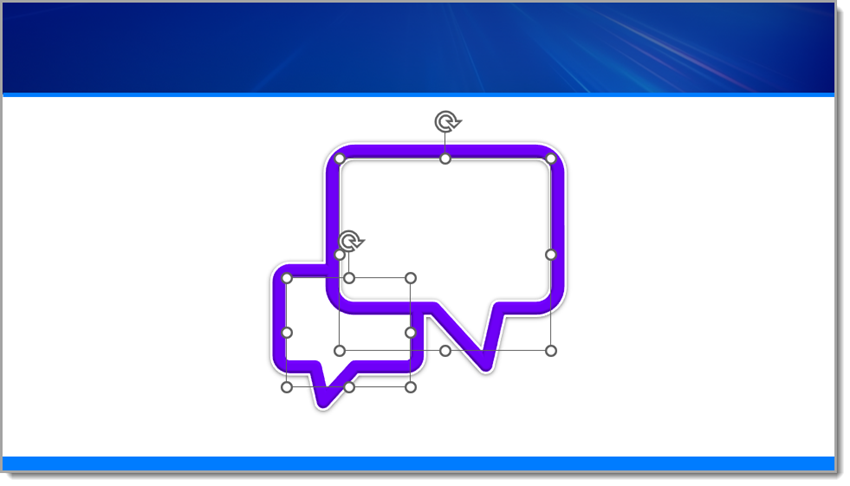
Step 3: Apply a Bevel and Contour
For extra dimension, use a Round Convex bevel:
Width: 5 pt
Height: 5 pt
Then, add a contour set to 3.5 pt. This gives the edges of the speech bubble a nice highlight and makes it feel more 3D.
Step 4: Fill the Speech Bubble with an Image
Next, fill the inner blank area of the speech bubble with an image of the Facebook logo:
Go to Shape Fill > Picture or Texture Fill
Choose the Facebook logo image (this Facebook logo is also sourced from The Noun Project)
Check “Tile picture as texture”
Set Scale X and Scale Y to 5%
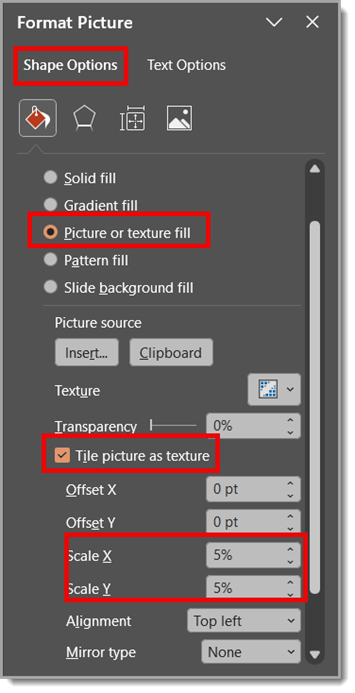
This creates a tiled pattern of the Facebook logo inside the bubble — a cool effect that works well for digital or social media-themed slides.
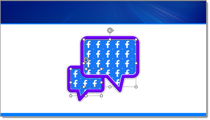
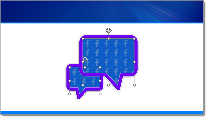
Step 5: Add a Soft Color Overlay
To blend the texture and unify the look, copy and paste the same inner shape directly on top. Then fill it with a solid color and set the transparency to 25%.
This soft overlay mutes the tiled pattern just enough while keeping the detail visible underneath, giving your speech bubble a professional, layered look.
Step 6: Add Text on Top
Now add a text box over the speech bubble and type something like: Add Facebook stat/callout here.
This is where you can highlight a key metric, social media insight, or fun engagement fact to make your design more informative and engaging.

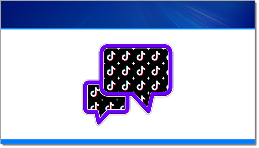
Now, Let’s Repeat the Same Steps Using a TikTok logo.
Repeat the same steps as before, but with one small edit (I sourced the TikTok logo from The Noun Project).
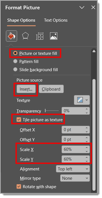
Back to Step 4: Fill the Inner Blank Area of the Speech Bubble with an Image of the TikTok Logo
Go to Shape Fill > Picture or Texture Fill
Choose the TikTok logo image
Check “Tile picture as texture”
Set Scale X and Scale Y to 5%
Note: You may need to adjust the Scale X and Y percentages depending on the size of the logo being used for the repeated texture.
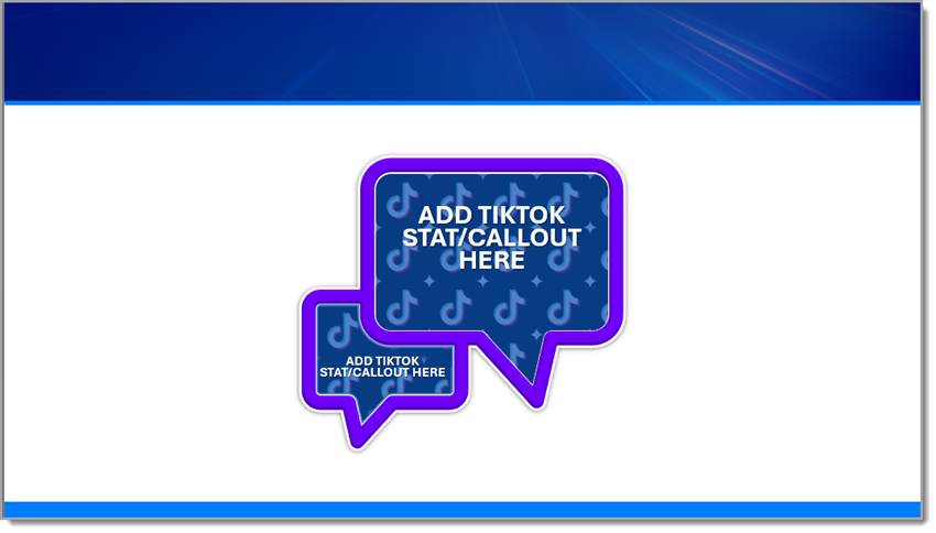
Final Result
The final result is a presentation-ready graphic because all of the design was completed directly in PowerPoint! Not only is the branded and dimensional speech bubble a standout slide element, it’s native to PowerPoint, so it can scale and be edited easily. It’s a great example of mixing vector shapes, styling effects, and rich surface detail – all directly in PowerPoint, no Photoshop required.
Want the final product for yourself? Download the editable TikTok PowerPoint slide HERE!
Hope you enjoyed these examples and design tutorial!
-Christie and the TLC Creative presentation design team