PowerPoint

Many Charts, 1 Legend To Rule Them All!

Presentations are meant to communicate ideas clearly and effectively, but too often, slides are cluttered with redundant elements that distract and hide the information to be conveyed. And as we look at charts this month, we find that they are often full of unneeded visual distraction. But this is a specialty scenario where the slide content with multiple charts creates opportunity to simplify the visual elements.

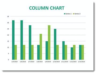
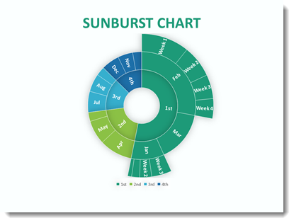
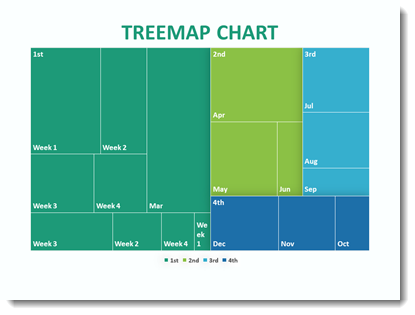
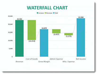
Three Charts: Three Legends

In this presentation, many slides had multiple charts, and each one included its own legend. At first glance, this might seem harmless—after all, each chart needs a legend, right? But in reality, this redundancy forces your audience to process the same information multiple times, making it harder to focus on what actually matters: the data trends and insights.

Our design goal is to remove adds unnecessary visual clutter and enable to audience to process the slide and quickly identify the message. The layout is good. All the charts visually align, accurately display the same Y axis metric, have the same color coding ̶ and have the same legend.

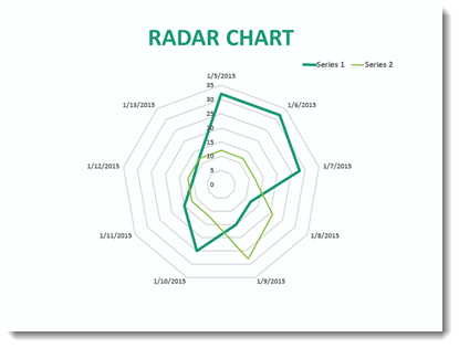
Three Charts: A Unified Legend

Because the legend is identical, instead of repeating it three times, we streamlined the slide by using just one legend beneath all three charts. This simple adjustment immediately reduces the visual clutter and makes it easier for the audience to focus on the data.

We are happy with this “1 Legend To Rule Them All” update. Which was similarly done on many other slides in this presentation. The cognitive load is reduced, and the message comes across quicker and clearer.

Why This Works

  • Improves Readability – A cleaner layout allows the audience to process information faster.
  • Reduces Redundancy – Eliminates unnecessary repetition, keeping attention on the data.
  • Enhances Aesthetics – A well-organized slide looks more professional and engaging.
  • Guides the Audience – With less distraction, viewers can focus on what’s important.
  • Small Tweaks, Big Impact
  • Great slide design isn’t about adding more—it’s about removing what doesn’t serve the message. By centralizing your legend, you create a more effective and visually appealing slide that helps your audience focus on what truly matters: the insights behind your data.

The TLC Creative presentation design team always takes a step back and asks: Are there unnecessary repeating elements? A little decluttering can go a long way in making a slideshow presentation more impactful.

– Christie on the TLC Creative design team

By |2025-06-26T07:55:25-07:00April 30th, 2025|PowerPoint, Tutorial|

Create Charts for Video and Print Projects in PowerPoint – Really!

Charts can be a powerful visual for any presentation to really make a memorable, or easily understandable, point. When you think about colorful bar, line and pie charts, everyone immediately thinks of PowerPoint slides. What about adding charts to a print or video project that is designed in Adobe InDesign or Premiere? While PowerPoint has robust chart and bar graph-building features, most print and video software do not.

InDesign is amazing for layout and print design, but it relies on charts and tables being important elements. The same for Adobe video editing software, Premiere. Charts, tables, and most all elements in a video are designed outside the app and imported.

And this need for externally created charts is where PowerPoint comes in. Whether you’re working on a print layout or editing a video that needs to look polished and professional, PowerPoint is ideal for building visuals that can easily be edited and exported for use in other software.

Step 1: Create a Chart in PowerPoint

All natively created charts in PowerPoint have a mini Excel sheet for the data.

And PowerPoint is truly one of the best tools for creating charts, including the option to use the data and instantly change from a bar chart to pie charts, line graphs, stacked or scatter plot. And all charts use the preset color scheme applied to that slide deck. Update the PowerPoint color scheme and all charts in the slide deck instantly update! It’s easy to style your data with colors, fonts, and labels. And since you’re doing it inside PowerPoint, it’s all very visual.

Step 2: Export the Chart as an Image for Print

Once your chart is sized and styled to what is needed in the print design, export it as an image for use in Adobe InDesign or Illustrator.

1. Click on the chart to select it.

2. Right-click and choose Save as Picture.

3. Choose PNG, which creates a static image of the chart with a transparent background.

4. Or choose SVG to create a static image of the chart that is a full vector format – great for pulling into an Adobe Illustrator project.

5. Import the new file into your InDesign layout like any other image.

The final result is clean and sharp, and you didn’t have to deal with other clunky chart-building tools and work-arounds.

Step 3: Using PowerPoint Charts in Premiere for Video

If you want to include charts in a video project using Adobe Premiere Pro, you’ve got a couple of options.

Option 1: Static chart image

Just like for print, export your chart as a PNG and bring it into Premiere. From here you can animate it with simple scale or opacity transitions to make the chart more visually appealing. But there is a bit more planning in the export process.

Option 2: Animate inside PowerPoint, export as video

PowerPoint has great animation capabilities, including animating charts. One option is to export the slide as a video (eg. 1920×1080 .MP4) to add to the Premiere video project.  In PowerPoint go to File > Export > Create a Video. Choose either an HD or 4K format.

But the exported video will be the full slide, including the background. If the video project needs to add the chart as a composited element with other elements in the video project, the above chart example was exported as a series of 6 PNG images, added to the Premiere project and each PNG animated with Premiere’s entrance effects. Plan the animation, then in PowerPoint duplicate the chart slide, in this scenario 6Xs. Then go through each slide, deleting the elements that are not part of that stage of the animation.

Using PowerPoint as a design tool is not part of video editing training, but as a someone that has created lots and lots of chart elements for successful print design and video projects, PowerPoint is the right tool. Next time a chart is needed as an imported element for a project, PowerPoint is a go to for both great visuals and saving design time.

– Mike, and the TLC Creative Services design team

By |2025-06-26T07:58:00-07:00April 25th, 2025|PowerPoint, Resource/Misc|

F1 Coolness at Almost 8K!

This week I am having a lot of visual fun working on exciting slides like this

The LED wall is almost 8K in resolution and the slides are designed to fill the screen with a custom “Ultrawide” presentation. But as the presentation approached 2GBs it was time to pause on design and manage the content for an optimized file size. I trust the NXPowerlite add-in to optimize images in presentations, and the Slidewise add-in to give me insights into what images are oversize, if there are unneeded master slide layouts and much more.

But working with 8K wide slides poses some issues for letting NXPowerlite optimize images. I created a custom 8K resolution profile, so any image LARGER than the profiles 7,680px wide (aka 8K) will be automatically re-rendered to that resolution. But what about a slide like this where the two images; the F1 logo and the awesome F1 vehicle are not 8K images, and need to be optimized to their on-screen size?

The answer, for me, is a feature that is part of PowerPoint – but not well known. Here is the process:

  • Copy the image (eg. the race car)
  • Use the Thor Hammer add-in to copy the image size and position
  • Delete the image (yes delete!)
  • Use PowerPoint’s Paste Special > as .PNG (or use the “PNG” icon on my QAT)
  • This adds the original image, but at the size it was copied at (eg. an optimized image!). For the F1 car image it originally as a 8.4 MB image (as reported by Slidewise’s image audit). The pasted in optimized .png is 2.8 MB. Same image, at the pixel size needed, so no quality loss, and over 5MB file size reduction!
  • Last, use Thor’s Hammer to position the new image exactly where the original image was

Yes, it is a manual process with a number of clicks. And yes, it took me approximately 10 minutes, but I went a 2GB file to a 1.5GB file with no qualify loss!

Back to creating amazing slide layouts!

Troy @ TLC

By |2025-04-22T22:49:28-07:00April 23rd, 2025|PowerPoint, Tutorial|

The Presentation Podcast talked about Data Viz in 2016

Throughout April The PowerPoint Blog is focused on charts and data viz in PowerPoint. From 2016 is this great conversation about data viz, episode 19 of The Presentation Podcast. It definitely is in line with the blog series and worth a mention and a relisten (or read through of the show notes outline)!

Original blog post announcing the podcast episode is here.

Episode 19 replay is available, with show notes, here.

By |2025-03-29T11:08:34-07:00April 18th, 2025|PowerPoint, Resource/Misc|

The 2016 New Chart Types – A Look Back to February 2016

Looking back through previous posts, I read this one highlighting new chart types introduced to PowerPoint back in 2016 (original post here).

Today, of the 4 chart types introduced in 2016, I cannot recall ever using a Radar chart… and maybe 3-4 times the Treemap chart type. I do recall working on a Sunburst chart and using PowerPoint to create the basic chart, then ungrouping -> converting to shapes -> modifying to the custom styling & sizing needed -> and then producing a fantastic animated series. End result was great, it all started with a native PowerPoint chart. But 4 hours later, it was all custom art elements.

Question: thinking back to 2016, how often do you use these 4 chart types?

How to insert New Chart Types in PowerPoint 2016

New Chart Types where added in PowerPoint 2016. There is bigger news than just some new styles. Microsoft is moving all charting to a new charting engine, and these new charts are coded with this new engine. Eventually, all legacy charts will be ported to the new charting engine, and, fortunately, this is still an in-process engine development (I am certain everyone will encounter a chart limitation depending on their chart data and the way they create charts) – so my take on things is “Yay new charts! But the new charting engine is not fully functional, so some options in the new charts are not fully functional yet.”

The good news is even though only subscription users can create these charts, all versions of PowerPoint (dating back to 2010 and Mac versions) can display chart types – editing and animation is somewhat limited when using previous versions…

Here are 4 of the new chart types currently available (we will continue to see more chart variations added over time, look for another new chart type in the February updates).

Follow these Steps:

Go to INSERT > CHART

New Chart Types in Powerpoint 2016


The Column Bar Chart

A standard Chart.

New Chart Types in Powerpoint 2016

1. Radar Chart

That same data in the Bar Chart can instantly be updated.


New Chart Types in Powerpoint 2016

2. Sunburst Chart

This a great addition to the native PowerPoint chart options vs. going to external charting apps to develop.


New Chart Types in Powerpoint 2016

3. Treemap Chart

This Chart is new to PowerPoint 2016 native chart options.

New Chart Types in Powerpoint 2016

4. Waterfall Chart

This standard Column chart with negative data.

New Chart Types in Powerpoint 2016

-Troy @ TLC

This is from our Look Back series, rediscovering previous blog posts with relevant PowerPoint tips, tricks and examples. The original post from February 17th, 2016 can be viewed here.

By |2025-03-31T14:29:32-07:00April 11th, 2025|PowerPoint|

Is My Chart Too Skinny?

If you’ve ever inserted a bar chart into PowerPoint and thought that the bars look too thin and awkwardly spaced — you’re not alone. The styling solution is available within PowerPoint, let’s walk through adjusting the bar thickness, and reducing that gap between bars.

1: Select Your Chart

Click on the chart to make sure it’s selected. Once it is, you’ll see the Chart Tools menu pop up at the top with two tabs: Design and Format. Along with the Format Data Series option, these are your go-to tabs for making all the visual adjustments you need.

2: Format the Data Series

To start adjusting your chart, right-click on one of the bars and select Format Data Series from the dropdown menu. This will bring up a panel on the right side of your screen, where you’ll find various options for fine-tuning your chart.

3: Adjust the Gap Width

Within the Format Data Series panel, navigate to Series Options. Here, you’ll find the Gap Width slider, which controls the width or height or your bars. Reducing the Gap Width will make the bars skinny. Increasing the Gap fattens them up. This step will also reduce (or increase) the gap between each of the series bars. In the two examples shown, notice the gap in the between the Black Cars and Green Cars. Play with the slider and adjust it based on your preferences.

4: Adjust the Overlap

If you’re working with a clustered bar chart, you might also want to tweak the Series Overlap setting, located just below the Gap Width slider. Increasing the overlap percentage will cause the bars to slightly overlap, while decreasing it will add more separation. A range of 0% to 20% usually works well, but adjust as needed for your design.

5: Fine-Tune and Customize

Once your bars are spaced to your liking, it’s time to add those finishing touches. Experiment with colors, add data labels, or remove gridlines for a cleaner look. You can do all of this from the Chart Elements button or through the Chart Design tab. Little tweaks like these can make a big difference in how professional and polished your chart looks.

Bonus Tip

If your bars still aren’t quite right, try resizing the chart by dragging its edges. Sometimes a wider or taller chart gives those bars the breathing room they need to stand out. Adjusting the size can be an easy fix for better proportions.

And that’s it! Now your bars should look bold, clear, and way more polished. It’s all about finding that sweet spot with the gap width and overlap.

By |2025-03-31T14:31:45-07:00April 9th, 2025|PowerPoint, Tutorial|

Adjust The Chart Size… Inside the Chart Frame!

There is a secret when it comes to PowerPoint charts (bar charts, line charts, pie charts, etc.) The secret is: charts have two elements for sizing; the overall chart element bounding box (or frame), and inside that the chart bounding box.

Keep the chart’s overall size as is, which can be helpful for alignment on a slide, or when multiple charts are on a slide. Click the chart, then click the data to make the inner bounding box active. Resize and position as needed – within the outer bounding box of course!

The same goes for chart and axis titles and legends. Each is resizable and moveable within the overall chart bounding box.

TIP: use the legend preset location options; top, bottom, left, right to adjust all chart elements positions, then fine tune the legend size and position).

The functionality is there. It is finnicky. And now it is no longer a secret, hidden formatting option!

-The TLC Creative design team

By |2025-06-26T08:13:53-07:00April 7th, 2025|PowerPoint, Tutorial|

Chart Tip from 2008 that is Still Relevant Today! – A Look Back to November 2008

TLC Creative’s theme for April is “PowerPoint charts”. And that had me looking way, way back to our past blog posts. Back in 2008 (17 years ago!) this posts contains tips to overcome the common frustration of “I edited the chart, but need the original version.”

The original post from November 3, 2008 is here.

For many projects I find myself ungrouping charts for custom animation or any number of other reasons. But what often happens is there is need to adjust the chart… oops it is now 50+ individual text boxes and autoshapes.

My solution is before I break apart a chart is to create a duplicate it.

Then shrink the duplicate to a miniature size.

I then move the miniature version off the slide so it is not seen during a slide show (or I have also ‘hidden’ it under another graphic).

Now I can ungroup the chart on the slide and do whatever the special needs are – and still have a backup option should the data need to be adjusted.

– Troy @ TLC

This is from our Look Back series, rediscovering previous blog posts with relevant PowerPoint tips, tricks and examples. The original post from November 3rd, 2008 can be viewed here.

By |2025-06-26T08:16:13-07:00April 4th, 2025|PowerPoint, Tutorial|

A Look Back to PowerPoint Kerning in December 2007

Design principles do not change, and text formatting rules, such as Kerning, remain constant. If there is one huge observation the TLC Creative design team all noted, it was that Kerning controls in PowerPoint have not improved in over 15 years! Here is the post from December 2, 2007 that (unfortunately) has the same interface and options in PowerPoint in 2025…

If you have used desktop publishing software you are familiar with the concept of kerning. With (variable width) fonts, different pairs of characters are spaced differently. Kerning is the adjustment of spacing between letters to obtain a more pleasing appearance. The great news is that PowerPoint now has some basic kerning capabilities. Microsoft calls it ‘Character Spacing’ and here is the quick menu.

We can also get more fine control over the Character Spacing by opening the Character Spacing dialog window.

Here are a few examples of kerning in use. The top text is the standard, or normal, kerning. The second one is expanded and the third is condensed. All is still editable text and can be applied to select text within a single text box.

– Troy @ TLC

This is from our Look Back series, rediscovering previous blog posts with relevant PowerPoint tips, tricks and examples. The original post from December 3rd, 2007 can be viewed here.

By |2025-03-31T14:20:33-07:00March 28th, 2025|PowerPoint|

Wait, PowerPoint Can Embed Fonts?

PowerPoint can embed fonts! On the surface this sounds like an amazing idea, especially when it comes to sharing presentations among multiple people. However, there are plenty of downsides that make this feature something that the TLC Creative team avoids.  But if you’re looking to embed fonts into a PowerPoint file, here’s how:

  • First, if the fonts used are Microsoft fonts, these do not need to be embedded as they will automatically download and dynamically install when the presentation is opened.
  • Open the presentation in PowerPoint
  • Navigate to File > Options > Save
  • Near the bottom, is EMBED FONTS IN THE FILE checkbox. After checking, there are two options for embedding the fonts.

  1. Embedding only the characters used in the presentation – best for reducing file size (there is not a lot of file size in fonts, so this is not our recommendation).
  2. Embed all characters – best for editing by other people (this is the better – and obvious – choice).

Select an embed option, save the presentation, and the fonts would be baked into the file itself.

SOUNDS GREAT – BUT…

Before deciding to embed a custom font, it’s best to check its licensing restrictions as some fonts won’t allow embedding.

  • To verify, go to your system fonts folder (often C:\WINDOWS\FONTS)
  • Right-click the font, select Properties, then Details
  • Look for the embeddability value:
    • Installable or Editable: Embedding allowed
    • Preview/Print or Restricted: Embedding not allowed

There’s also other downsides of Embedded Fonts:

  • They can bloat file size
  • May cause editing issues
  • Have limited cross-platform support
  • Risk potential corruption

Best Practices:

  • Use System or Microsoft Standard/Cloud fonts for maximum compatibility
  • If necessary, share custom fonts with viewers (check license allowances)
  • Google Fonts are all embeddable (see “How to Use Google Fonts in PowerPoint” post)
By |2025-02-10T10:23:21-08:00March 26th, 2025|PowerPoint, Tutorial|
Go to Top