Animated Object Goes Opaque (1)
Many of the emphasis animations do not respect the transparent properties of an image – whether it be a .png with alpha channel transparency or an image where PPT ‘Set Transparent Color’ tool was used. In most cases you can use some more advanced animation to create the same effect and not have the opacity problems.
Here is our image. It is a .png image created in Photoshop and it has no background.

But if we apply the TEETER emphasis animation
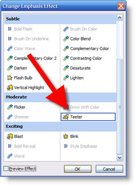
When animated the background changes from transparent to a solid color (blue in this instance)

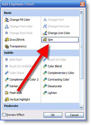
We can create the same effect with some custom settings on the SPIN emphasis animation. So the first step is to apply the SPIN emphasis.
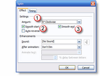
Then go into the animation properties and on the EFFECT tab change:
1. Amount from 360 to 5
2. Turn on Smooth Start
3. Turn on Smooth End
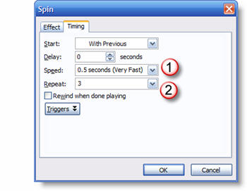
Then in the TIMING tab change:
1. The speed to VERY FAST (or faster)
2. Repeat to 3 times
Now the object will “teeter” and maintain its transparent background!
– Troy @ TLC