MS PowerToys – Find My Mouse
This is the feature that caught my attention about Microsoft PowerToys. It is something I have used while presenting and find it to be a great tool, for presenting, instructing, creating how-to videos and more.
-Troy @ TLC
Microsoft PowerToys and PowerPoint
This is a free set of Windows OS utilities that is put out by Microsoft. I have had these installed for a while and use many of the features and I have a mini-series on some of these great features that work with presenting.
These are FREE for Windows 10 and 11 OS computers. Search “PowerToys” – 1 word – in the Microsoft App Store to install.
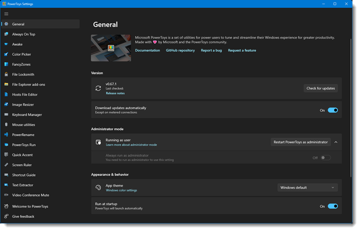
Once installed, all of the tools and features are available. The only parameter is PowerToys needs to be running (on my computers I have MS PowerToys automatically run when the computer starts).
– Troy @ TLC
5 PowerPoint Accessibility Checker Errors
This is fantastic information! Bookmark it, because at some point, we will all be asked to make a presentation that meets accessibility needs. Stephy put this great video on YouTube, and I am listing it here to let everyone know of it, and to keep it as a reference for our team to find it in the future!
Watch the video here: https://www.youtube.com/watch?v=p46jZ0q8blI
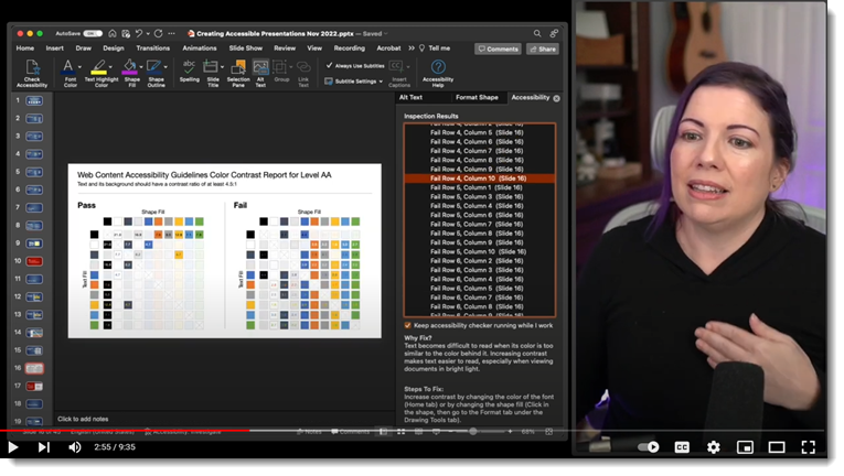
Troy @ TLC
Podcast Release – PowerPoint Tables are Not All Bad
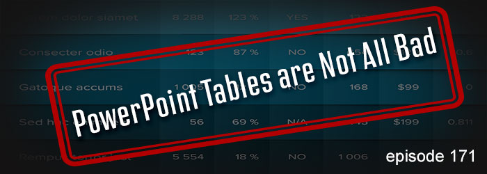
PowerPoint tables – good, not good, and many tips on formatting and presenting tables from Troy, Nolan and Sandy on this episode of The Presentation Podcast. Join the conversation entitled “PowerPoint Tables are Not All Bad” here.
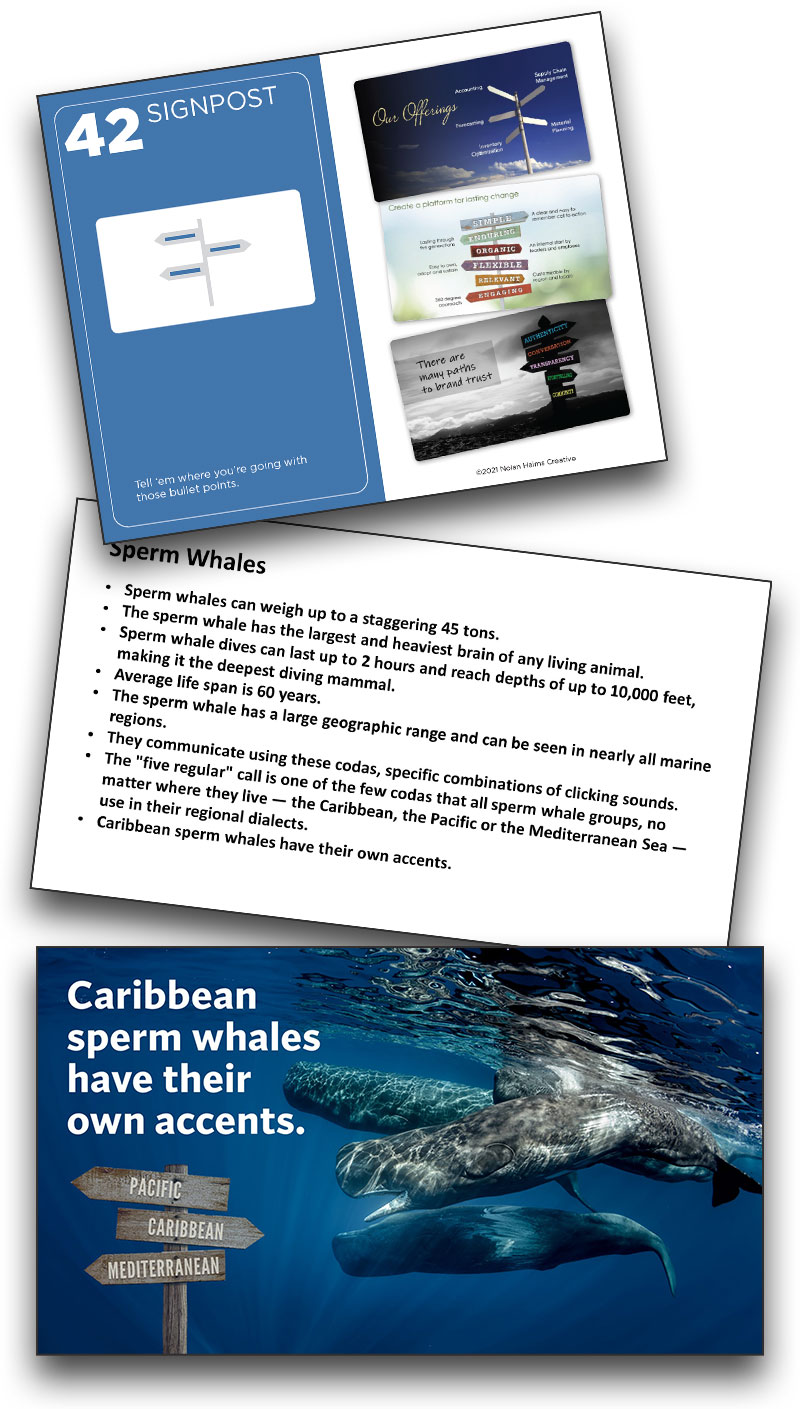
And last, Lori’s Card #42
There were so many more fantastic slide designs that came from this internal project. A big thank you to Nolan Haims and The Better Deck Deck for the inspiration! We started with a slide design from Lori, and we are ending this series with another of the slides that Lori designed – because creativity is on display here! Using card 42 – Signpost, it takes amazing creativity to envision a signpost that not only replaces bulllets as it tells part of the story, but is a signpost underwater!
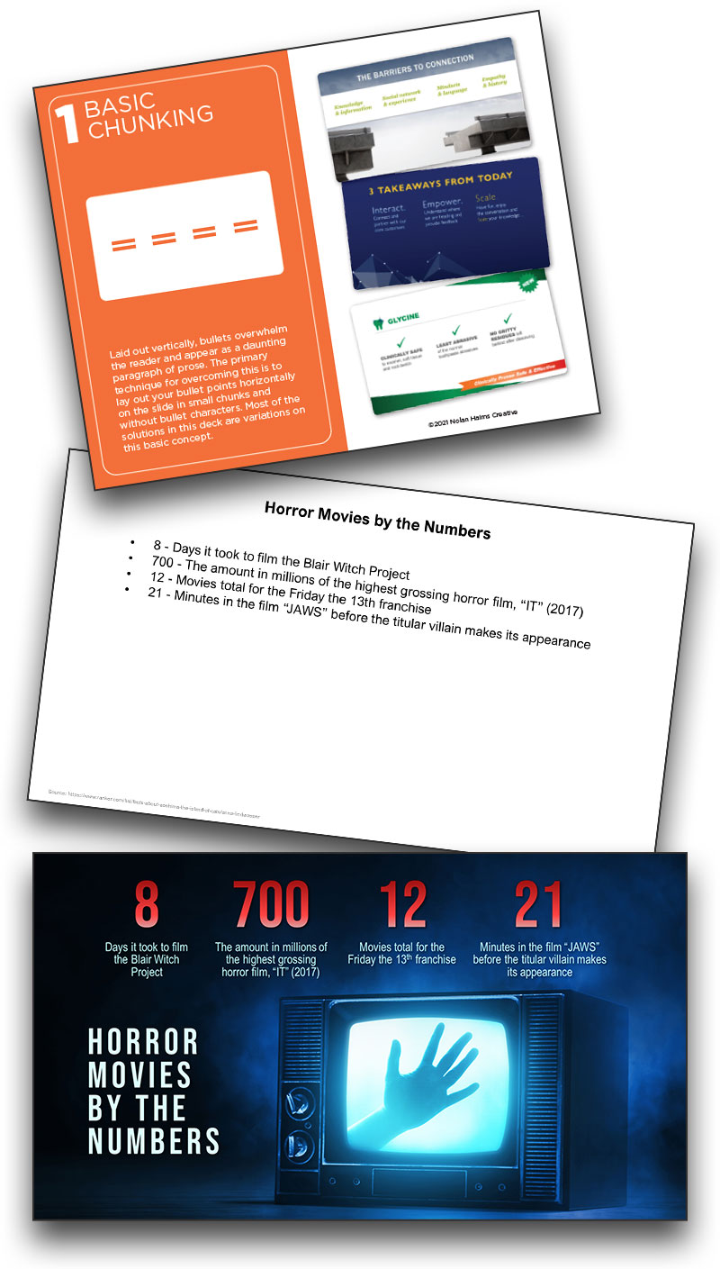
Basic Chunking Can Be Horrifying!
Jake on the TLC Creative design team also drew card #1 – Basic Chunking. The final slide on horror movie info not only converts the bullet points into chunks, but is an amazing visual that creates emotion and a story unto itself.
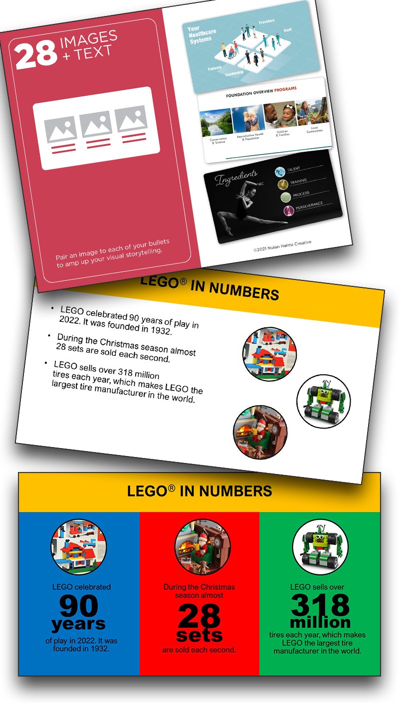
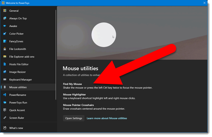
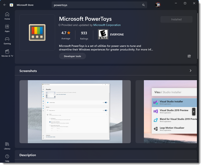
Karen’s Card #28
This slide inspires me on many levels. Karen drew The Better Deck Deck card 28 – Images + Text. The final design integrates the original randomly added images into a slide that uses great typography for the “+ Text” portion of the card, but also integrates the instantly recognizable Lego color scheme in the design!