Let’s Talk About Quotes
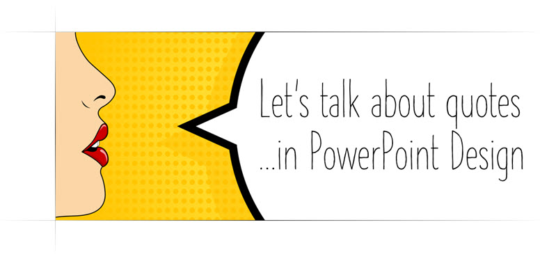
The TLC Creative Services presentation design team created a series of inspiration slides using quotes. The results were great, and we are sharing some of the team’s slides over the next few weeks in a series that will hopefully provide inspiration for slide design and provide PowerPoint layout and text formatting tips. So, as my intro image (composited in PowerPoint and exported as a image) says, “Let’s talk about quotes …in PowerPoint design”.
Troy @ TLC
New Presentation Podcast Episode!
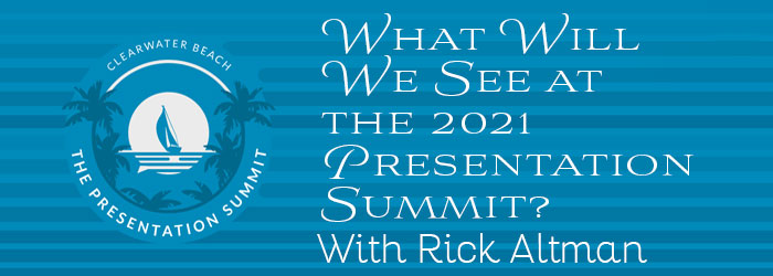
If you know about the Presentation Summit, an annual presentation focused conference, this is a great podcast episode to listen to! Rick Altman, founder and director of the Presentation Podcast, now in its 19th year (!) talks with Troy, Nolan and Sandy about the hybrid attendee plans for this year and gives some insights into the excitement coming to this years event (and a special discount promo code!).
Listen to the podcast episode 132 here.
Color Blindness InDepth
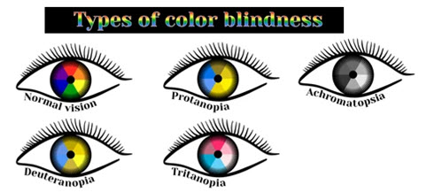
For presentations there is a lot of talk about designing with color blindness in mind. But how much do we know, and understand, color blindness?
[videopack id=”15216″]https://thepowerpointblog.com/wp-content/uploads/2021/08/Rotating-Color-Dots.mp4[/videopack]
I found a nice overview article of color blindness that explains what it is, the types of color blindness (there are 5) and more – all in simple language making it a quick read that I found easy to understand. So, sharing an online resource I found that should be of interest to anyone looking at their slides through the color-blind view.
Article is here.
Troy @ TLC
New Podcast – Everyday Business Storytelling with Janine Kurnoff
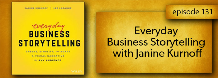
New episode and presentation conversation available today!Once upon a time, finding a book on presentation design was almost non-existent. On this episode we get to spend some time with the co-author of “Everyday Business Storytelling”, one of the latest entries into the presentation space. All three of us; Nolan, Sandy and Troy, read the book, found it full a great information and examples and are excited to have a conversation with Janine Kurnoff about it!
“Rounded” is the New Look
With the Microsoft new office look, there is a generous use of rounded corners, which Microsoft labels “Soft Corners.” But is this good for presentation design?
As example, all four corners of the Ribbon, and in my setup the top of the Ribbon and bottom of my QAT because it is positioned below the ribbon, have a subtle rounded corner styling.
In edit view, the left film strip slide sorter has been changed so all slides have a subtle rounded corner design. Very mobile app and social media inspired. The actual work slide area maintains the full rectangle shape.
New is not always better. Are rounded corners on the slide sorter better? While I appreciate the creativity the Dev team has implemented, I am voting that this update can impact visual reference of the slide design. As example, this presentation in the full slide sorter view – which also has the rounded corner styling applied.
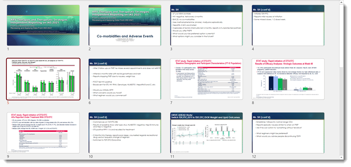
The template, developed here by the TLC Creative design team, has a very linear styling. These newly introduced rounded corners to the slide preview add to, alter, and impact the viewer interpretation of that design. In addition to cutting out (small) portions of the content at each corner. For reference, here is the Title slide layout in full (rectangle) view. I feel the above slide sorter view of the slides and this full slide have very different design aesthetics, even though they are the same slides.

That’s it, just an observation. As an end user we cannot turn off this new view, it is what PowerPoint gives us. The Microsoft PowerPoint team has already received lots of feedback on this aspect of the new Office look and I am hopeful that this specific update revert to the more practical slide shape is what is represented everywhere.
Troy @ TLC
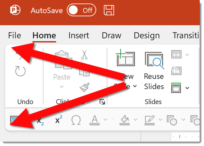
My QAT is All Words! Give Me Back My Icons!
Part of the New Office look are some improvements to the QAT. But in the excitement to showcase what is new, Microsoft steps on our customized settings and alters the QAT for those users that rely on it. Aside from the initial shock of my QAT becoming virtually useless, there are good improvements.
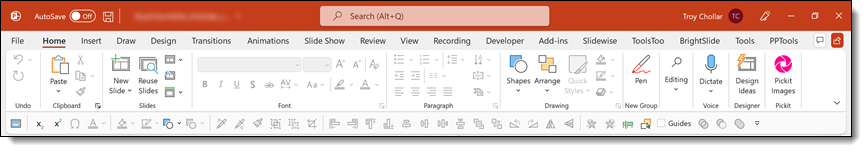
So here is my standard QAT; 37 curated action icons set in specific groupings and order that enable the TLC design team to work faster and more efficient in PowerPoint. The QAT on all TLC design computers is positioned below the ribbon.
After the New Office Look update, my QAT looked like this. 12 icons + the word description of those action items. This rendering my QAT, and my workflow virtually useless.
It took some looking. Here is the action item you want to know and do. Find an open space on the QAT between the left most icon and the right most icon. Right click to bring up the QAT right-click options menu (it will most likely take several attempts). I am sure this menu is accessible in another location, but I have not found it yet.
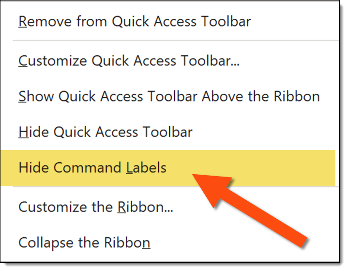
The important new addition is the HIDE COMMAND LABELS option. Click it and your QAT will return to the efficient icon layout and presentation work can return to normal.
Troy @ TLC
Microsoft Office Apps have a “New” Look
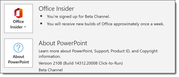
Microsoft has started rolling out the “new Office look”. On my test computer, running the Office Insider, Beta Channel build the “new” Office look was updated last week. So, all builds of Office 365 should see this in their updates within the next few weeks.
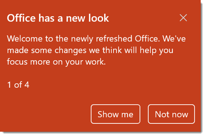
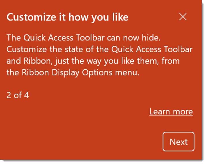
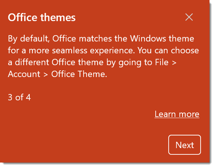
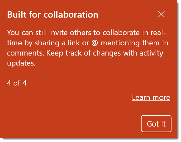
If you clicked the “not now” message to the mini info tour of what the new Office look is all about, here are the 4 information screens – when clicking “Show Me”.
Troy @ TLC