powerpoint

How To Fix The Gap in Text Reflections

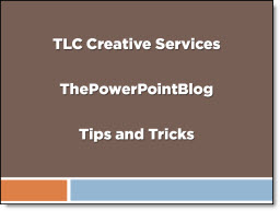
Selective use of the reflection tool for text can make slide layouts very dynamic. But why does the upper text have a gap and the lower text does not?

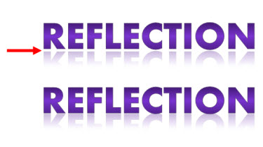
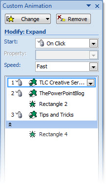
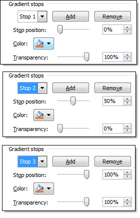
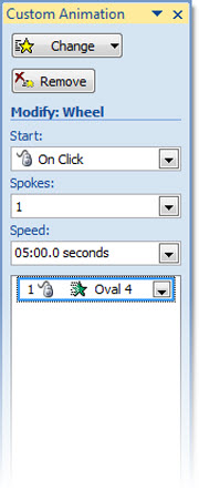
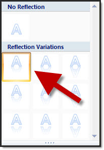
There are 3 preset gap options, but both samples here have the same setting (zero gap).

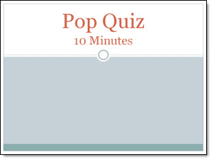
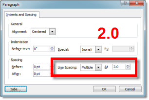
The answer is the line spacing is different. The larger the line spacing the larger the reflection gap – even when set to zero gap option. The top sample has a line spacing of 2.0, which creates a gap:

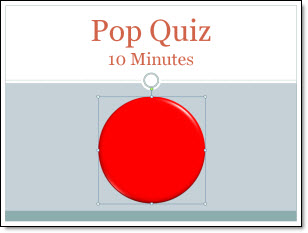
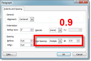
The lower text is setup with a .95 line spacing (note: 1.0, or single spacing, is the zero point for refections):

– Troy @ TLC

By |2016-08-16T11:47:30-07:00April 15th, 2010|Tutorial|

PowerPointMaps.com

This is another option for adding a map to a presentation. Reviewing the PowerPointMaps.com website virtually every country/region is represented.

The site offers 2 types of downloads; free and premium. To download a free version you need to register first. I downloaded a few free maps to review the quality. Unfortunately the free version is unusable as it is a flat .jpg image with the website name watermarked across the middle. Here is one of my free map download of the United States, which has an ad for the premium version with a .jpg of the map (I added the red outline to highlight the .jpg)

The premium maps are vector based with each state/region as separate elements which is very usable. Each premium map is 49euros (approx. $66 U.S.) and is definitely a premium price. You can search for “map” to find reviews of other options.

– Troy @ TLC

By |2016-08-16T11:51:10-07:00April 9th, 2010|Resource/Misc|

Free PPT Templates at templateswise.com

Templateswise.com has a variety PowerPoint templates that are all easily previewed and free.

The template designs I viewed are professional and fresh designs. Each has a variety of slide background options. My sample has 4 background options.

But the templates are not true templates. There is a big difference between a nice slide and a full featured template that has master slide formatting, custom color scheme, and more. The files downloaded do not have any master slide formatting…

One nice feature is the download includes the .pot and large 1600x1200px .jpg’s of each background.

Also, the templates I downloaded are PowerPoint 2003 .pot files.

– Troy @ TLC

By |2016-08-16T11:54:10-07:00April 5th, 2010|Resource/Misc|

Animate Visual Dividers

Using the previous post’s sample, here is how I set up the animation on the slide.

Here is the sample slide:

Here is the Animation Pane for the slide:

1. Text Box = Entrance animation – Expand – On-click (for each level) – Fast
2. Divider Lines = Entrance animation – Fade – With Previous – Fast
3. Drag 1st lines animation under 2nd line (2nd animation). So it fades in as the 2nd line of text expands.

Done!

The animated sample slide can be downloaded here (47K ).

– Troy @ TLC

By |2016-08-16T11:55:25-07:00March 28th, 2010|Tutorial|

Gradient Visual Dividers

Lots of slides have a few main points, like this example:

I like to add a simple divider line as a visual break between each line. And I create it in PowerPoint using a simple gradient fill. So my sample slide looks like this:

To create the divider line, start with added a basic rectangle – no outline and the fill color you want.

Then change to a Gradient Fill.

Creating the feathered edge is a bit tricky:
1. Type = Linear
2. Angle = 0
3. Stop 1: position = 0, color = your pick, transparency = 0
4. Stop 2: position = 50, color = your pick, transparency = 100
5. Stop 3: position = 100, color = your pick, transparency = 100
** Delete any additional stops (only want 3)

Last, adjust the rectangle height to be smallest possible.

Done!

– Troy @ TLC

By |2016-09-16T08:55:31-07:00March 26th, 2010|Tutorial|

Application Mockup with PPT

PowerPoint is a great tool for creating and manipulating mock-ups. And PPT 2007’s drawing and style tools make it possible to complete entire projects without needing outside resources. As example, this application interface mockup was done completely with PowerPoint (eg. no photoshop, illustrator, or other external application).

The full project walked through several usage scenarios and was setup with trigger animations to allow the presenter to interact with the application to demonstrate the information flow.

– Troy @ TLC

By |2016-09-16T08:57:49-07:00March 6th, 2010|Portfolio|

Template Note on PPT 03 vs 07

This great tip is from MS PPT MVP Sandy Johnson at The Presentation Wiz. In talking about developing presentation templates Sandy mentioned a disclaimer type slide she includes at the beginning of all templates to help the user understand there are some challenges in using PPT 2003 templates in PPT 2007 and vice-versa.

Here is the slide included in her templates:

This template has been created in PowerPoint 2003 and is designed to utilize 2003 design features. While presentations created using this template can be viewed in PowerPoint 2007, note that if our presentations are edited in 2007, some of your Slide Master features will be lost.
To that point, we strongly encourage the PowerPoint template best practice of always starting new presentations with a “fresh” Slide MASTER template (vs. reusing an old presentation).
Thank you.

This is a great idea and service to everyone that uses the template. Look for a various to be included in all of my PowerPoint templates from now on.

– Troy @ TLC

By |2016-09-16T08:55:03-07:00February 25th, 2010|Tutorial|

Animated Timer

On a recent show I was asked (minutes before needed onscreen) to display a timer for some group interaction. Of course the answer was ‘no problem’… and I got to work. Here is the result:

New Transitions Sample

Making this visual timer is easy.

1. Here is my sample slide, using PPT 2007’s Civic template.

2. Next I created 2 cirlces of identical size. For the “timer” cirlce I made it red and applied some Shape Styling.

3. Using the alignment tools both circles are set to stack and then positioned on slide.

4. Apply an entrance animation to the top/red circle:
– Wheel
– 1 Spoke

5. Customize the time (of the entrance animation) to anything up to 99 minutes.

6. Run the show!

– Troy @ TLC

By |2016-09-16T09:04:42-07:00January 29th, 2010|Tutorial|

ThunderCats – The Template!

Always fun to work on projects that allow me to creative license to create something super dynamic. One such project was a PowerPoint template for the upcoming ThunderCats movie.

My first stop was lots of research to familiarize myself with this cartoon series I overlooked in the 80’s. I also watched the trailer for the upcoming movie and reviewed lots of the movie release info. From all this I identified the primary characters – logo – color pallet – and theme. Then I pulled in a number of images and started developing the basis for the template backgrounds in Photoshop. After a number of revisions and input from client the background art was imported into PowerPoint 2007 and all template options set. Here is the final result.

1. Opening Theme Graphic Slide
2. Title Slide
3. Content Slide

– Troy @ TLC

By |2016-09-16T09:12:35-07:00December 29th, 2009|Templates/Assets|

PPT 2007 vs. Imported PPT 2003 Tables (part 2)

Working from this slide the goal is to give both an identical look/style (file can be downloaded from previous post).

The template has a few options for tables preset that the imported tables to not automatically have turned on. Until these are manually activated the Table Styles Options will produce different visuals for the charts.

As example, for the sample file the ‘Header’ and ‘Banded Rows’ is active for all new tables by default. But the inserted PPT 2003 tables do not have these options active.

Select the (PPT 2003) table, activate these options and the 2 tables can easily be updated to look identical for a consistent presentation.

– Troy @ TLC

By |2016-09-16T09:13:03-07:00December 24th, 2009|PowerPoint|
Go to Top