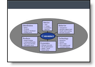
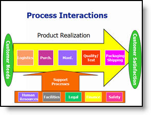
Oh ,The Colors
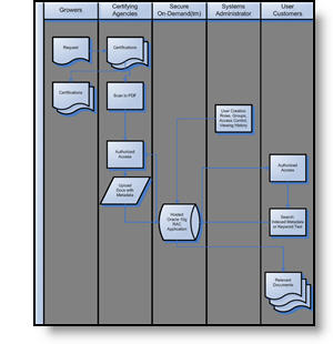
It is often beneficial to color code the data. But sometimes to much color makes things difficult to interpret and ends up looking like the circus has arrived. Here is a great diagram that provides a lot of vital information – it just gets lost in all of the colors and shapes.
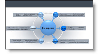
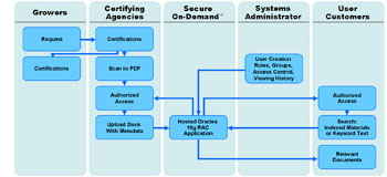
My goal was to minimize the distracting colors, make the diagram fit within the slide and emphasis the relation and process. Here is the revised diagram:

– Troy @ TLC