Tutorial

Oh ,The Colors

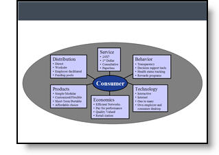
It is often beneficial to color code the data. But sometimes to much color makes things difficult to interpret and ends up looking like the circus has arrived. Here is a great diagram that provides a lot of vital information – it just gets lost in all of the colors and shapes.
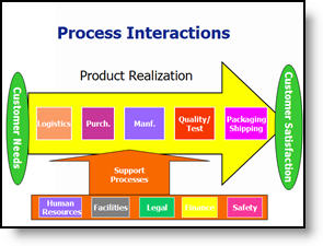
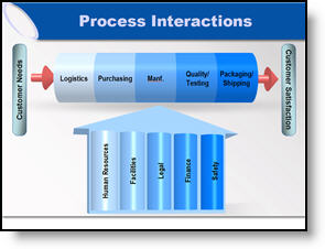
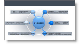
My goal was to minimize the distracting colors, make the diagram fit within the slide and emphasis the relation and process. Here is the revised diagram:
– Troy @ TLC
By |2016-11-17T15:46:07-08:00March 7th, 2007|Portfolio, Tutorial|

Great Graphic – For an Engineer

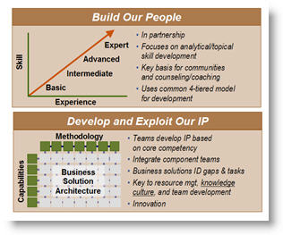
Here is the original graphic provided. It has all the needed information, is nicely balanced, has good contrast – and has all the factors an engineer would appreciate.

Taking the same content, basic layout, and even color scheme, here the revised version of the diagram developed for the (16×9, widescreen) presentation.

– Troy @ TLC

By |2016-11-17T15:45:31-08:00March 5th, 2007|Portfolio, Tutorial|

Show It A Story

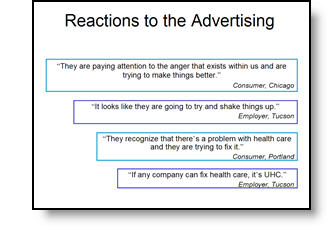
Lots of presentations show quotations. Here is the original slide with a lot of quotes – each animates on with a click.

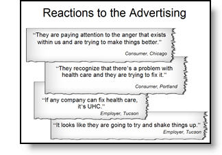
To put the quotes in a visual environment a series of ‘torn paper’ graphics where designed, font sizing and line spacing were also adjusted.

– Troy @ TLC

By |2016-11-17T15:44:00-08:00March 1st, 2007|Portfolio, Tutorial|

Tell the Right Story

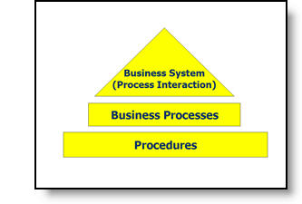
Here is the graphic from an original slide.

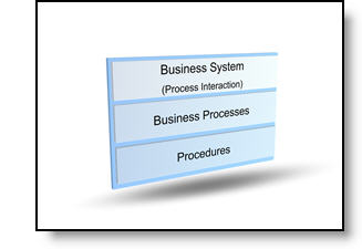
After discussing with the presenter, the message was not really about a hierarchy, but that all three processes where controlled by one business unit. Here is the revised graphic that was more aesthetic, cooridinated with the presentation color scheme, and showed a more accurate story.

– Troy @ TLC

By |2016-11-17T15:43:22-08:00February 27th, 2007|Portfolio, Tutorial|

PowerPoint Gets The Blame with Full Screen Videos

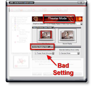
PowerPoint seems to cause the problem, but it is really video card settings that make your movie playback at full screen.

(on pre-Vista OS) go to START >> DISPLAYS >> SETTINGS tab >> ADVANCED button >> depending on graphics card find the settings for THEATER MODE (usually buried a few buttons down). If it says play movies full screen, that is what PowerPoint looks at and does… I recomend changing THEATER MODE to ‘standard’ so there are no surprises.

– Troy @ TLC

By |2016-11-17T15:39:44-08:00February 15th, 2007|Tutorial|

PowerPoint Gets The Blame with Widescreens

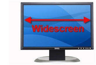
There are times when it looks like PowerPoint is to blame, but in reality it is a computer OS setting that is making PowerPoint appear to behave badly. An example of this that comes up often is running a presentation on a widescreen monitor.

Recent Post on the PowerPoint Forum:
I have a widescreen monitor powerpoint distorts graphs. The font becomes much larger and squished together. How do I stop the powerpoint from changing things?

My Response:
(on a pre-Vista OS) Go to START >> CONTROL PANEL >> DISPLAY >> SETTINGS tab >> ADVANCED button >> depending on which video card, find setting for MAINTAIN ASPECT RATIO. Now 4×3 presentations will display with black bars on the left/right so nothing is distorted on a widescreen monitor.

– Troy @ TLC

By |2016-11-17T15:38:48-08:00February 13th, 2007|Tutorial|

Video Tutorial on PowerPoint Photo Crop Tool

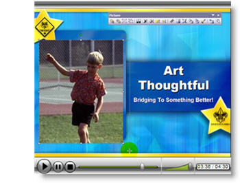
For a recent client I supplied the PowerPoint template and a quick video tutorial on using PowerPoint’s Crop tool to provide some tips on how best to insert a series of photos. Now for your viewing pleasure I have uploaded that tutorial to one of my servers for all to enjoy!

Note: This was unscripted and created in just a few minutes, so it is definitely lacking much of the polished professional touches that go into real projects… Click here to view.

– Troy @ TLC

By |2016-05-13T15:19:43-07:00February 11th, 2007|Portfolio, Tutorial|

Add Align Tools to a Toolbar

I use the Align and Distribute tools constantly. But accessing them by going to the DRAW button and then into the ALIGN OR DISTRIBUTE tab was just to much work. I added these important tools to my Draw toolbar, which now has a number of addtional buttons – all to make my work faster and easier.

– Troy @ TLC

By |2016-11-17T15:32:04-08:00January 22nd, 2007|Software/Add-Ins, Tutorial|

What’s Wrong With It? (Alignment!)

In working through many, many presentations this week a large part of my time was spent not only improving the overall visual content and layout, but giving the small, but professional, tweaks to elements. As example:


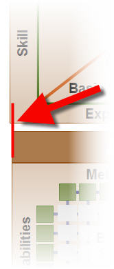
Here are two elements, as provided. They screamed out to me, but what was the problem…


Zooming in we can see that the two equal size boxes are not aligned.


The solution is very easy in PowerPoint.
Select both boxes.
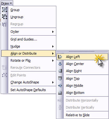
Go to DRAW >> ALIGN OR DISTRIBUTE >> ALIGN LEFT.


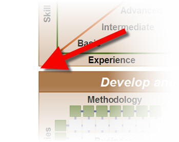
Now both boxes are perfectly aligned! (and all is good with in my world… just 200-300 more slides to go).

– Troy @ TLC

By |2016-11-17T15:31:46-08:00January 20th, 2007|Tutorial|

Why Do My Slides Start at Zero?

Had a client call with this situation – which is frustrating if you don’t know where to look.

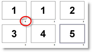
You look at your slides in Slide Sorter view, or on a printout, and the first slide is not labeled as #1, but as #0.

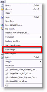
To “fix” go to FILE >> PAGE SETUP

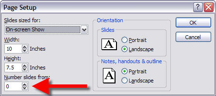
In the Page Setup Dialog note the NUMBER SLIDES FROM option. Change the “0” to “1” and all is back to normal.

– Troy @ TLC

By |2016-11-17T15:31:00-08:00January 16th, 2007|Tutorial|
Go to Top