design

Design For Speed Slide

This is from a recent presentation project.
Designing For Speed Sample Slide

The slide started with 2 original images:

In photoshop I dropped out the background of each and saved as .png images with transparency.

Then each image was inserted to the slide, a simple FADE IN animation applied to the top image for the transformation.

– Troy @ TLC

By |2016-08-16T11:28:32-07:00June 9th, 2010|Portfolio|

Defending PPT – Easy When This is the Sample Slide

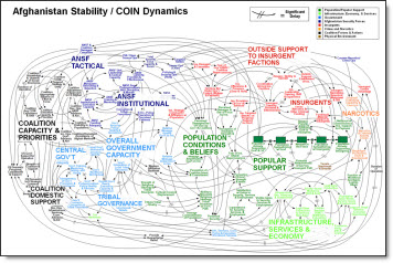
Recent headlines quote Army Gen. Stanley McChrystal, who heads U.S. and NATO forces in Afghanistan, criticizing PowerPoint presentations for creating “the illusion of understanding and the illusion of control. Some problems in the world are not bullet-izable.” When I looked a bit further I found this is the slide being referenced as not providing clear information.

hmmm…… I think action should be taken – and it has nothing to do with PowerPoint as an application, but against the company that decided this was worthy of being included in a presentation.

The offending “slide” was sourced from MSNBC. And I am confident it was not created in PPT, but by another application and imported as a graphic. Last, here is a really good webpage with a lot of people’s comments in defense of PPT. Among my favorites are:

This tool is highly misused and abused by presenters, secretaries and supposed PowerPoint ‘experts.’

It’s not the tool on the computer, it’s the tool AT the computer

I think a good strategy is to drop old PowerPoint slides from military briefings behind enemy lines. This should really confuse them…”

– Troy @ TLC

By |2016-08-16T11:38:31-07:00April 30th, 2010|Resource/Misc|

3D Metallic Text Style

For a recent presentation I decided to develop this text in PPT using the text style options (vs. creating in Photoshop using preset filters). The result was liked by client and being able to edit text quickly within the presentation vs. adjusting in Photoshop and updating image was great.

Download sample slide here.

– Troy @ TLC

By |2016-08-16T11:47:08-07:00April 19th, 2010|Portfolio|

Slide Redesign

In the original slide there was a nice graphic and the layout was clean and balanced. It did not have bullet points for the text, a small graphic or many other common layout issues.

For the presentation makeover a series of colored and slightly beveled shapes were used throughout. Keeping consistency the text was highlighted on the circle, the demographic image on a rounded corner rectangle and the two connected with the gradient (triangle).

– Troy @ TLC

By |2016-08-16T11:59:00-07:00March 12th, 2010|Portfolio|

Adjusting Bad Line Breaks

Here is a graphic from a recent client presentation (as sent to me – but with some text ‘removed’).

A simpe line break, soft-return (shift-return) grouped the topic/cities onto a single line which is much easier for the audience to interpret quickly.

– Troy @ TLC

By |2016-09-16T08:54:39-07:00January 13th, 2010|Tutorial|

Mesa Aquatics Web Banner

One of the things that definitely keeps presentation work fresh is a diversity of projects. My daughters are on a swim team together and the president of the swim club asked if I could help with updating some of the website elements, starting with the webpage banner at mesaaquatics.com.

– Troy @ TLC

By |2016-09-16T09:11:15-07:00January 3rd, 2010|Portfolio|

ThunderCats – The Template!

Always fun to work on projects that allow me to creative license to create something super dynamic. One such project was a PowerPoint template for the upcoming ThunderCats movie.

My first stop was lots of research to familiarize myself with this cartoon series I overlooked in the 80’s. I also watched the trailer for the upcoming movie and reviewed lots of the movie release info. From all this I identified the primary characters – logo – color pallet – and theme. Then I pulled in a number of images and started developing the basis for the template backgrounds in Photoshop. After a number of revisions and input from client the background art was imported into PowerPoint 2007 and all template options set. Here is the final result.

1. Opening Theme Graphic Slide
2. Title Slide
3. Content Slide

– Troy @ TLC

By |2016-09-16T09:12:35-07:00December 29th, 2009|Templates/Assets|

WWE Template

Sometimes a template just needs some high energy visuals. That was pretty much my direction for a project for the WWE (World Wrestling Entertainment) – “it needs to be great and full of energy!”

I took that direction, the official logo, some online research on (… have not followed professional wrestling a lot) and the final result was this template.

– Troy @ TLC

By |2016-09-16T09:47:20-07:00August 24th, 2009|Templates/Assets|

Give Depth To a 3D Shape

PPT 2007 has some create functions for converting even the simplest shape into a 3D element. But there is some interaction of features needed to create the effect.

1. Here is my sample arrow with some stylizing applied.

2. To convert to 3D I like to open the full FORMAT SHAPE dialog. To open, select the shape >> FORMAT tab >> SHAPE STYLES section >> small OPEN dialog in lower right corner

3. Go to the 3-D ROTATION tab

4. From the drop-down menu of preset I choose OFF AXIS 1 TOP

5. Here is my arrow converted to 3D

6. To add some depth to the arrow go to the 3-D FORMAT tab and increase the DEPTH point size

7. This menu has live preview, so as you adjust the shape will update. For my I increased the DEPTH to 20 points for my final image.

– Troy @ TLC

By |2016-09-16T09:59:25-07:00August 12th, 2009|Tutorial|
Go to Top