design

Clear Text Styles

So you are working in PPT 2007 and enjoying the great design tools like the ability to stylize any text (because all text is WordArt now).

I start with this:

Then we stylize it to look like this:

But later we decide we want it back to standard text – like this:

How do you do that….

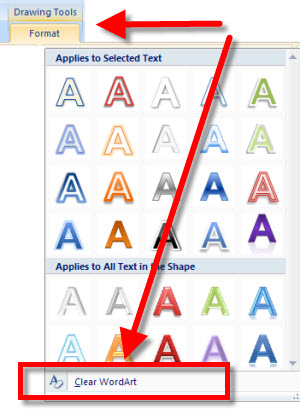
Select the text >> go to the Draw-Format tab >> click the drop down to show the full menu of the preset styles >> at the very bottom is the ‘clear wordart’ option (remember, ALL text is now wordart)

Done!

-Troy @ TLC

By |2016-09-16T10:09:41-07:00June 25th, 2009|Tutorial|

Texas Branded (Literally) Template

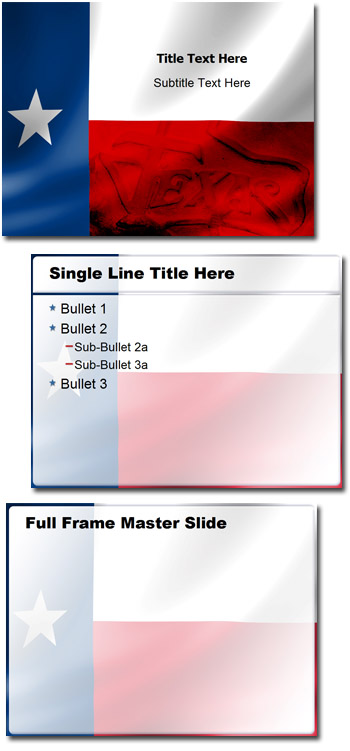
This is from a recent project that was specifically for legal proceedings in the State of Texas. Because Texas was the core message I developed the template using the Texas State Flag, some overlay boxes in Photoshop and a great image of a ‘Texas’ branding iron.

– Troy @ TLC

By |2016-09-16T10:10:43-07:00June 19th, 2009|Portfolio|

Communication Tower Slide

It is difficult to explain the creative process that goes into designing slides. Much is visual, subjective, and just design experience. But one thing that is easy to explain, or show, is the communication process. As example:

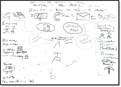
Here is what was faxed over (and this is enhanced in Photoshop to make it more legible!), plus a 5 minute call.

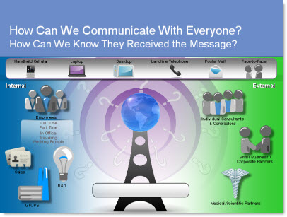
And here is what resulted.

This slide also animated in 3 clicks to setup the communication story and build the complexity of the situation.

– Troy @ TLC

By |2016-09-16T10:11:01-07:00June 17th, 2009|Portfolio|

Toy Story – The Template!

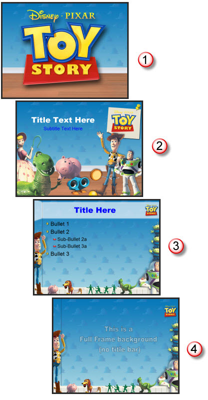
Sometimes work is just fun! Who could have a bad day when surrounded by Woody, Buzz, and the whole gang from Toy Story. Animated properties are great projects because they come with great visual assets that are all high quality and professionally developed. For this marketing presentation I developed the backgrounds from assets (Hint: the clouds are Andy’s wallpaper in his bedroom) and then had lots of fun playing with all the toys making them fit without hindering the content area.

The full template was developed with 4 master slides:
1. Theme graphic
2. Title slide
3. Content slide
4. Full Frame slide

– Troy @ TLC

By |2016-09-16T10:11:28-07:00June 15th, 2009|Portfolio, Templates/Assets|

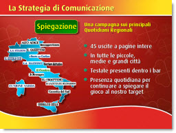
And I Don’t Even Speak the Language

Received a call from a past client with request to help update a series of presentations. Project was great and super to reconnect with clients I consider friends. Of course working on presentations in a language you are not familiar with has its challenges…

– Troy @ TLC

By |2016-09-16T10:18:21-07:00May 27th, 2009|Portfolio|

Alternative to Bullets

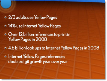
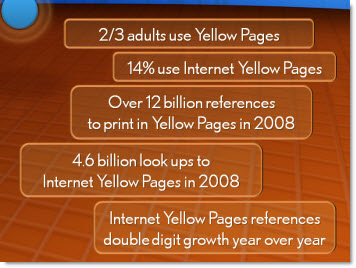
Here is an example from a recent project that shows an alternative to a list of bulleted text. The overall presentation we images and key words only. This part of the script was a quick recap of these sound bites – to quick for visuals, but a bulleted list was not a good option because it was just not dynamic enough.

Here would be the ‘standard’ slide:

Here was my layout:

– Troy @ TLC

By |2016-09-16T10:23:45-07:00May 11th, 2009|Portfolio|

Lexus LS

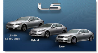
The final portfolio post this month is a slide from a 16×9 high-def show (1920x1080px projection onto 28′ wide screen). The template design was subtle gradients with stylized swooshing lines (used in the collateral materials for the meeting).

What makes this slide stand out is the photoshop work. The ‘LS’ chroming and drop shadow was applied to standard text (using the provided Lexus font). Each car was cutout to remove the background (and keeping wheels looking round and proper is not an easy task). The text was done in PPT 2007 with a custom bevel effect. And the nice animation entrance cannot be seen in the static image – but it was nice too.

– Troy @ TLC

By |2016-09-16T10:59:21-07:00February 28th, 2009|Portfolio|

Before and After

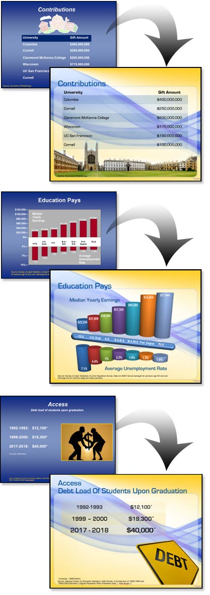
I received enough email since the last post to make me change my plans and show some of the Before-and-Afters from the project highlighted in the previous post “Higher Education”. As a side note: I have been collecting images for a month long series of before-and-after slides which should be good to go in May (don’t hold me to that) – and this is one of the posts you will see again 🙂

With this project I received a “raw” presentation and was tasked with developing a new template and updating all of the slides. The great thing about the presentation is the content for each slide was very minimal, allowing it to be big – dominant – and on a dynamic template.

– Troy @ TLC

By |2016-09-16T11:01:12-07:00February 26th, 2009|Portfolio|

Higher Education Presentation

This project was for a university program. They needed a template that integrated their school colors, but was lively-energetic-modern-cool. That was the direction provided and from there I was able to go in any direction. I developed 5 concepts and this was the one selected.

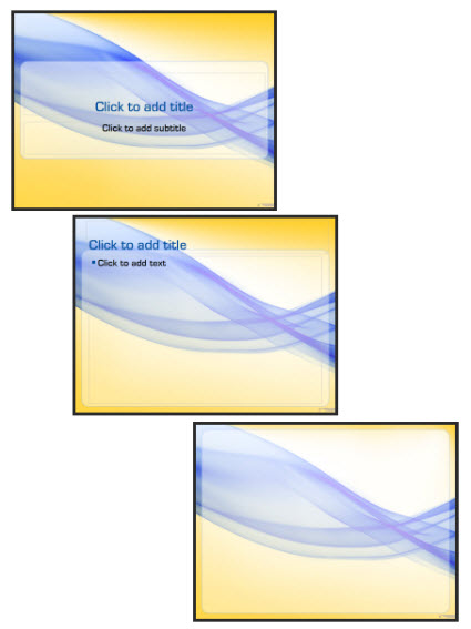
The template also used a custom font, which was installed on all presentation computers vs. embedding in the presentation. It featured 3 master slides:
1. Title slide
2. Content slide
3. Full Frame slide

The full frame layout is unique in that generally this style master slide removes the title bar to allow room for images/charts that need the full frame. In this template the title are is actually defined by the absence of the content area. So the Full Frame slide has the content area extended, creating a full canvas for content.

Of course there is a lot of competing visuals with a template like this. The background is full of contrasting, dominant shapes. It has a definite flow that draws the eye across the slide (from left-right). Lots of small text could easily become lost. And this would not be first choice for “standard” corporate template.

For this project I was provided the full (raw) presentation before any design work began and was able see the type of content. Because the content was large, minimal and to-the-point (eg. no inserted 200 cell excel charts or 20 bulleted lines) I was able to go with a more dominant and visual template design.

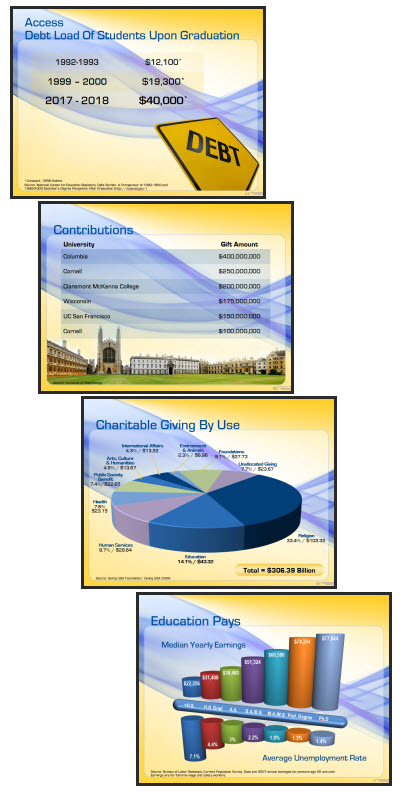
Here are few slides from the presentation:

– Troy @ TLC

By |2016-09-16T11:02:15-07:00February 24th, 2009|Portfolio, Templates/Assets|

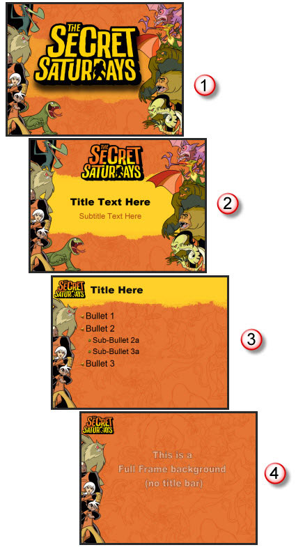
Secret Saturdays Template

If you have boy, age 6-12, you a probably familiar with Secret Saturdays. This is a new cartoon series on Cartoon Network and with my 3 girls I was forced to enjoy some research watching several episodes to get in touch with my inner adventurous boy before developing this marketing template.

Working with entertainment properties, especially animated properties, is great. They have all the visual assets needed. And they are all high-res and layered (so no background).

For this project I assembled all of the characters into good and bad. Then selected the most vertical poses and went to work in Photoshop to create my layouts. The key characters (the good guys) are on the left, remain a constant throughout all master slides and positioned just far enough off the slides to not interfer with the content area. The background is a great line drawing the characters overlayed on the primary background color (pulled from the style sheet). And there are 4 master slides:
1. Theme (used at beginning and end of presentations)
2. Title slide
3. Content slide
4. Full Frame slide

Definitely not your standard corporate template – and I bet these presentations are more fun to sit through!

– Troy @ TLC

By |2016-09-16T11:02:43-07:00February 22nd, 2009|Portfolio, Templates/Assets|
Go to Top