This is a continuation of the previous post, which introduced BrandIn along with our pro and con list. BrandIn is a new asset management solution for PowerPoint and Word, making templates, image assets, pre-designed slides, and text chunks – all accessible directly in PowerPoint without the need to go to a separate website or app to find and add assets to a presentation!
Let’s Try It!
Because BrandIn has a fully functional free version, try it! This post is from the perspective of our design team and our studio workflow of adding BrandIn. A special note that our workflow does diverge from some of the official BrandIn support info.
Install
Getting started with BrandIn is easy:
1. Requirements – a business Microsoft 365 plan which includes SharePoint Online (eg., Personal M365 plans will not work at the time of our review).
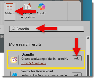
2. Download – BrandIn is a PowerPoint web add-in (eg., no separate .exe installer needed). This makes the installation easy and available to all but the most stringent IT-controlled companies. In PowerPoint, go to the HOME tab > ADD-INS > search for BRANDIN. Click ADD to install.
3. Setup – The BrandIn support info notes that the assigned M365 administrator must link BrandIn to their SharePoint library, then invite users to the BrandIn account, and do the shared asset organization within the SharePoint folders. Don’t let the “SharePoint” references scare you. Our experience at TLC Creative was that very little direct SharePoint activity was needed.
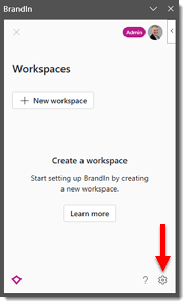
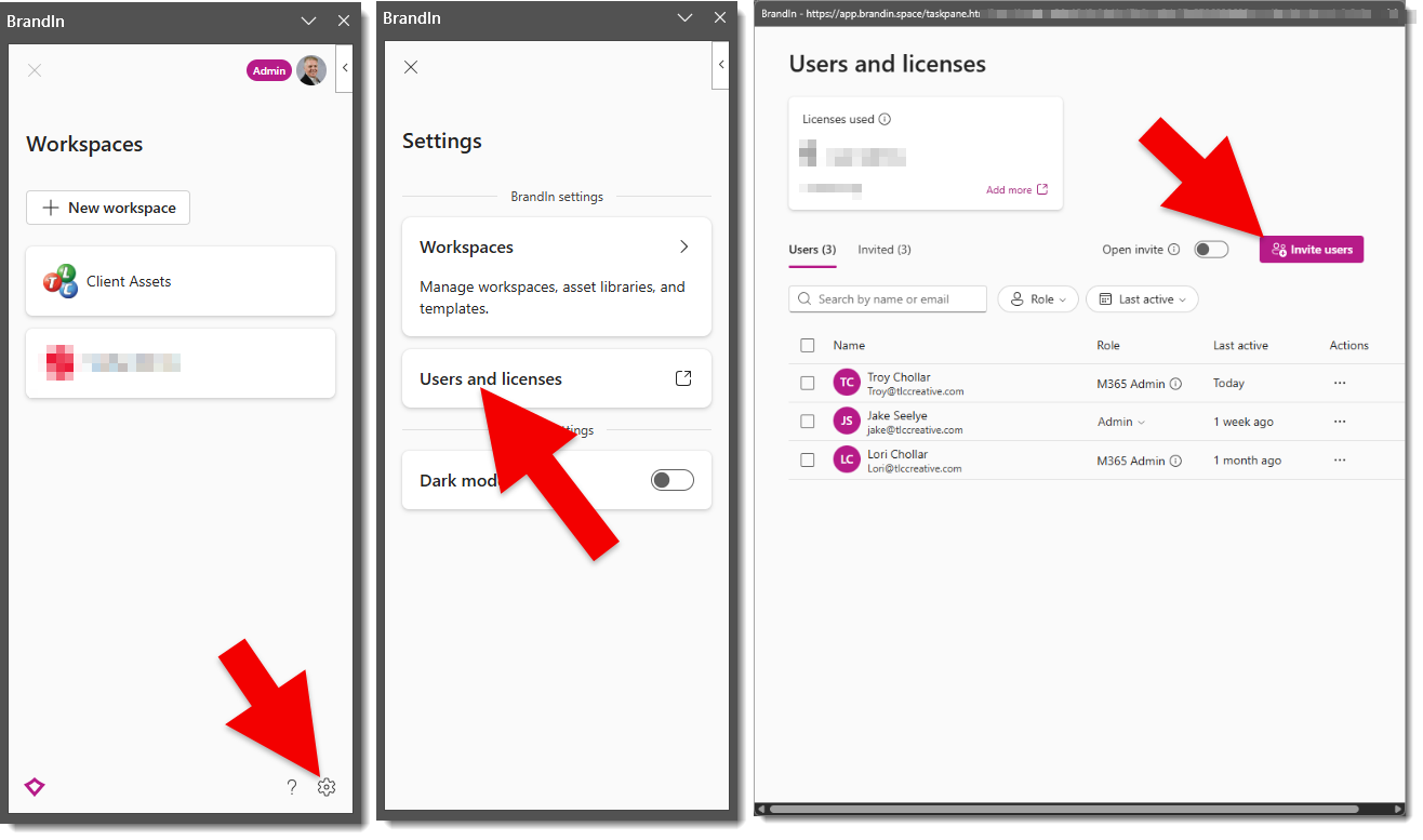
- From the HOME tab, click the BrandIn button to launch. Then click the settings (gear) icon at the bottom.
- Click “Users and licenses”
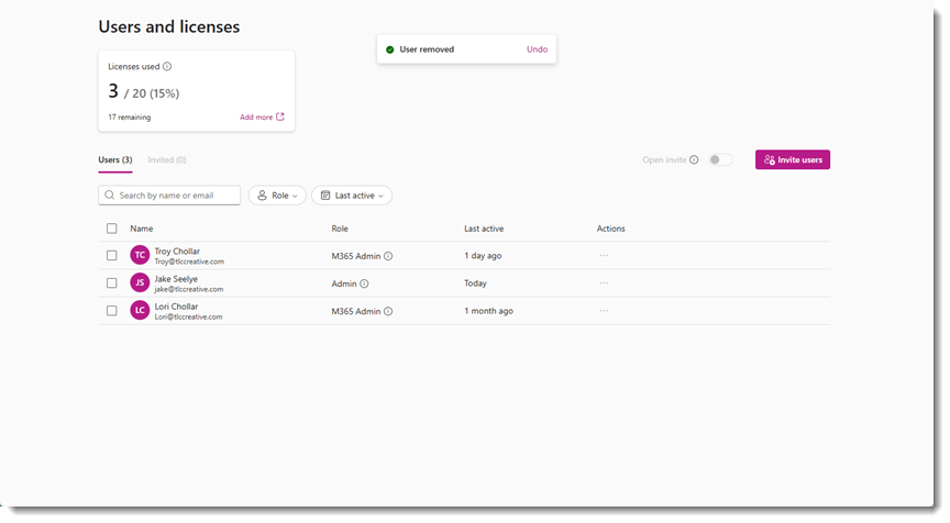
4. Invite Users – at the pop-up dialog, click “invite users” and follow the steps to invite users.
- The account must be set up by someone who is an M365 Admin.
- After this, anyone assigned as a BrandIn Admin (M365 Admin role is automatically a BrandIn Admin) can invite other users and create new workspaces.
BrandIn Workspaces
Workspaces are BrandIn’s way of creating separate areas to silo content for different brands, teams, or departments. The Free version is limited to 2 Workspaces, while the Business and Enterprise plans enable creation of as many Workspaces as needed. Each workspace connects to its own SharePoint site and can include its own asset library, templates, and custom settings, keeping everything organized and tailored to that group’s needs.
This is another area where the “SharePoint” reference does not need to scare anyone away. Below, we detail our workflow of using Teams to set up and organize the SharePoint folders and content – without needing to venture into “SharePoint”.
Add a Workspace to a BrandIn account:
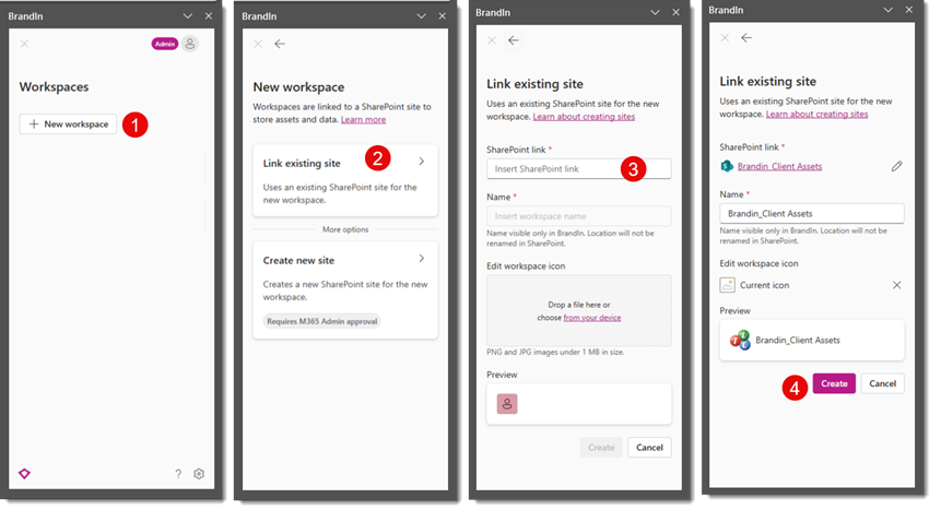
- In the BrandIn pane, click NEW WORKSPACE (1).
- Select LINK EXISTING SITE (2).
- For the SHAREPOINT LINK (3), here is the TLC Creative simplified process (eg., we don’t really use SharePoint):
- Set up a Team (name the MS Team what you want to show in BrandIn as the Workspace name) > go to the Channel > go to the FILES tab > click the 3-dot drop-down menu > select OPEN IN SHAREPOINT
- Copy the web SharePoint browser URL
- Back in the BrandIn setup, paste this URL into the SharePoint Link field (3)
- Name the BrandIn Workspace, which will be seen in BrandIn (does not need to be the same as the Teams name, but we found it simpler for both the Teams name and the BrandIn Workspace name to be the same). Click CREATE (4).
- Note: the number of Workspaces that can be added is based on the account type (for example, the Free version is limited to 2 Workspaces).
User Access, SharePoint vs. Teams
BrandIn users have access to the BrandIn pane and each Workspace.
- Note: BrandIn users and access to Workspaces are separate, at least from our experience in using MS Teams for the BrandIn available assets. For example, everyone who has access to BrandIn does see all Workspaces, but they may not have access to go into the workspace folders based on the Team and who is set within Teams (more details below).
- Summary from the previous post on inviting BrandIn Users:
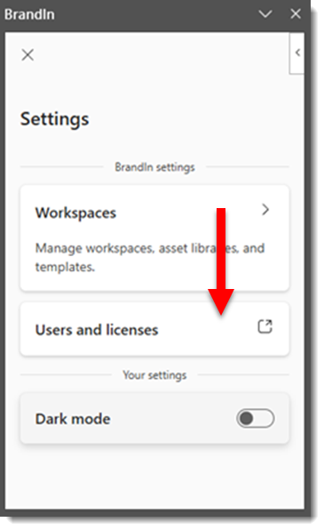
- In PowerPoint, open the BrandIn pane (e.g. click the BrandIn button on the HOME tab)
- Click the settings GEAR icon
- Click USERS AND LICENSES
- Click INVITE USERS (and follow the process)
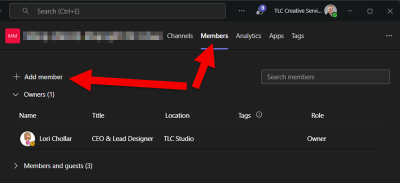
- MS Teams Users
- Once the Team is setup
- Go to MANAGE TEAM
- Add users and assign as Owners, Members or Guests (eg. someone external to the organization)
Using BrandIn
After the BrandIn account is set up, users are added, and the BrandIn add-in is installed in PowerPoint (and Word), things are pretty easy for users.
- In the PowerPoint HOME tab > click BRANDIN > the BrandIn pane opens
- From the BrandIn pane, select a Workspace > select an asset folder > click any asset to open or be added to the current slide.
BrandIn Libraries and Assets
Organization and access to assets are the core of what BrandIn is. Understanding the combination of Library types and a plan for organizing the files/assets is going to make implementation smooth… or complex.
Each Workspace automatically has a “Template” library. Templates, both PowerPoint and Word, are available when clicking the NEW PRESENTATION (or New Document) link in BrandIn. Not only does this create a single folder for templates to be uploaded to, but it also means there is now a single location for templates, making the current template version easy to manage.
Libraries are basically folders in SharePoint with specific properties applied. The Library properties are added directly in the BrandIn interface (e.g. BrandIn applies the settings to the SharePoint folders for you).
Libraries (aka folders) can be any name and contain any files. Common libraries are Slides, Images, Icons, Slides (for predesigned, ready-to-use, individual slides), and Content (for things like preset text chunks – which is a really great BrandIn feature!).
As we quickly learned, having a central organization plan that everyone uses, is critical to a smooth setup of BrandIn. It is recommended someone on the planning side spend a few minutes reading about Libraries in the BrandIn Help Center.
BrandIn details setting up folders and assets within SharePoint; however, TLC Creative is happy to avoid SharePoint, and we’ve found that virtually everything can be done within the Microsoft Teams workflow. Once the folders are set up and connected to BrandIn, the SharePoint Library settings can be applied directly in BrandIn. The one exception is that the PowerPoint templates folder is specific to SharePoint, but BrandIn has a link to open SharePoint in a browser to the folder where template files need to be copied to.
Tips for MS Teams:
- When creating a Team, it is easier to manage if it is the same name as the BrandIn Workspace.
- Add users for access to each Team. We found this to be a great option for managing who can access assets in BrandIn (again, this can also be accomplished within SharePoint, but the MS Teams workflow was less “IT” and easier to implement for us). For example, everyone on our team sees all of the BrandIn Workspaces. But, if someone has not been given access to the MS Team, they can see the BrandIn Workspace, but do not see nor can access its assets from BrandIn.
- For assets to be available in BrandIn, it is as easy as copying the files into the Team, which can be set up in sub-folders, and the sub-folder structure also is in Teams. Go to the FILES tab > add folders and asset files.
- Everything added to the Team will be available in BrandIn (with the note that BrandIn needs to support the file types).
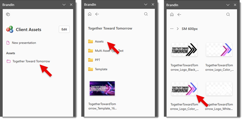
With the above steps complete, we can go to our demo BrandIn Workspace > Client Assets > and see a sub-folder, Together Toward Tomorrow.
- The CLIENT ASSETS Workspace is an MS Team
- We then added several clients and projects within CLIENT ASSETS
- The Together Toward Tomorrow folder in CLIENT ASSETS is a separate MS Team with its own assets folder structure, assets, and user access (based on who has been given access to this Team)
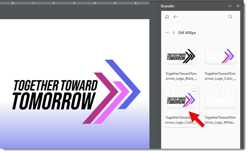
To see the logos for the Together Toward Tomorrow brand; open BrandIn > Client Assets > Together Toward Tomorrow > Assets > Logos > PNG > SM 600px > select the logo to add to the slide.
The best part is, everyone is accessing the same folders and assets. So if one of the logos needs to be updated, update it this central folder and everyone now accesses the newest version (YAY!!). Or if a new logo is added to the brand, add it to the logo folder(s) and everyone has access to it (double YAY!!).
Conclusion
Overall, this is one of the most intuitive DAM (digital asset management) systems for finding and inserting PowerPoint templates, image assets, pre-designed slides, and text assets (a new feature that is really helpful!), and overall is a powerful slide content tool.
The BrandIn install is available from within PowerPoint and more info is available on the BrandIn website. Additionally, BrightCarbon routinely offers BrandIn intro workshops.
TLC Creative receives no paid endorsement, but with our successful implementation of BrandIn, we have become a BrandIn Partner (eg., we have created documentation, processes, and training to assist companies with their BrandIn setup and adoption). Contact us at info@tlccreative.com any time. Whether you’re a small company or a large enterprise, if you are looking at BrandIn as an asset management option, we are happy to help.
-Troy @ TLC Creative