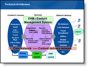
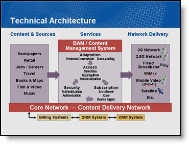
From This To That (Technical Architecture Slide)
With a recent project I began to feel that part of my duties were interpreter. All the information was there, but I did not have the presenter available to explain the industry and what the message of the slide was. All is done and very well received, but thought I would share a some before-and-after slides.
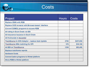
Before:
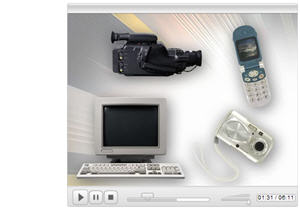
Lots of information, sort of compartmentalized, lots of colors, lots of confusion and of course, clip art.
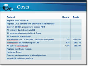
After:
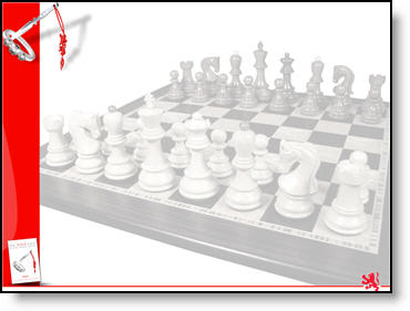
Took a while to figure out the message, then recreate with a new layout that allows everyone to see the interaction of the elements, a more limited color palette and no more stock clip art.
– Troy @ TLC