Tutorial

Videos Not Pure White or Pure Black?

You watch a video in Windows Media Player or Quicktime Player or any other player and it looks great. On the same computer, the video is inserted whites and blacks look grey. Don’t blame PPT, but the Graphics Card (GPU).

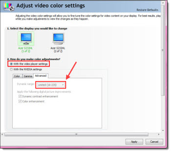
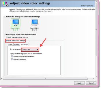
If running an nVidia card, look at the DYNAMIC RANGE setting, because it is most likely set to limit the color range of videos (no idea why, but I see this on everyone of the TLC show computers I setup).

Dynamic range describes the ratio between the maximum and minimum white and black.
With the nVidia graphics card, you can adjust the settings for the display. By default, many nVidia cards are set to use the settings which are limited to 16-235 (whites won’t be white, blacks won’t be black).

Open the nVidia Control Panel >> on the left in the “Select a Task” column go to ADJUST VIDEO COLOR SETTINGS >> look at the settings in “2. How do you make color adjustments.” Click on the “ADVANCED” tab. If the DYNAMIC RANGE setting is (16-235), go to the next step.

Select the WITH THE NVIDIA SETTINGS radio button. On the ADVANCED tab, change the DYNAMIC RANGE to FULL (0-255). This lets videos use the full color range from pure white to pure black.

– Troy @ TLC
By |2016-08-16T09:05:25-07:00October 2nd, 2012|Resource/Misc, Tutorial|

PowerPoint vs. Photoshop Opacity Settings

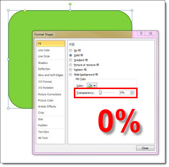
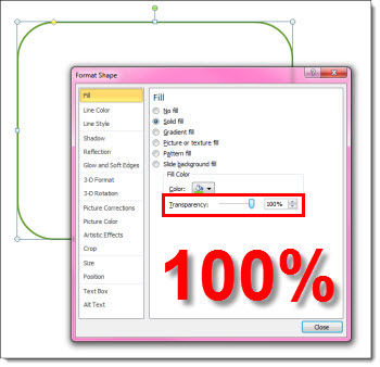
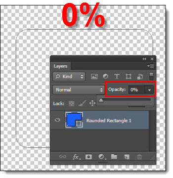
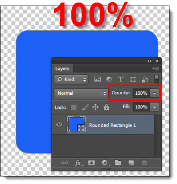
PowerPoint and Photoshop each have their own way of changing the opacity of an element. The most confusing aspect is that each app defines 0% transparency different.

In PowerPoint, 0% Transparency means the shape is fully opaque/solid.

In PowerPoint, 100% Transparency means the shape is fully transparent/invisible.

On the other hand, Photoshop does the exact opposite.

In PhotoShop with 0% Transparency the shape is fully transparent/invisible.

In PhotoShop, 100% with Transparency the shape is fully opaque/solid.

– Troy @ TLC
By |2016-08-16T09:06:52-07:00September 24th, 2012|Tutorial|

Help – This Shape is Stuck in the Chart

There is a good reason for this feature, but for most it seems to be bug. Which is it, depends on your preference.

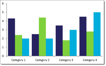
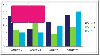
Here is the scenario. A chart is on a slide:

With the chart selected, you decide to add a callout box to highlight the important data in the chart.

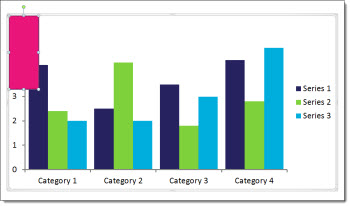
The new shape is inserted, editable and look like what you wanted. But the shape is actually within the chart boundaries. In this case you select the new shape, and the chart is also still. Select the chart, and the shape is also part of the selection.

The dilemma is the new callout shape can be edited and moved – but it can only move within the chart boundaries. It is also connected to the chart for animation.

What PowerPoint has done, which is actually by design, is inserted the shape as part of the chart element, because the chart was selected while the shape was inserted. If the chart is moved, the shape moves. If the chart is deleted, the shape is deleted. But the shape does not directly interact with the chart. As example the chart styling options do not change the shape styling. Chart animations do not animate the new shape(but animations can be added and controlled for the shape, they are part of the chart element animation).

For some, this is a feature – the ability to tie new shapes to a chart. For others, it is a bug –  they did not want the shape tied to the chart.

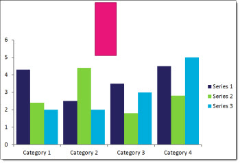
SOLUTION: If you want the shape outside of the chart, the easiest fix is to select the shape (select the chart, then select the shape within the chart) >> copy >> delete >> unselect the chart >> paste. Now the slide has a chart element and a separate shape element.

– Troy @ TLC
By |2025-03-16T10:53:19-07:00September 19th, 2012|PowerPoint, Tutorial|

PPT 2013 – Updated Ribbon “Metro” UI

When you first launch PowerPoint 2013, it looks similar and different at the same time.

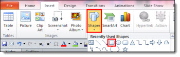
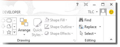
If you look at the ribbon, everything is in the now familiar locations and order.

When viewed more closely, you can see all of the aesthetics are new – in the “Metro” style. The Metro style was developed by Microsoft for the Windows Phone 7 interface. It is a success and has now become the basis for the Windows 8 UI and the Office 2013 UI, plus the MS website and many other interfaces.

Ironically, one of the original design reasons for Metro was “a key design principle of Metro is better focus on the content of applications, relying more on typography and less on graphics.” But, PowerPoint’s interface is definitely icon oriented and where typography is used, it has mixed reviews (ie. all caps for the ribbon tabs).

Also new is the logged in user option (for my Beta install the user is “TLC”). There is a lot of new features around the user account, which are overviewed in upcoming posts.

The happy face icon on the far right is a standard feature of Microsoft beta software. Clicking it brings up a dialog box to submit feedback, bug reports, etc. you discover while using the application. The smiley will not be a part of the retail version.

While the new aesthetics are not going to be everyone’s favorite, they are what is coming to a computer near you.

– Troy @ TLC
By |2016-08-16T09:17:33-07:00August 3rd, 2012|Tutorial|

Turning Point on Computer with Multiple PPT Installs

Last week was a corporate meeting that integrated Turning Point ARS (audience response system) for a series of audience interaction questions throughout the meeting. I have used lots of ARS options, but find Turning Point the most full featured and best PowerPoint integrated package.

All of TLC Creative’s show computers have two versions of PowerPoint installed, currently all have PPT 2003 and PPT 2010. When installing the Turning Point app, I always run into the issue of it being recognized in the PPT version needed for that meeting. So here is a quick tutorial on setting up Turning Point to open and function in a specific version.

OPTION A:
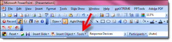
1. Open TurningPoint in 2003 – Select Tools on the Turning Point toolbar

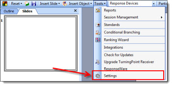
2. Go to Settings

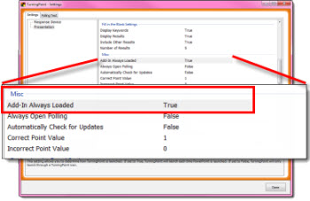
3. Under Misc >> Add in always loaded – Change to “TRUE”

OPTION B:
Launch the TurningPoint before starting (any version) of PPT, which will open 2010 as default
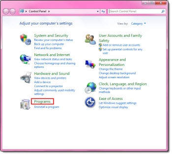
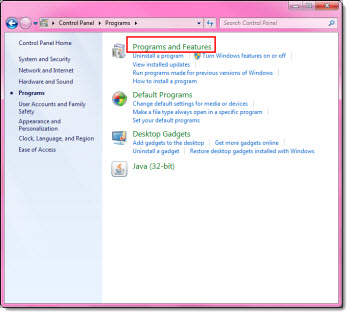
1. Control Panel > Programs

2. Click Programs & Features

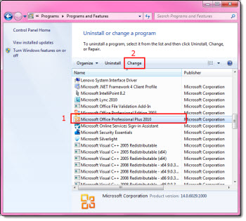
3. Scroll down to Microsoft Office 2010 > Select Change

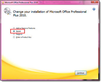
4. Repair

5. Wait for the repair to finish, it will ask you to restart. Once restarted when launching TurningPoint 2008 PowerPoint 2010 will be the default. TurningPoint will default to launching the last modified version of Office – so when you repair Office 2010, it prompts TurningPoint to choose 2010 as default.

– Troy @ TLC
By |2016-08-16T09:19:03-07:00July 27th, 2012|Tutorial|

Speaker Icon Evolution

Audio files (music, narration, sound effects, etc.) are represented on slides with speaker icon.

Here is the speaker icon used in PPT 2003

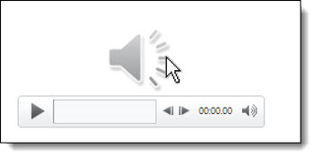
Here is the speaker icon used in PPT 2007 and 2010

In addition, when you rollover a PPT 2007/2010 speaker icon a mini player bar is displayed

– Troy @ TLC
By |2016-08-16T09:19:41-07:00July 23rd, 2012|Tutorial|

DVD Video Standards

If you are exporting a presentation as a video for use on a DVD, what setting should be used? If this is for a consumer video player DVD use, go with PowerPoint’s highest quality (960x720px for a 4×3 aspect ratio) and let the DVD authoring software lower the resolution.

DVD compliant video has very specific requirements in order to be viewable on standalone DVD players.
• NTSC Video
• 720 x 480 resolution
• Audio type (Dolby AC3, PCM, MPEG) 48KHz sampling frequency
• 29.97fps frame rate
• Maximum bitrate of 9800 bps

Note 1: DVD authoring software (TLC Creative Services uses Sony Vegas Pro + DVD Architect) will transcode the PPT video and set these specs.

Note 2: High Def Blu Ray DVD’s can use different specs.

– Troy @ TLC
By |2016-08-16T09:20:35-07:00July 18th, 2012|Tutorial|

Creating the “Open Again” Image in PPT

Yesterday’s post used a fun image that was downloaded from Fotolia.com and completely customized in PowerPoint. Here is what I did:

1. Research and download image from Fotolia.com (where TLC Creative Services has a subscription plan), then insert on slide.

2. Frame the right and bottom of the image with gradient lines.

3. Add a white box (white to match the slide background color).

4. Size and position the white box to cover the existing text.

5. Add PPT text with the new message using a custom font, same fill color as the marker in the image and positioned right over the marker.

6. Done – no Photoshop needed.

– Troy @ TLC

By |2016-08-16T09:23:07-07:00July 2nd, 2012|Tutorial|

Add Slides to a Presentation and Keep Their Original Look

Adding slides from one presentation into another and hoping for a button that will automatically format the slides the way needed is just not a feature in PowerPoint. But, the almost magical “Destination vs. Source Formatting” button does exist. For this tutorial, we are going to add slides from the “Blue” presentation (Presentation #1) to the “Purple” presentation (Presentation #2) and keep the blue slides blue (ie. opposite of the last tutorial where the slides updated to the purple template).

Here is our “Blue” presentation (#1):

And here is our “Purple” presentation (#2):

Select the slides from Presentation #1 and copy. Then paste them into Presentation #2. To paste in the new slides, right-click and in the pop-up menu in the “Paste Options” sections, select “KEEP SOURCE FORMATTING:”

With the KEEP SOURCE FORMATTING option the template for the new slides keeps the template that was used in Presentation #1. So the blue slides stay blue.

Behind the scenes what happens is a new Master Slide set is added to the presentation. So if you look in the slide layouts (HOME >> SLIDES section >> LAYOUTS) there are two master slide sets to choose from (Presentation #1 and Presentation #2).

NOTE: If you paste in more slides from the Blue presentation in a new location and select KEEP SOURCE FORMATTING another blue master slide set will be added (which is not optimal).

– Troy @ TLC
By |2016-08-16T09:25:02-07:00April 8th, 2012|Tutorial|

Add Slides to a Presentation That Fit In

Adding slides from one presentation into another and hoping for a button that will automatically format the slides the way needed is just not a feature in PowerPoint. But, the almost magical “Destination vs. Source Formatting” button does exist. For this tutorial, we are going to add slides from the “Blue” presentation (Presentation #1) to the “Purple” presentation (Presentation #2) and make all of the slides the same, so they are all purple.

Here is our “blue” presentation (#1):

And here is our “purple” presentation (#2):

Select the slides from Presentation #1 and copy. The paste them into Presentation #2. To paste in the new slides, right-click and in the pop-up menu in the “Paste Options” sections select “Use Destination Theme:”

With the USE DESTINATION THEME option, the template for the new slides is assigned to the template used on the slide in front of the insert point. So now all of the blue slides are changed to the purple template.

*Note: There is no “magic” button and with this example the text boxes, background, colors used, etc. were all setup correctly using the template formatting (which also means it is a real template). When updating to the new (purple) template all of the master slide formatting carries over just fine. But there are lots of times when things are not based on template formatting and need to be manually updated (ie. no magic format button).

– Troy @ TLC
By |2016-08-16T09:25:27-07:00April 6th, 2012|Tutorial|
Go to Top